Topic / design
70 posts✦
December 16, 2025 • #
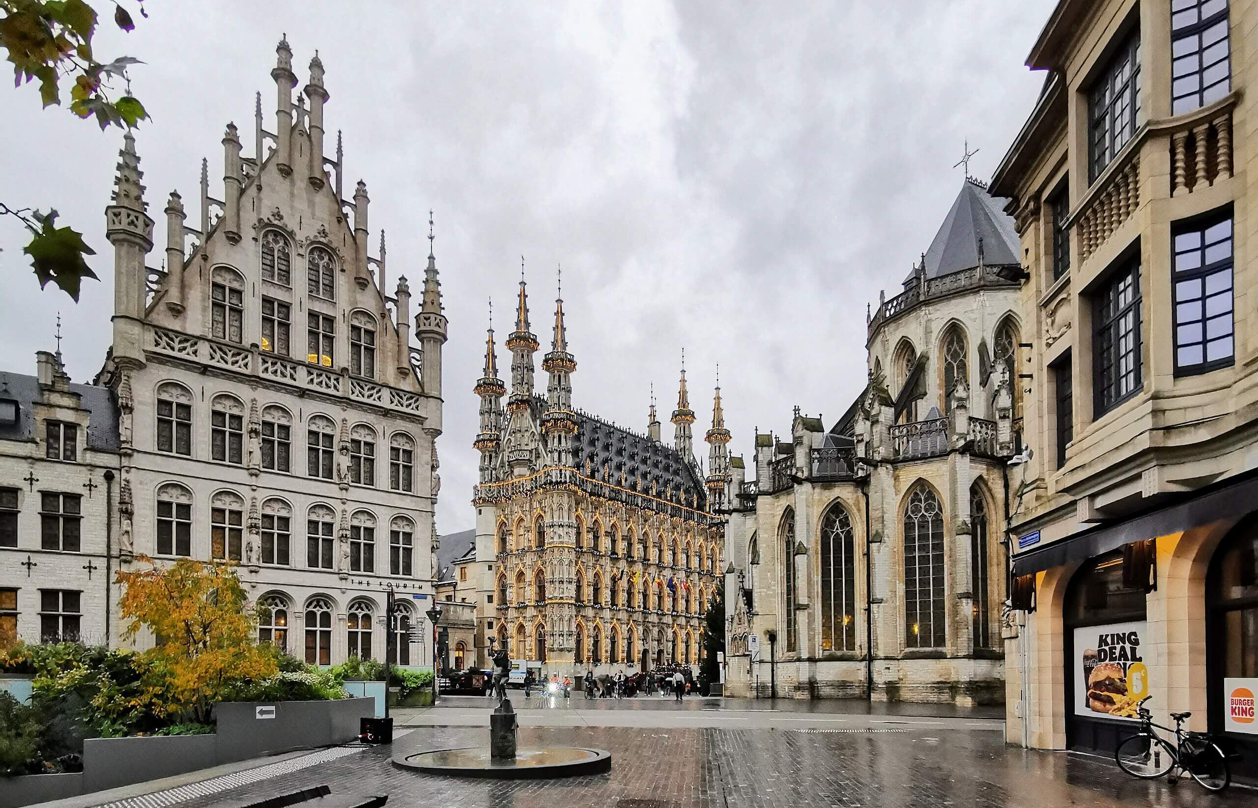
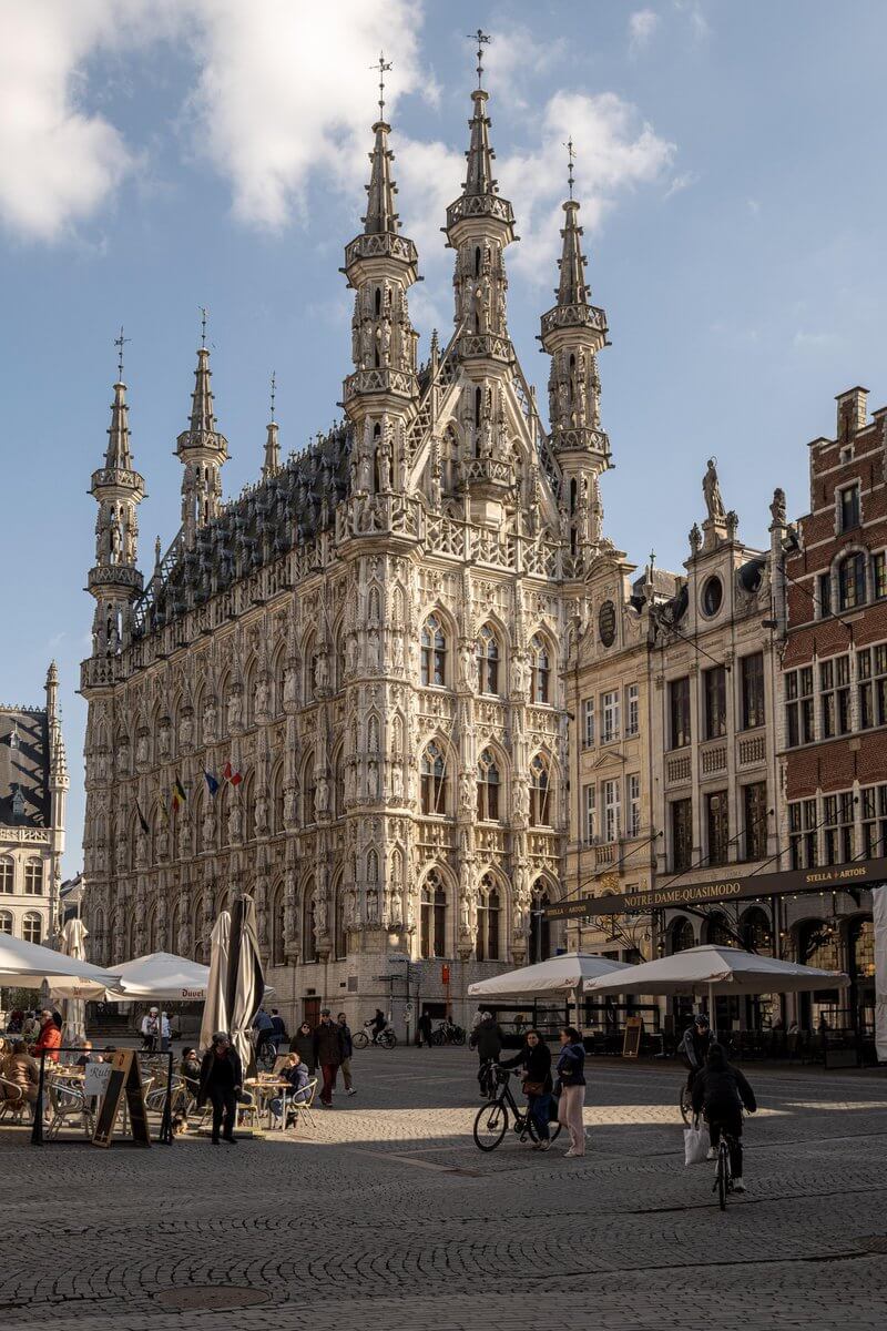
Leuven Town Hall. Flemish Brabant, Belgium.
⎈
Storehouses of history
December 7, 2025 • #When old corporate buildings preserve a heritage.
✦
patternlanguage.cc
September 2, 2025 • #A web-published version of A Pattern Laguage's graph of pattern relationships.
✦
Conversational Interfaces
May 12, 2025 • #Why conversational interfaces still aren't the right approach for human-computer interaction.
✦
March 3, 2025 • #
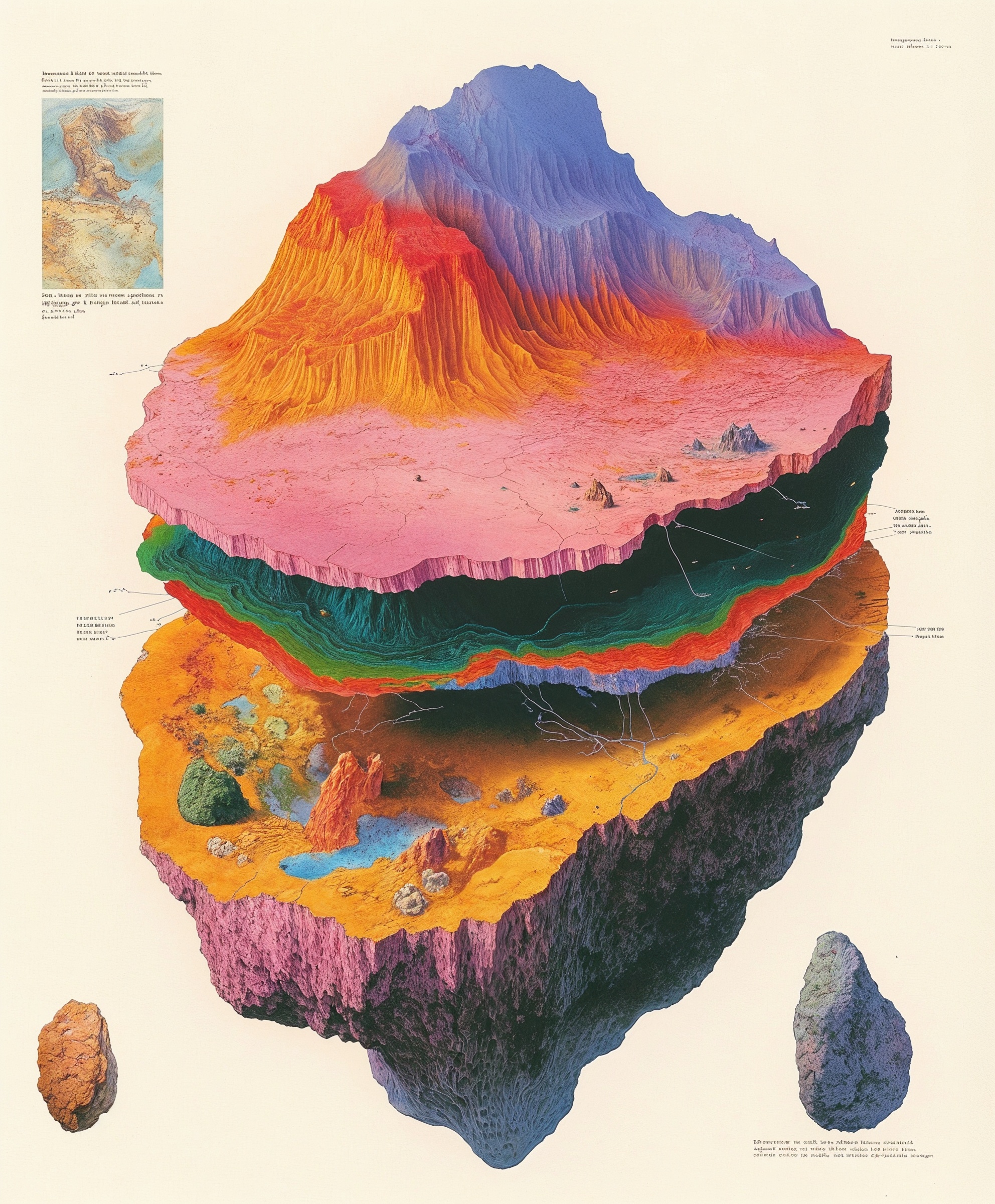
“Topographic beauties straight from old geography books”, @egeberkina.
⎈
We Did All This Discovery, Now How Do We Decide?
February 25, 2025 • #Ryan Singer on going from discovery to decision in product development.
✦
Materials and Mastery
February 17, 2025 • #How masters build expertise through deep understanding of their medium
✦
The Simplest Thing That Could Possibly Work
January 14, 2025 • #Start simple > get it working > iterate > advance
✦
Places to Intervene in Systems
November 22, 2024 • #Donella Meadows on places to intervene in systems.
✦
July 30, 2024 • #
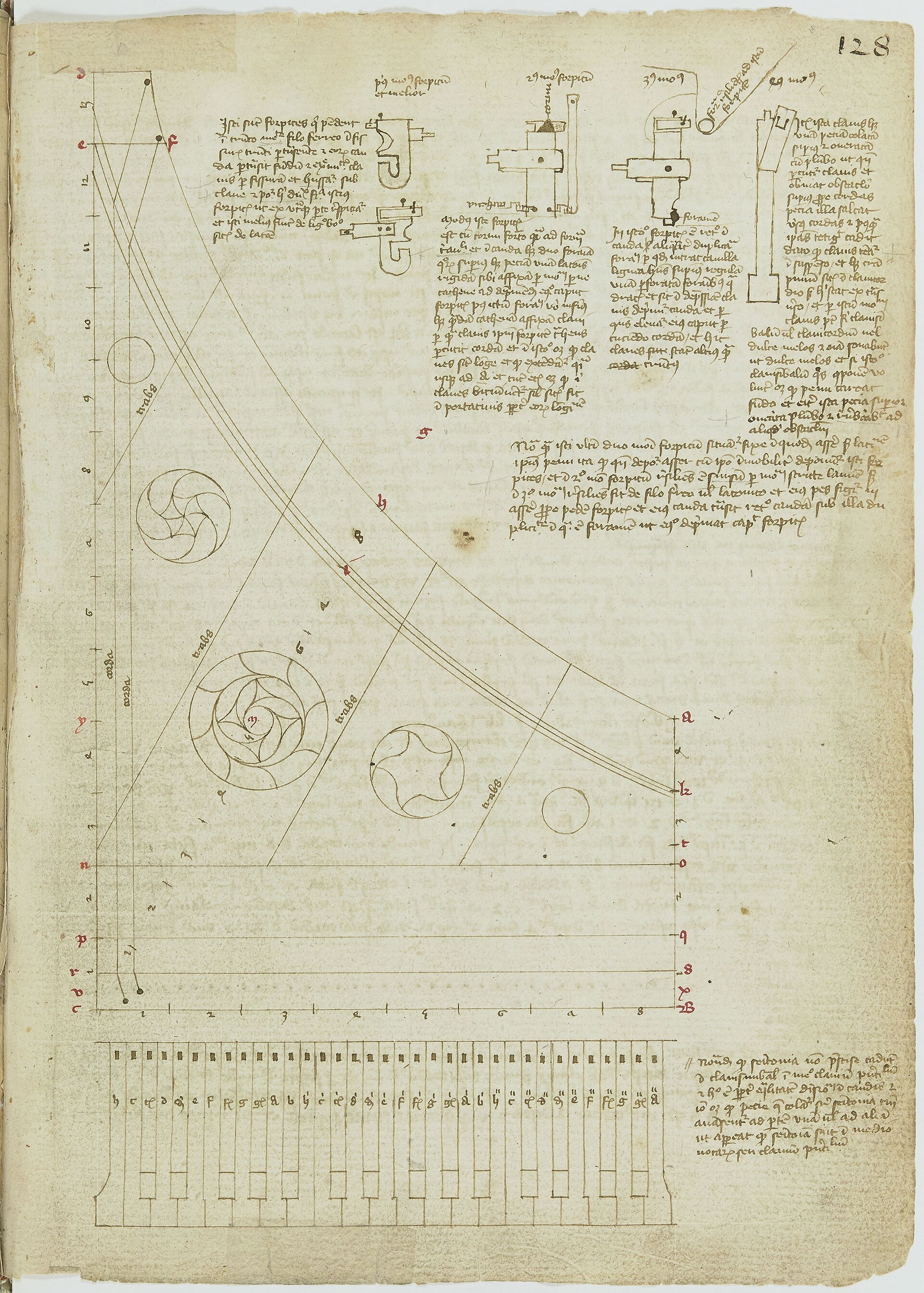
Diagram of a harpsichord. Arnault de Zwolle, c. 1430.
⎈
May 2, 2024 • #

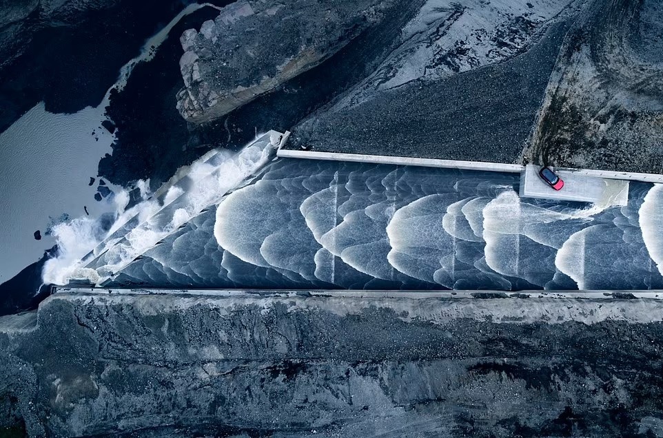
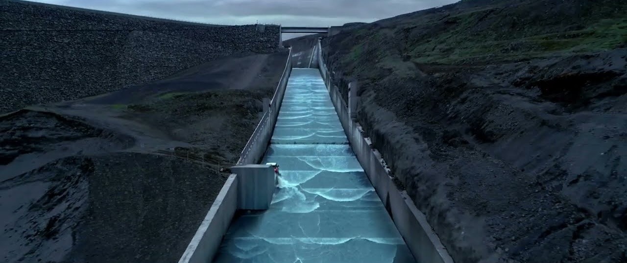
The amazing spillway at Kárahnjúkar Hydropower Plant , Iceland.
I can’t see brutalism without thinking of Dune. Upper image looks like Caladan.
⎈
March 27, 2024 • #
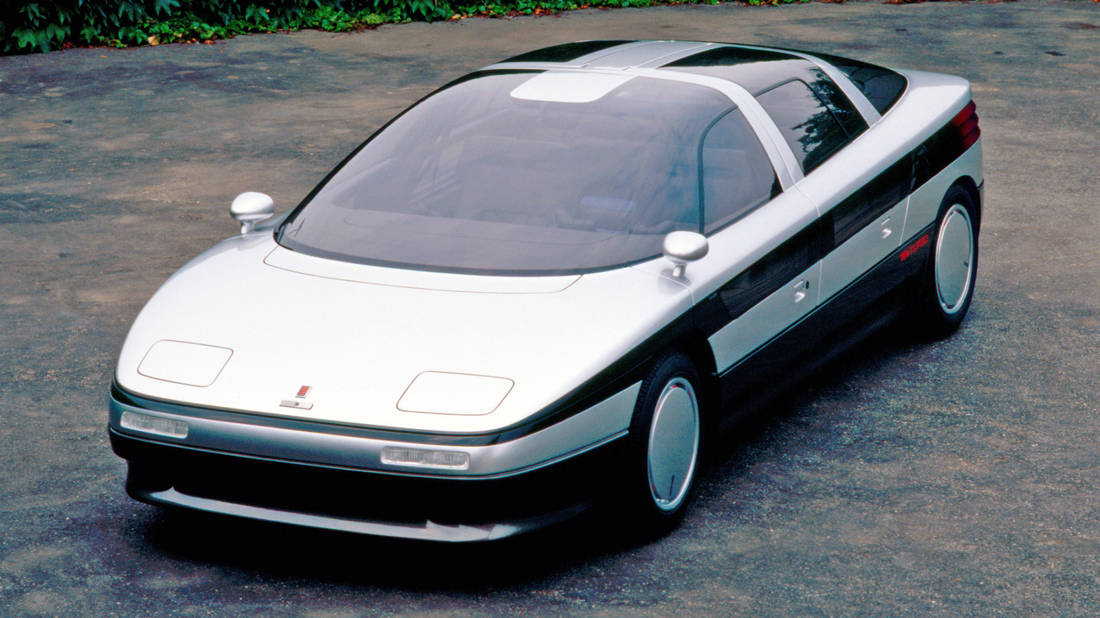
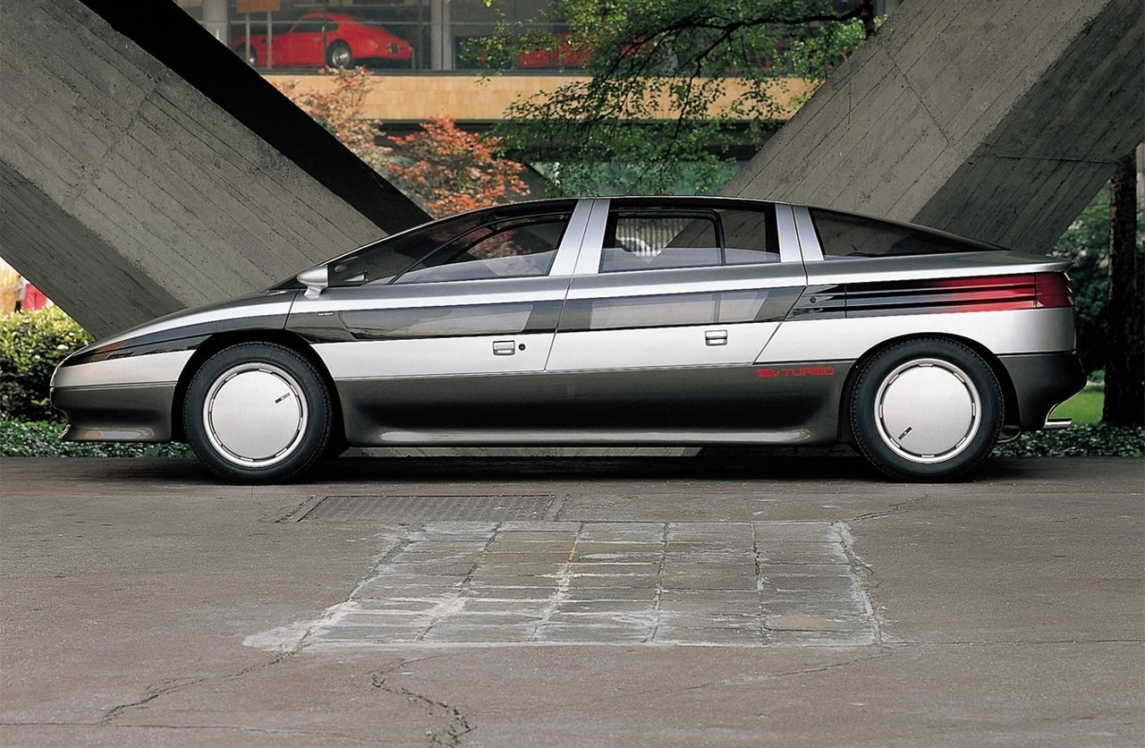
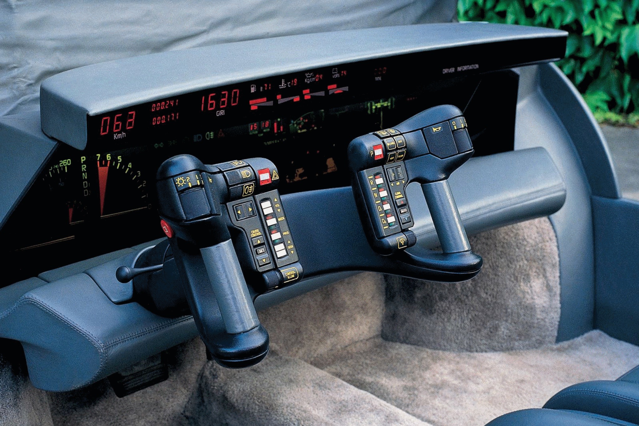

Oldsmobile Incas concept car, 1986.
Resurrect the 80s concept car design language.
This existed and they used a Ford Taurus in Robocop?
⎈
March 24, 2024 • #
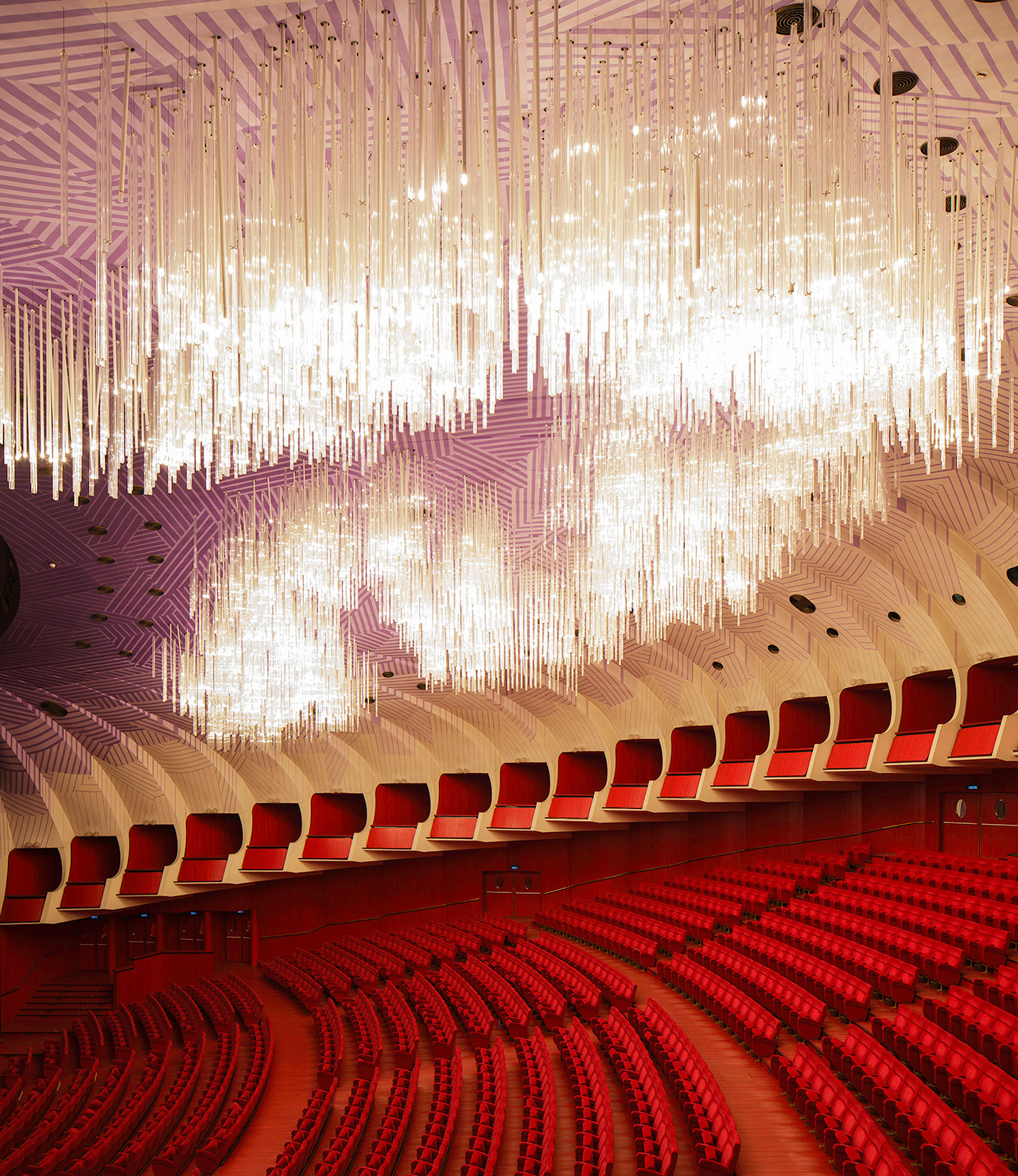
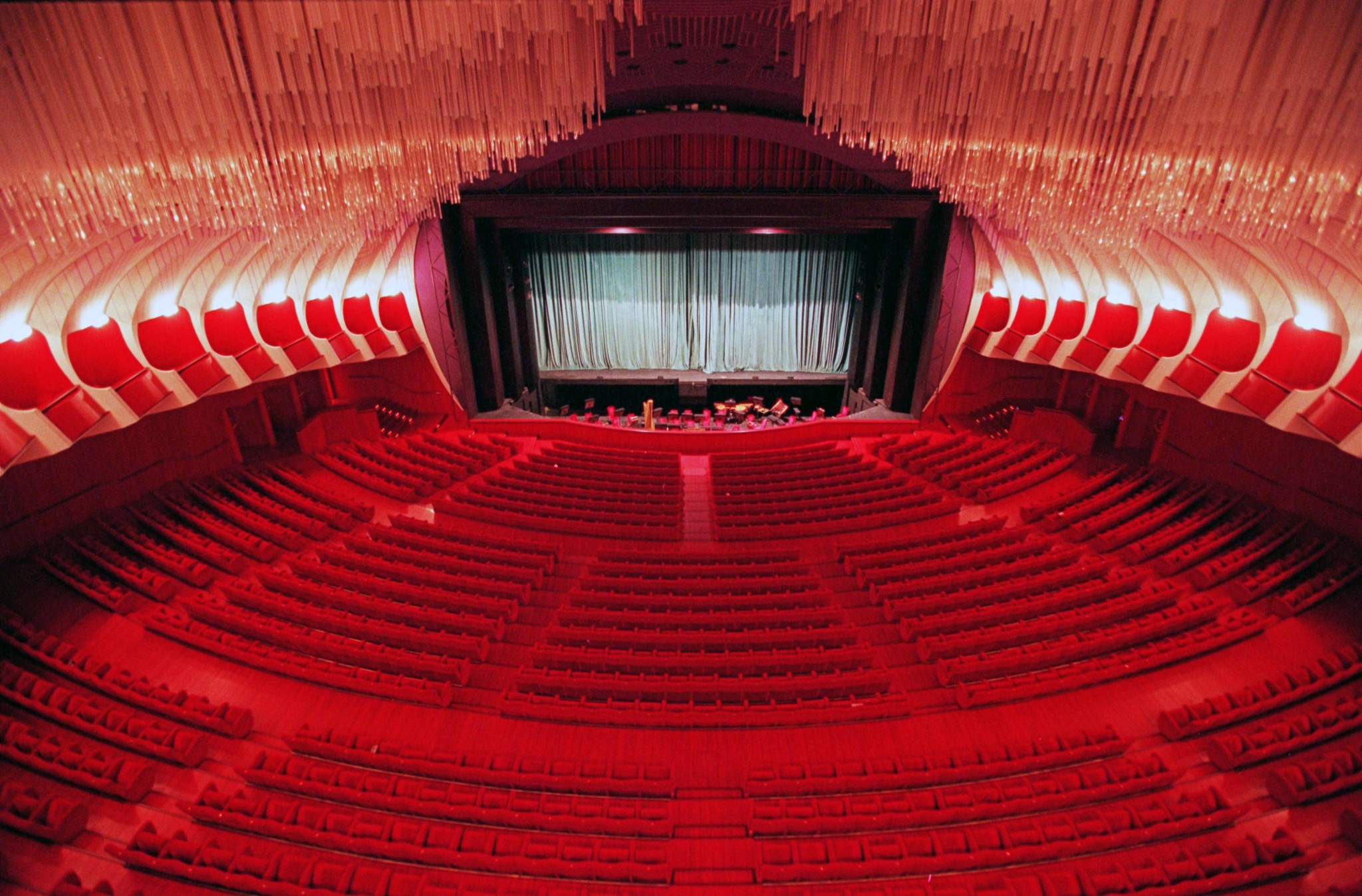
Teatro Regio. Turin, Italy.
That lighting.
⎈
March 8, 2024 • #
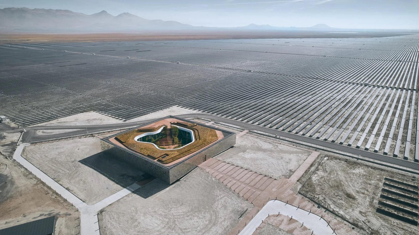
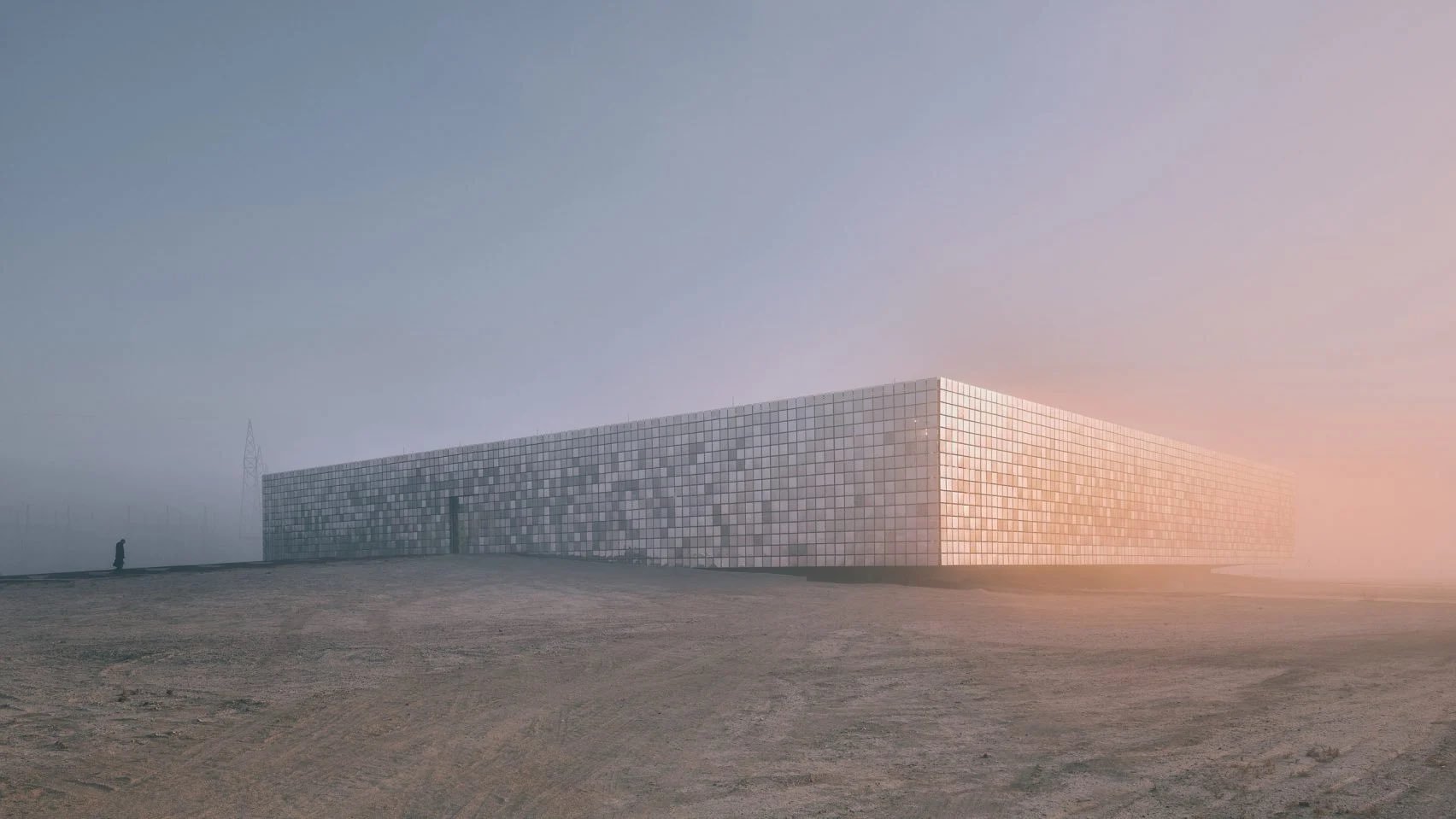
The central control building of a solar farm in Karapınar, Turkey.
Future site of an unnamed science fiction film location shoot.
⎈
March 6, 2024 • #
A collection of chart designs.
⎈
March 1, 2024 • #

Set the alarm.
⎈
February 26, 2024 • #
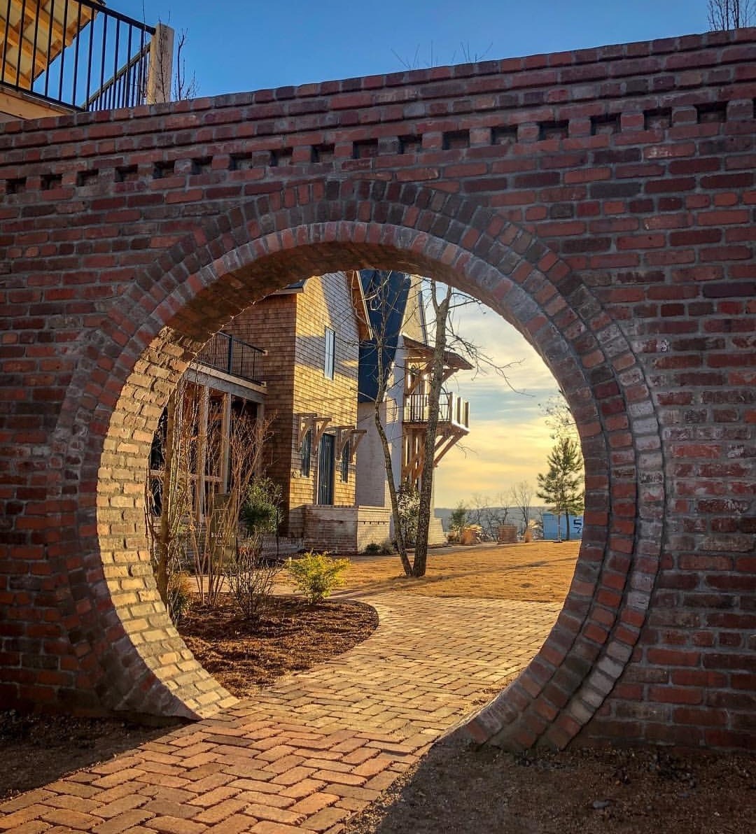
We should build more moongates in our gardens and backyards.
From Austin Tennell on X.
⎈
February 23, 2024 • #
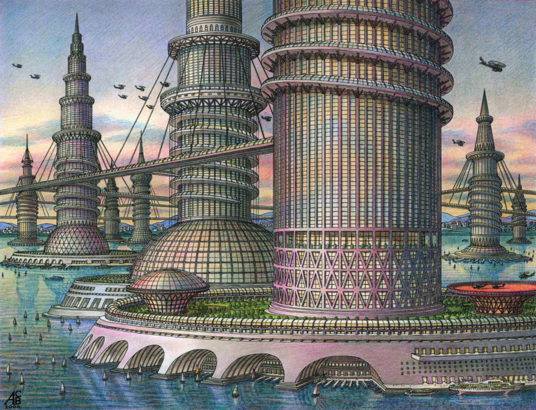
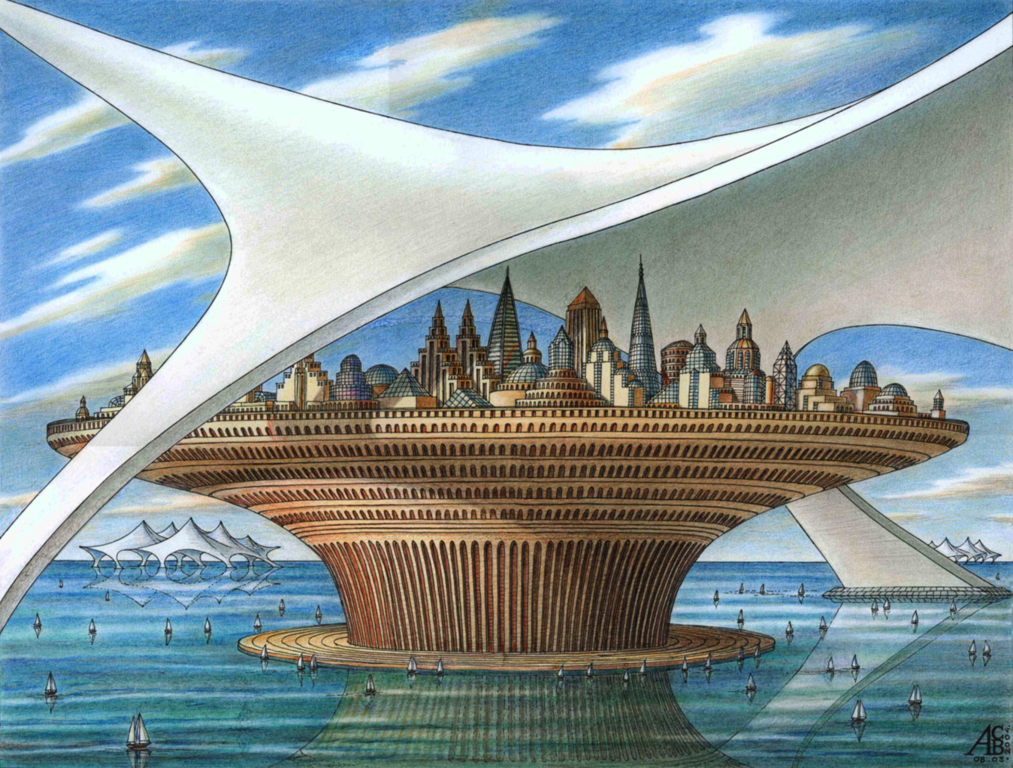
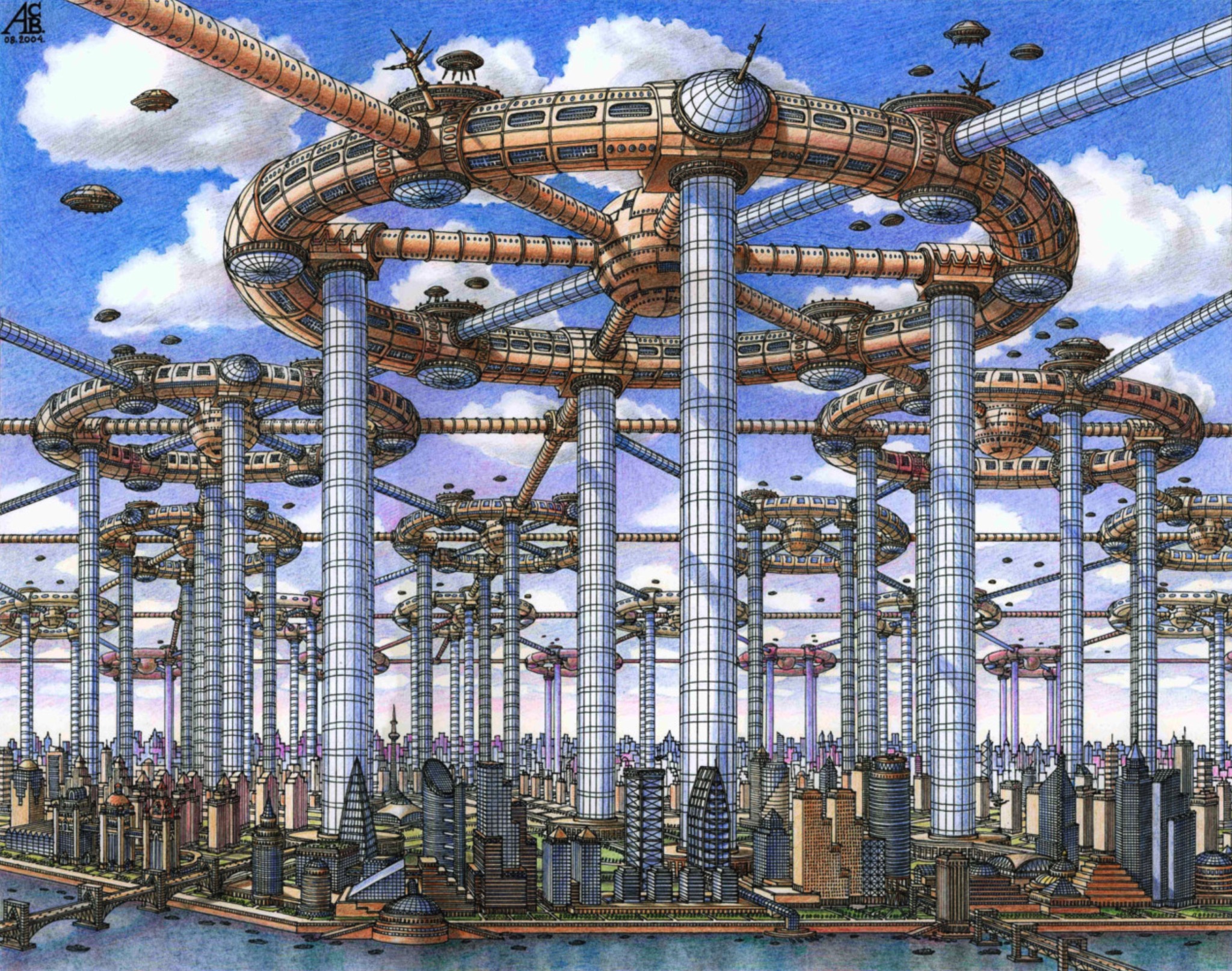
The Magic City , by Russian artist Artur Skizhali-Veis.
⎈
February 20, 2024 • #

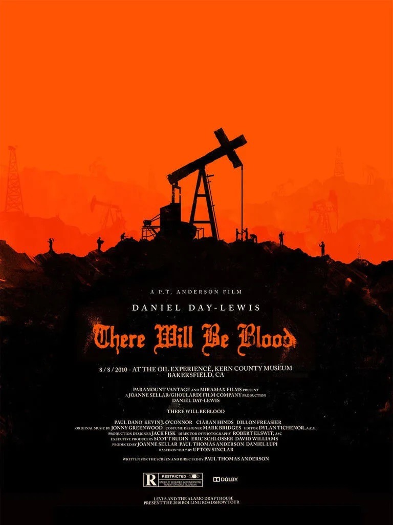

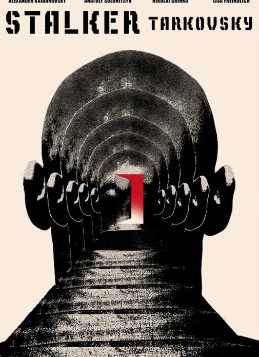
Every standard mass-market film poster design is subpar. We can do so much better.
⎈
February 19, 2024 • #
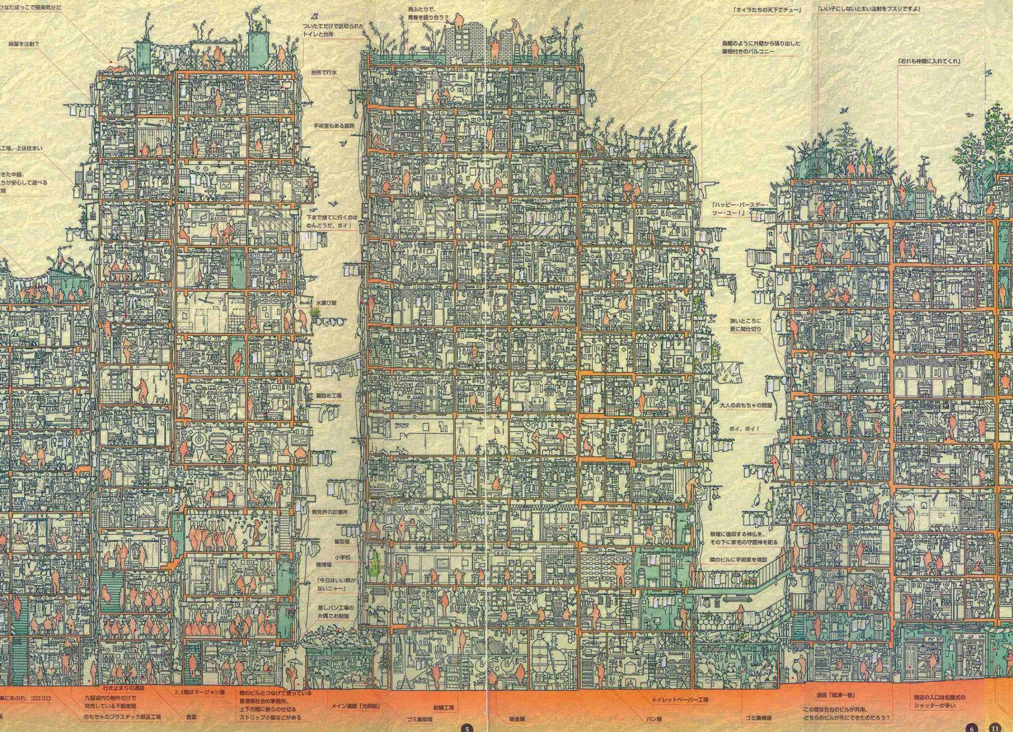
Cross-section of Hong Kong’s Kowloon Walled City.
⎈
February 18, 2024 • #
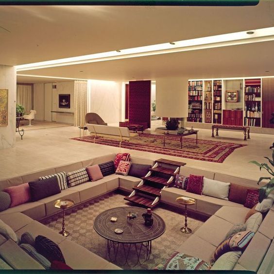
Let’s return to conversation pits.
⎈
February 10, 2024 • #
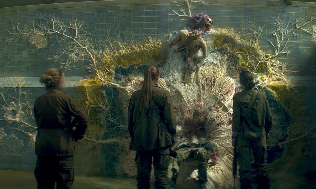
The film adaptation of Jeff VanderMeer’s Annihilation took some liberties in the narrative. But Alex Garland’s vision on the world, the twisted melange of organisms, the shroom-trip in the Southern Reach — all spot on.
⎈
February 10, 2024 • #
My latest post on Res Extensa:
⎈
February 4, 2024 • #
Jason Fried:
A better path is to reflect forward, not backwards. Develop a loose theory while working on what’s next. Appreciate there’s no certainty to be found, and put all your energy into doing better on an upcoming project. But how will you do better next time if you don’t know what went wrong last time? Nothing is guaranteed other than experience. You’ll simply have more time under the curve, and more moments under tension, to perform better moving forward. Internalize as you go, not as you went.
⎈
January 31, 2024 • #
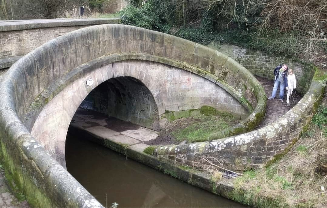
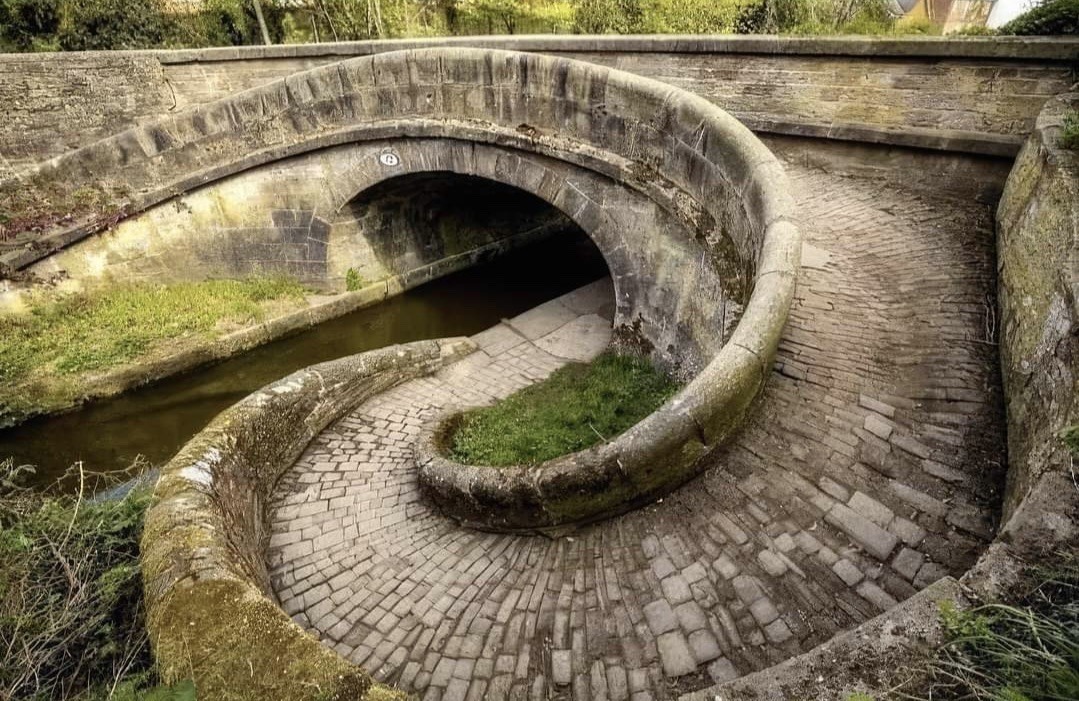
Snake Bridge on Macclesfield Canal. Astbury Congleton, England.
Bring back artisanal masonry.
⎈
January 24, 2024 • #
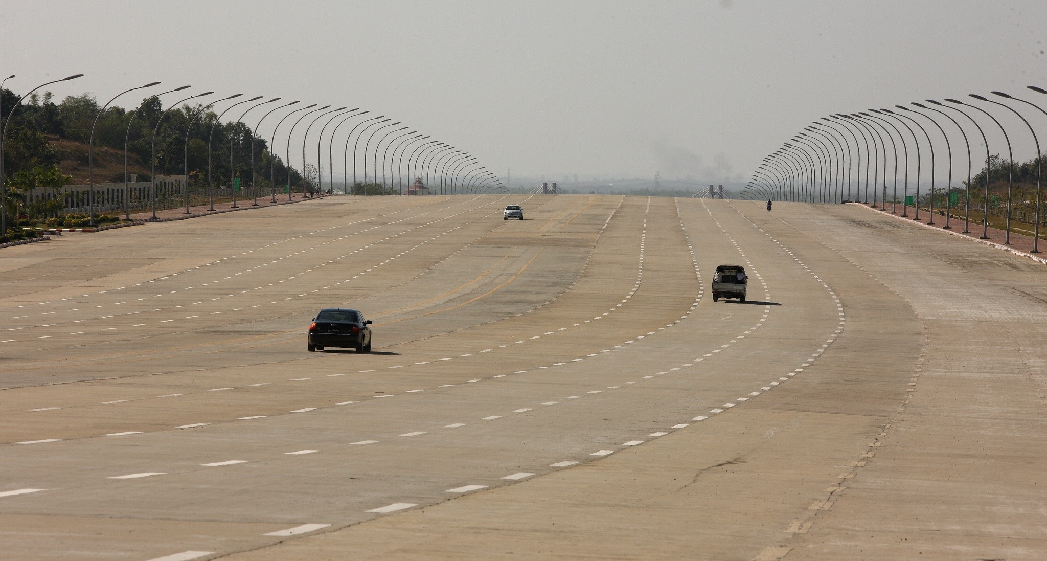
The barren highways of Naypyidaw.
Don’t listen to the high modernists. You can’t will cities into existence.
⎈
Arcology
October 20, 2023 • #Paolo Soleri's 'Arcology'.
✦
Quality Without a Name
October 18, 2023 • #Quality is often tangible, but hard to articulate.
✦
Monthly Reading, August 2023
August 29, 2023 • #The 'improving mentality', how learning works, making decisions, the virtue of speed, and pattern languages
✦
Noise Factors vs. Control Factors
May 9, 2023 • #Differentiating between factors you can't control and those you can't≥
✦
37signals Live Design Review
March 22, 2023 • #Behind the scenes of a design review process.
✦
Cuttle.xyz
January 6, 2023 • #A design tool for cutting machines.
✦
When to Design for Emergence
October 14, 2022 • #The long-tail of user problems means we need tools that adapt and extend to their unpredicted needs we can't design explicitly for.
✦
Miter Spline Jig Design
October 7, 2022 • #Designing a jig for repeatable miter splines.
✦
Architecture from Every Country
September 12, 2022 • #The Cultural Tutor's architecture examples from every country.
✦
Notes on the Design of Everyday Things
August 25, 2022 • #Notes on Don Norman's Design of Everyday Things.
✦
Scenes, Pattern Languages,and Nested Systems
August 22, 2022 • #Similarities between systems for writing, pattern languages, design tools, and other networked
✦
Hard Edges, Soft Middle
January 2, 2022 • #Defining hard objectives with permissive experimentation is the best way to build products.
✦
Small Tools for Shaping
July 29, 2021 • #Ryan Singer walks through a recent shaping process.
✦
Roam CSS System
June 24, 2021 • #Alexander Rink's Roam CSS system.
✦
11:59 September 10
September 11, 2020 • #A tribute to a tradition at Spatial Networks.
✦
Weekend Reading: A New Web, Future of Higher Ed, and a Ford Concept Car
August 22, 2020 • #A clean start for the web, unbundling education, and a retro-future concept car.
✦
RoamThemes
August 9, 2020 • #A quick access Chrome extension for managing Roam themes.
✦
Synthetic A Priori
July 9, 2020 • #A new podcast on design and systems thinking from Ryan Singer.
✦
A Nomenclature for Low-Code Users
July 7, 2020 • #Developing a nomenclature for users of low-code software.
✦
Why Figma Wins
June 18, 2020 • #An analysis of Figma's business dynamics from Kevin Kwok.
✦
Weekend Reading: American Production, On Bikeshedding, and Glyphfinder
May 9, 2020 • #American industrial production, why we bikeshed, and an app for glyphs.
✦
Spatial Software for Enhancing Interactions
April 12, 2020 • #Spatial dimensions and how they can improve software interaction.
✦
Practical Typography
April 5, 2020 • #Butterick's Practical Typography.
✦
Weekend Reading: Readwise with Roam, WWI Naval Intelligence, and Interaction Density
April 4, 2020 • #Sync Readwise to Roam, naval intel in World War I, and interaction density between desktop and mobile.
✦
Weekend Reading: Figma's Typography, Xerox Alto, and a Timeline of CoVID
February 29, 2020 • #Figma's attention to typographic detail, restoring a Xerox Alto, and mapping the spread of CoVID-19.
✦
Alfred Emoji Pack
November 29, 2019 • #A powerpack extension for Alfred to make emojis easier.
✦
Weekend Reading: Figma Multiplayer, Rice vs. Wheat, and Tuft Cells
November 23, 2019 • #How Figma built their multiplayer tech, rice vs. wheat and influence on culture, and how tuft cells communicate threats to the immune system.
✦
The Efficiency-Destroying Magic of Tidying Up
November 19, 2019 • #Florent Crivello on the differences between orderliness and efficiency.
✦
Balancing Power and Usability
November 18, 2019 • #An essay from the past on the tensions between usability and complexity for power users.
✦
How Google Designed the Stadia Controller
October 15, 2019 • #✦
Weekend Reading: Signaling, Busyness, and Magic Ink
September 28, 2019 • #Virtue signaling, busyness as a proxy for productivity, and Bret Victor's analysis of information design.
✦
Weekend Reading: Ted Chiang, Renewable Energy, and ColorBox
September 21, 2019 • #An interview with Ted Chiang, renewables outlook around the world, and a tool for color generation.
✦
Weekend Reading: tracejson, Euclid, and Designing at Scale
August 24, 2019 • #tracejson for GPS data, reimagining Euclid, and how Dropbox designs at scale.
✦
Weekend Reading: Terrain Mesh, Designing on a Deadline, and Bookshelves
August 17, 2019 • #Real-time terrain mesh with MARTINI, designing Notion using Figma, and @patrickc's bookshelf.
✦
Weekend Reading: Tissot's Indicatrix, National Park Fonts, and Starlink
June 8, 2019 • #Visualizing map projection distortion interactively, a National Park Service typeface, and SpaceX's move for space-based connectivity.
✦
The Spatial Networks Shop
May 21, 2019 • #We just launched a merch store for company gear.
✦
Wireframing with Moqups
May 16, 2019 • #Using Moqups to do wireframes.
✦
Fulcrum's New Look
March 29, 2019 • #Relaunching the Fulcrum website with an updated brand and logo.
✦
Designing with Figma
February 19, 2019 • #Caleb from our design team on rapid, interactive prototyping with Figma.
✦
A Live Experiment in Disassembling a Map
February 7, 2019 • #Cartographer Daniel Huffman breaks down how he builds his map designs.
✦
The Incredible Inventions of Intuitive AI
January 2, 2019 • #TED talk on deep learning and generative AI.
✦
Weekend Reading: Railway Logos, Meditation, and the Next Feature Fallacy
December 8, 2018 • #Andrew Chen on the 'Next Feature Fallacy', Bill Gates on meditation, and some cool railway logo redesigns.
✦
A Never-Ending Train
April 25, 2010 • #An amazing train station design — the trains don't have to stop.
✦