April 10, 2024 • #
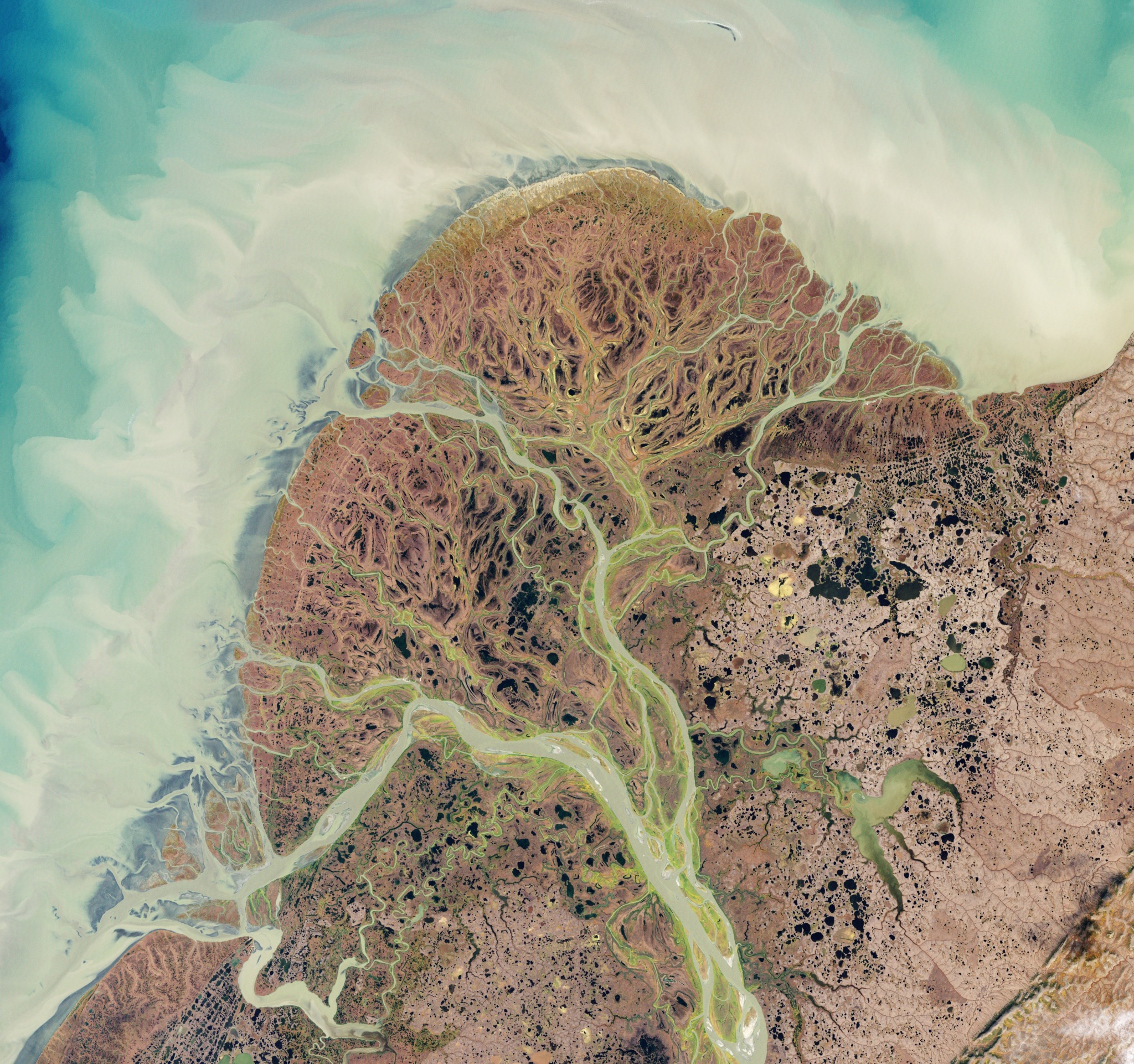
The Yukon River delta , Alaska.
The Yukon River delta , Alaska.
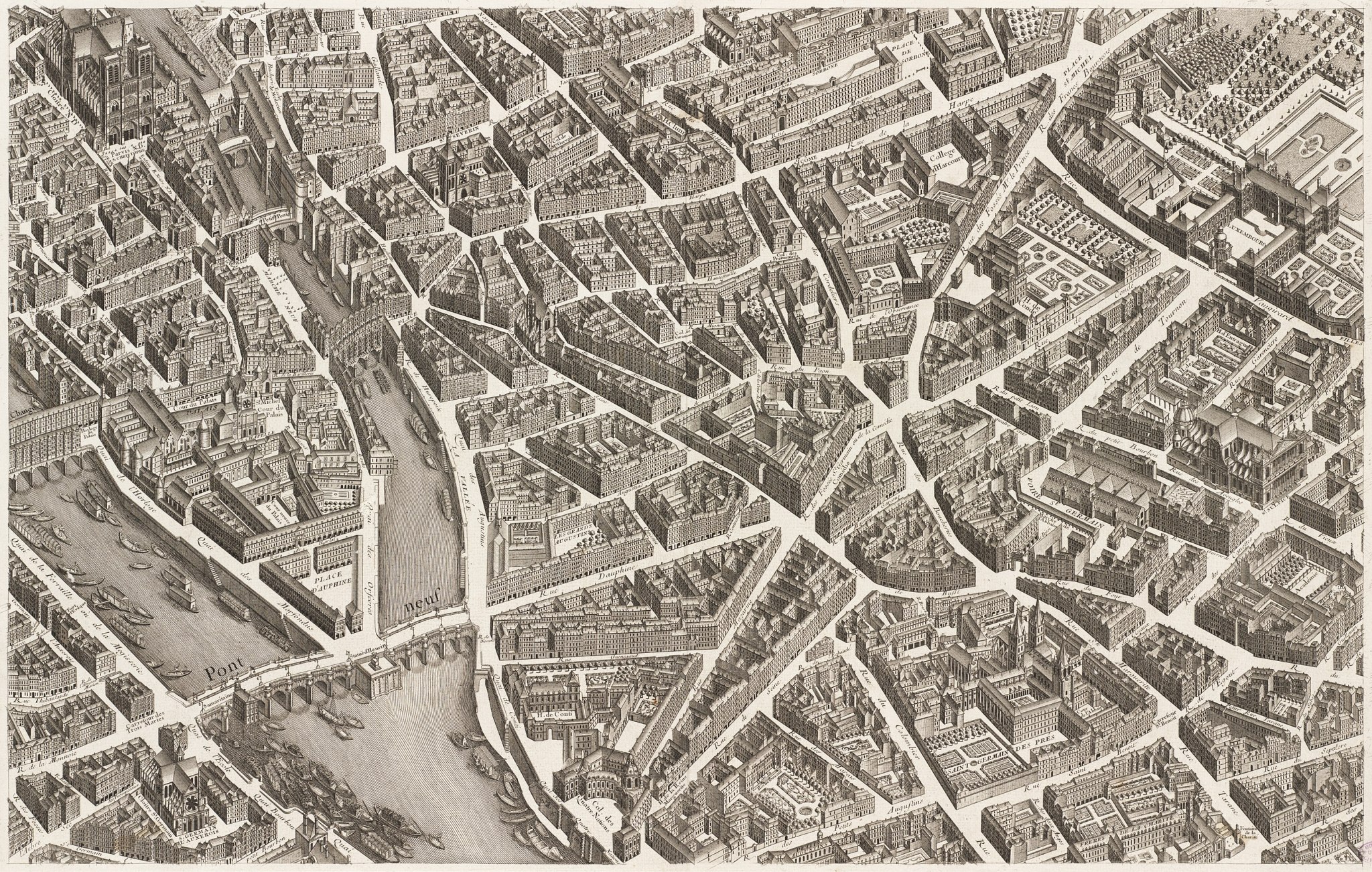
Map of Paris by Michel-Étienne Turgot. 1739.
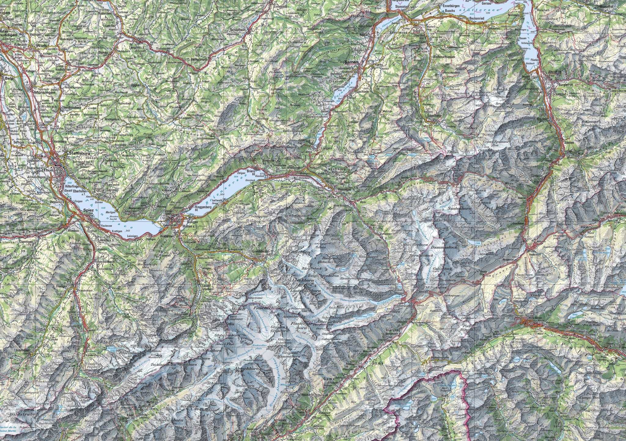
The beautifully rendered topography of Switzerland.
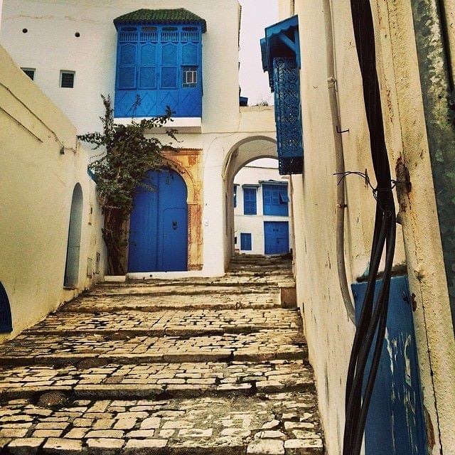
The blue and white architecture of Sidi Bou Said. Tunis, Tunisia.
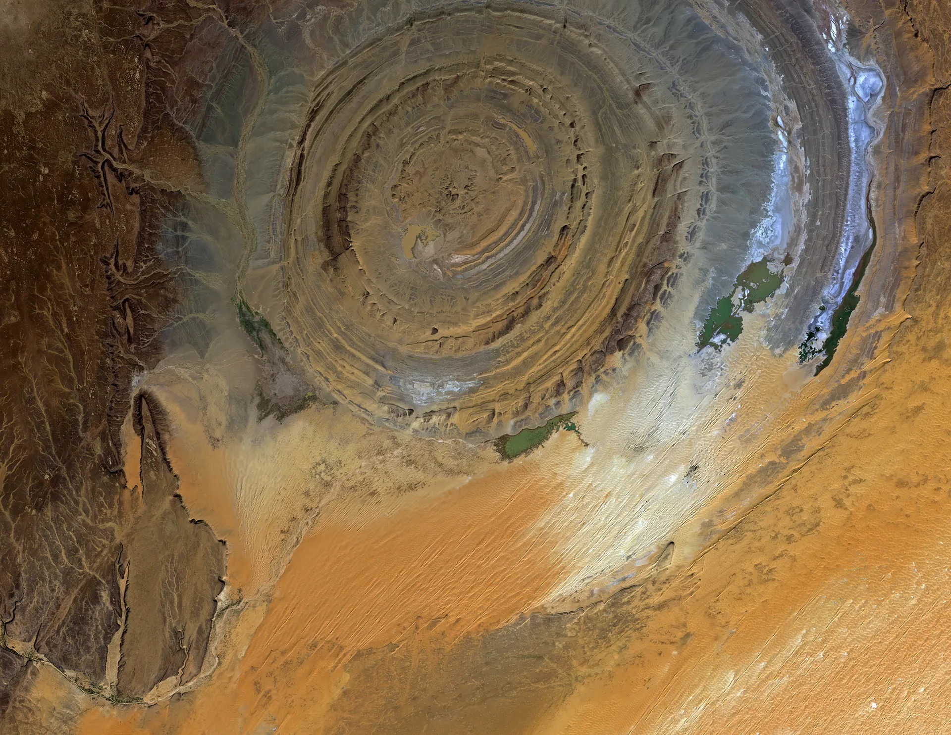
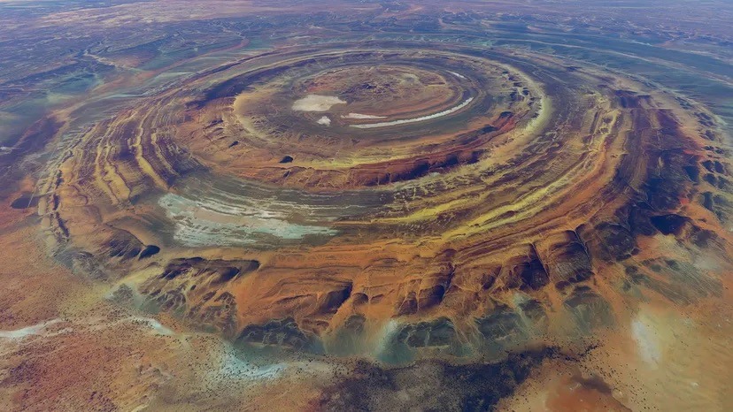
The Richat Structure in the Saharan Desert of Mauritania.
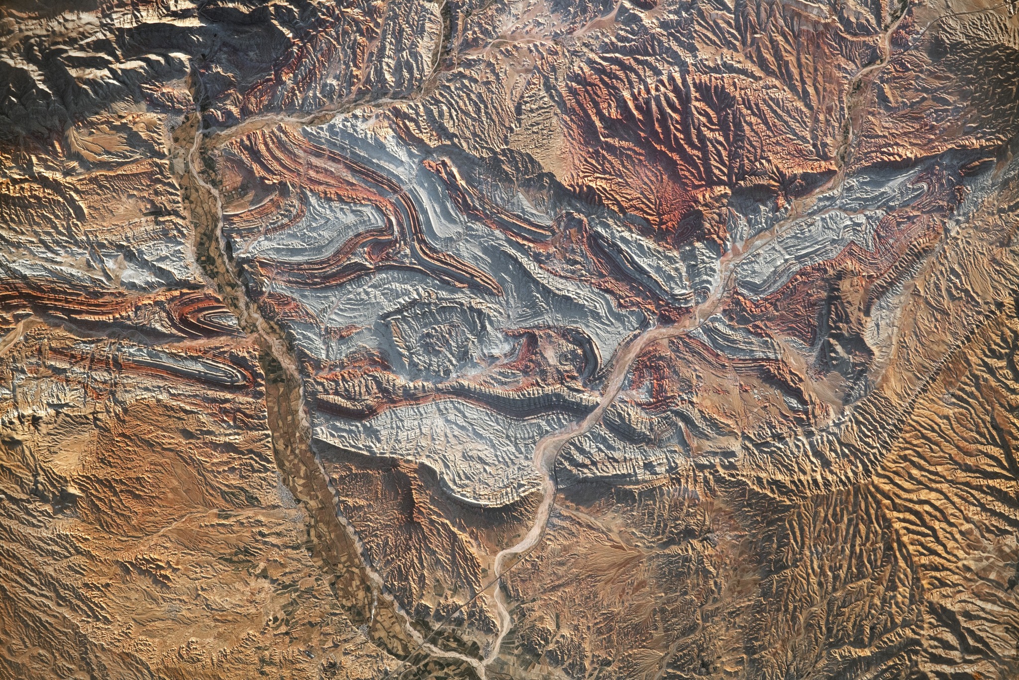
An eroded geologic dome.
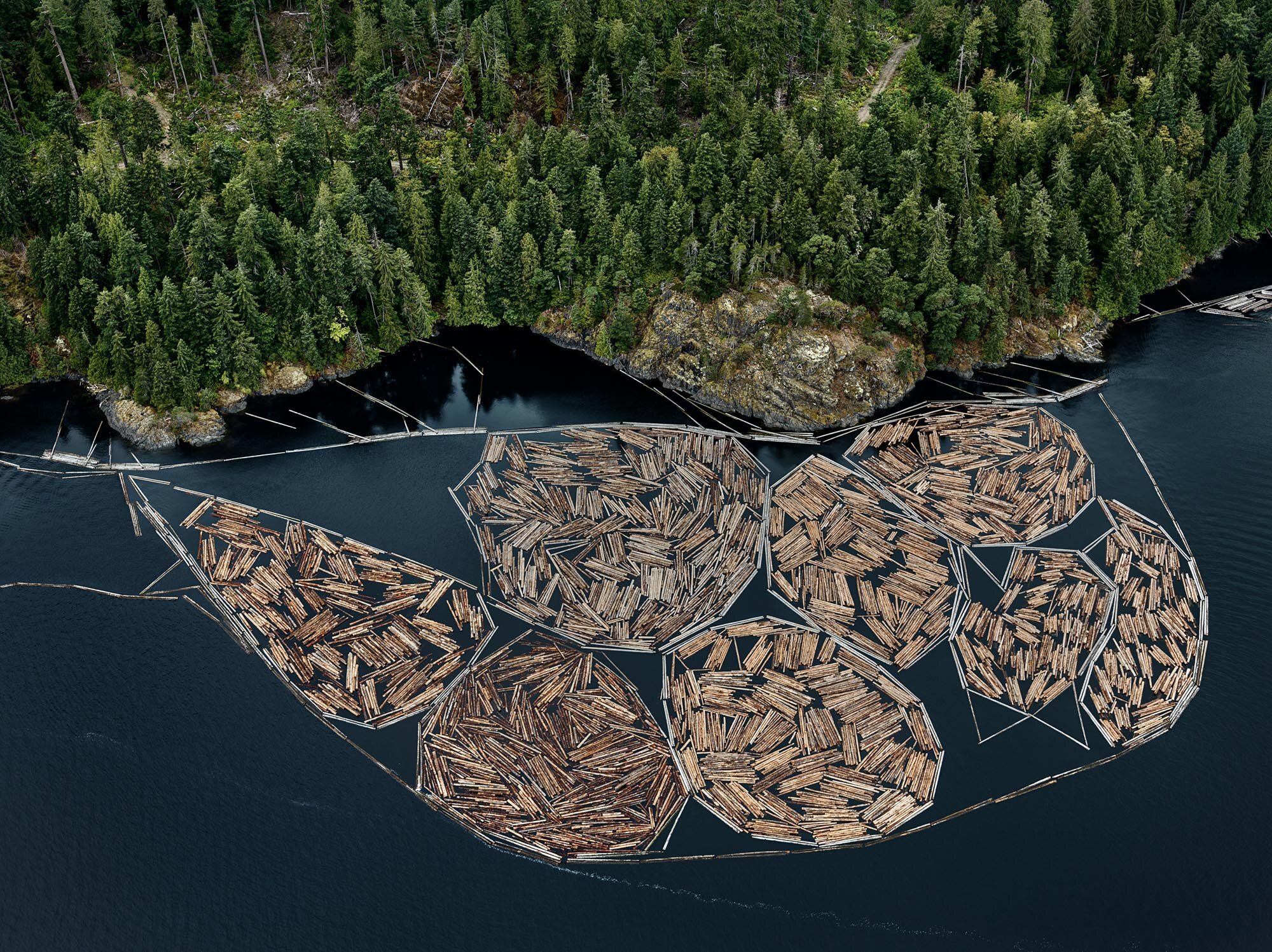
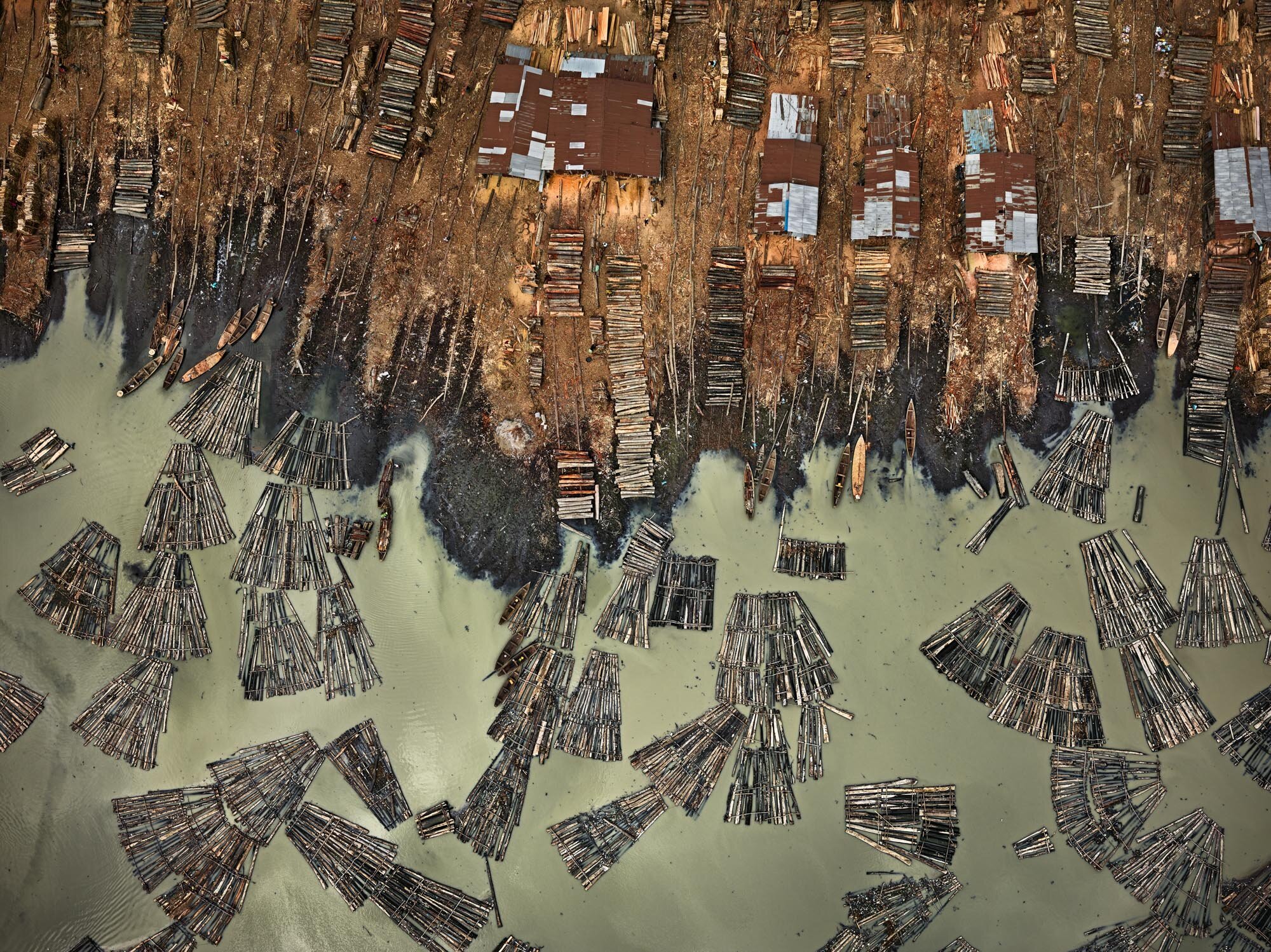
Log booms and sawmills. From Edward Burtynsky’s Anthropocene project.
Vancouver Island above, Lagos below.
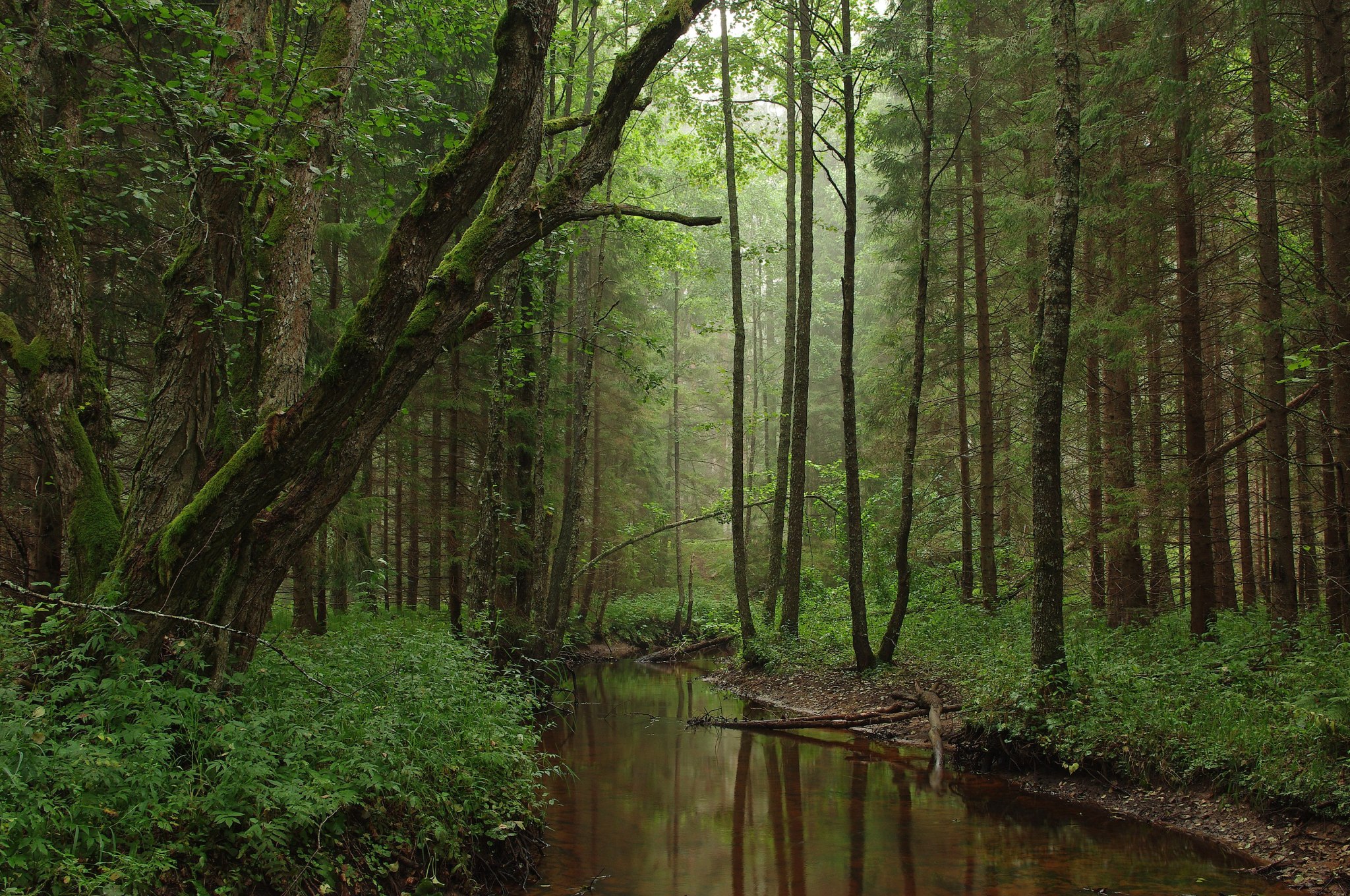
Põhja-Kõrvemaa Nature Reserve , Estonia..
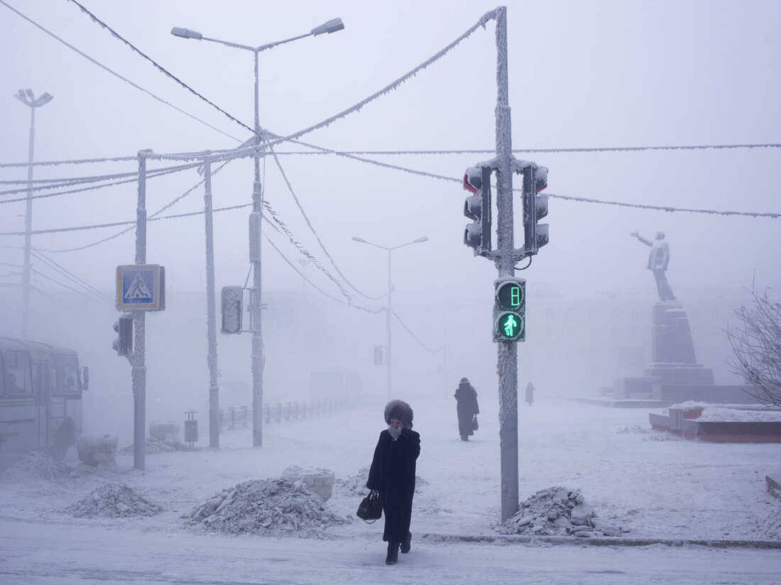
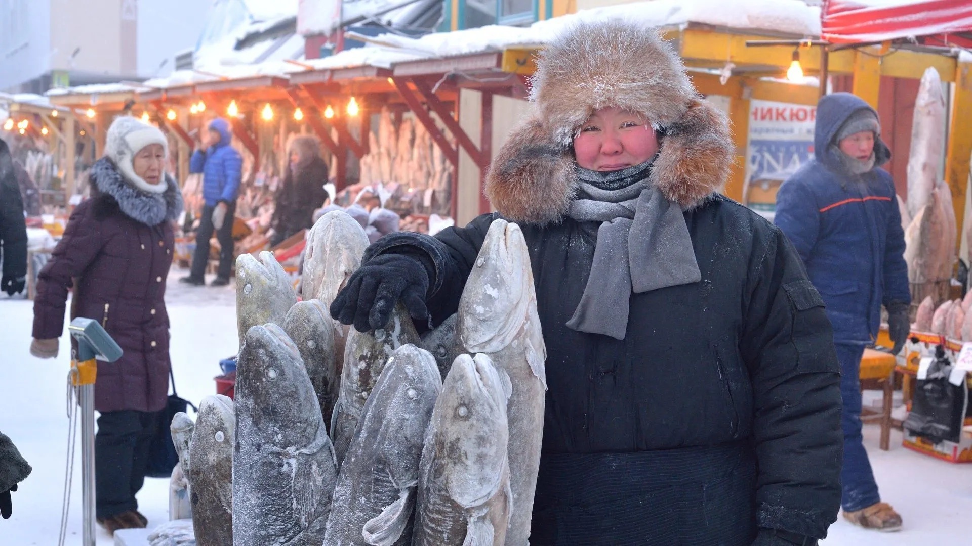
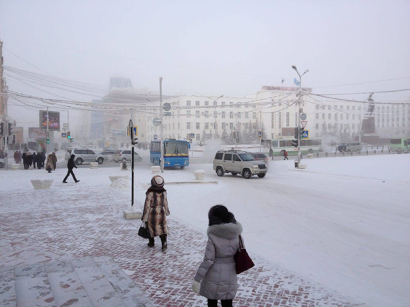
The Siberian city ofYakutsk, in the Russian Far East, is unfathomably cold, yet home to over a quarter million people:
Yakutsk has an average annual temperature of 17.6 °F winter high temperatures consistently well below −4 °F, and a record low of −−83.9 °F. As a result, Yakutsk is the coldest major city in the world
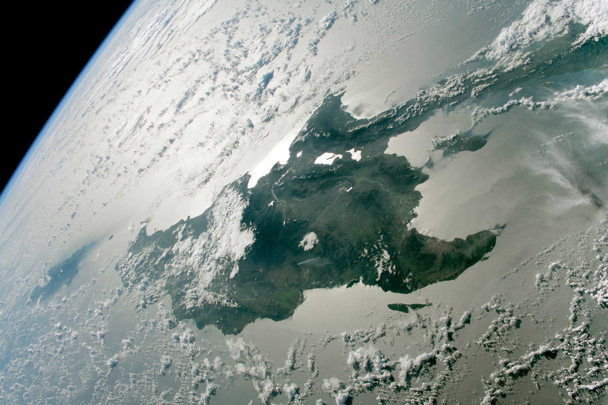
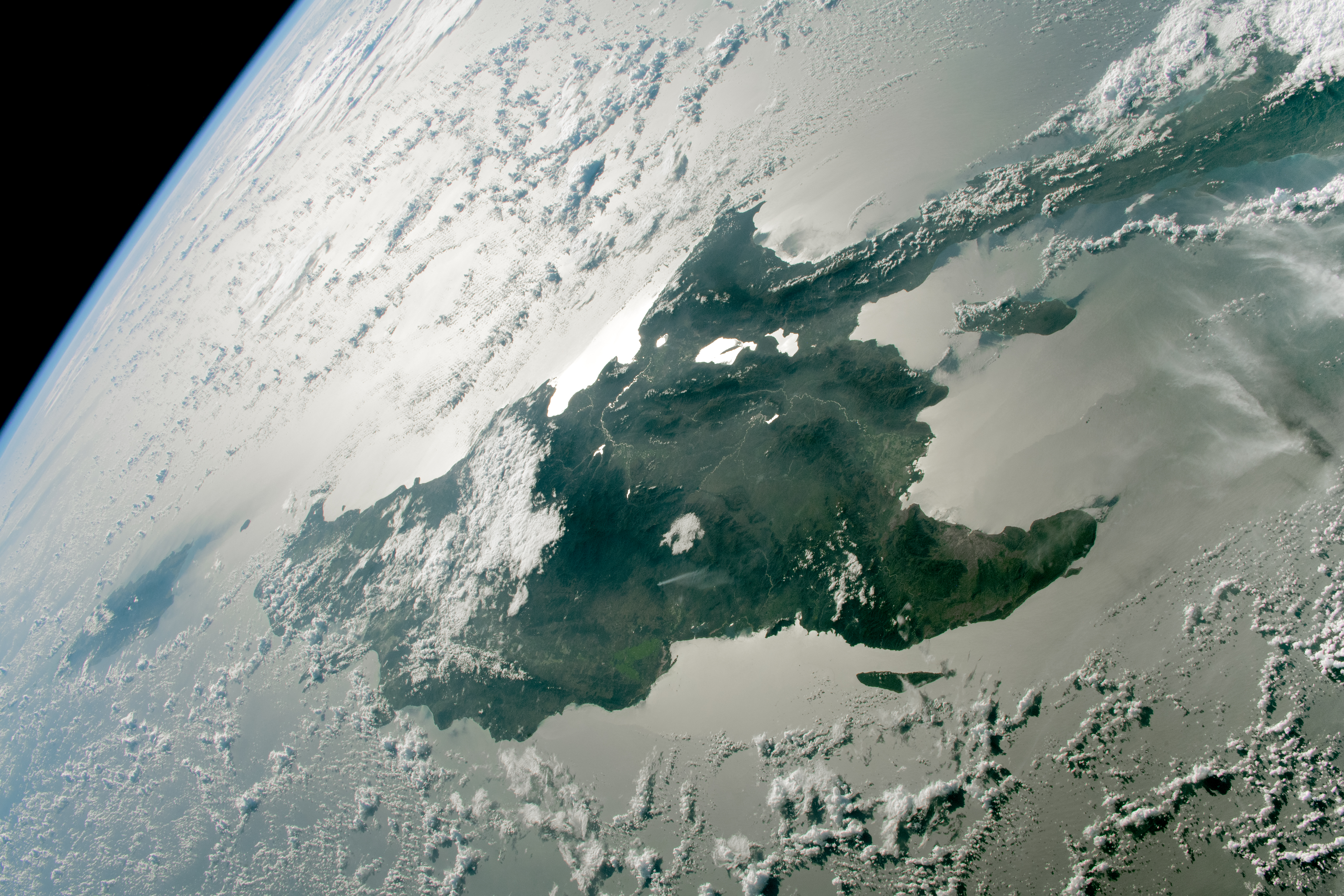
The island of Hispaniola , from the ISS.
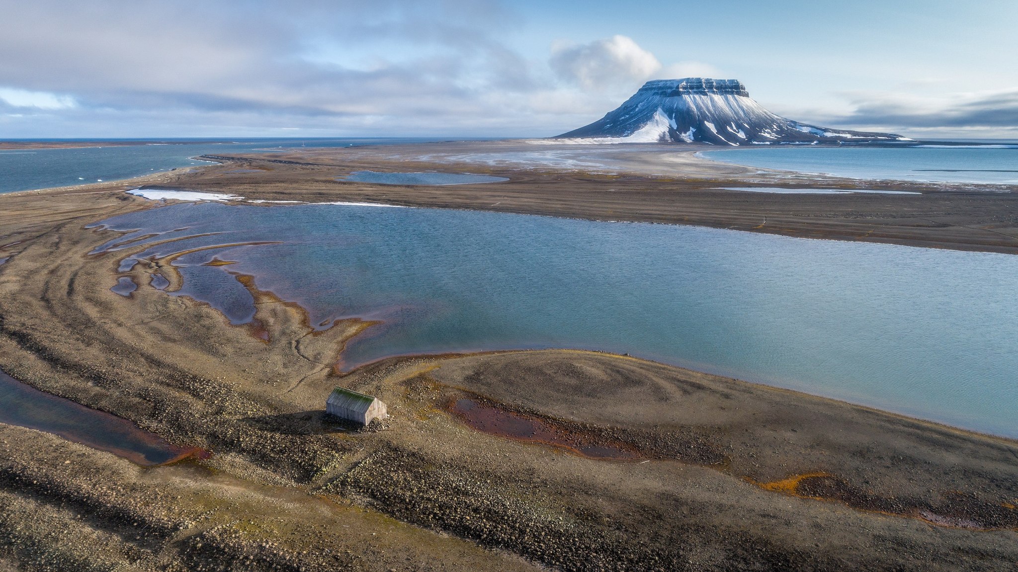
**Bell Island, **part of the Franz Josef Land archipelago in Russia.
I couldn’t believe this:
The island was the first among the Franz Josef archipelago to be visited by Benjamin Leigh Smith in his 1880 expedition. In his second expedition to the islands in 1881, Smith built a wooden lodge on the north side of the island which he used to winter. The lodge stands to this day.
A small wooden shack, built on an island in the Arctic Ocean, stands for 150 years. Will think about that next time I’m building something.
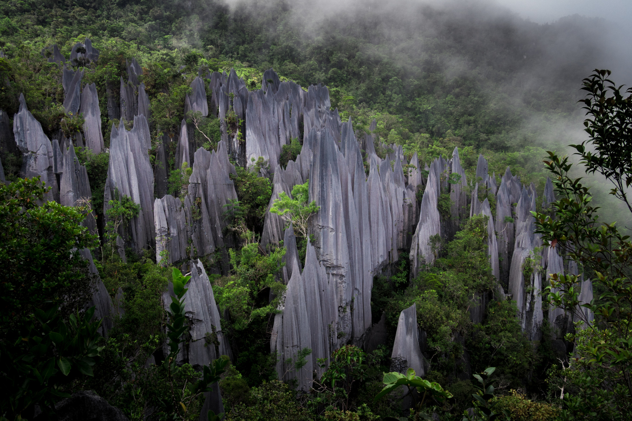
The karsting limestone of Mount Api , Malaysia.
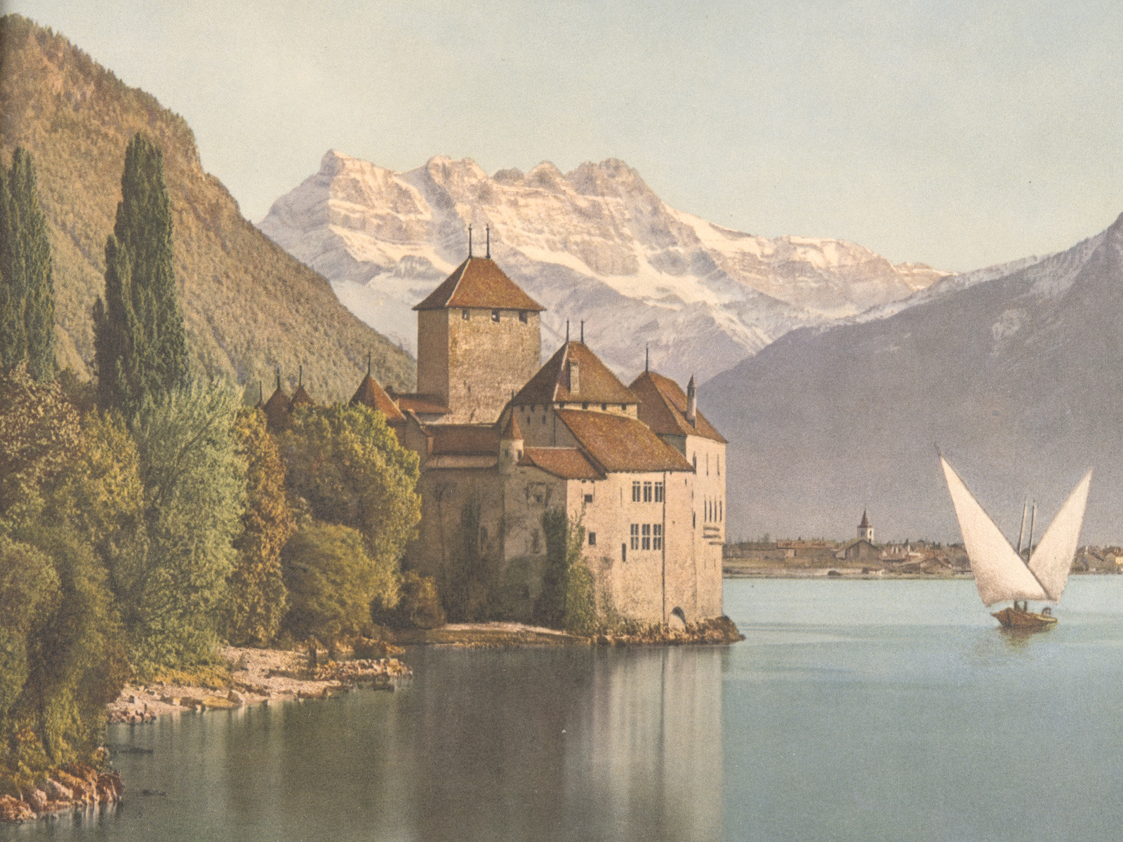
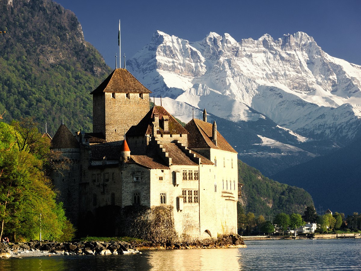
Chillon Castle , island fortress on Lake Geneva, Switzerland.
The building originally dates to the 11th century, but there’s evidence the Romans had forts on the small island a millennium earlier.
It’s functioned as fort, prison, and summer home to counts and dukes. Added to my one-day-Swiss-vacation list.
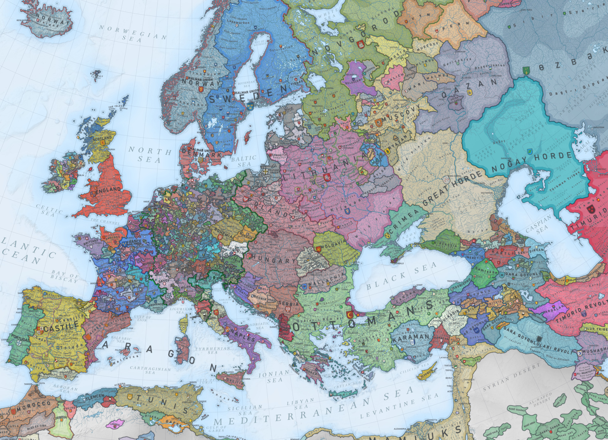
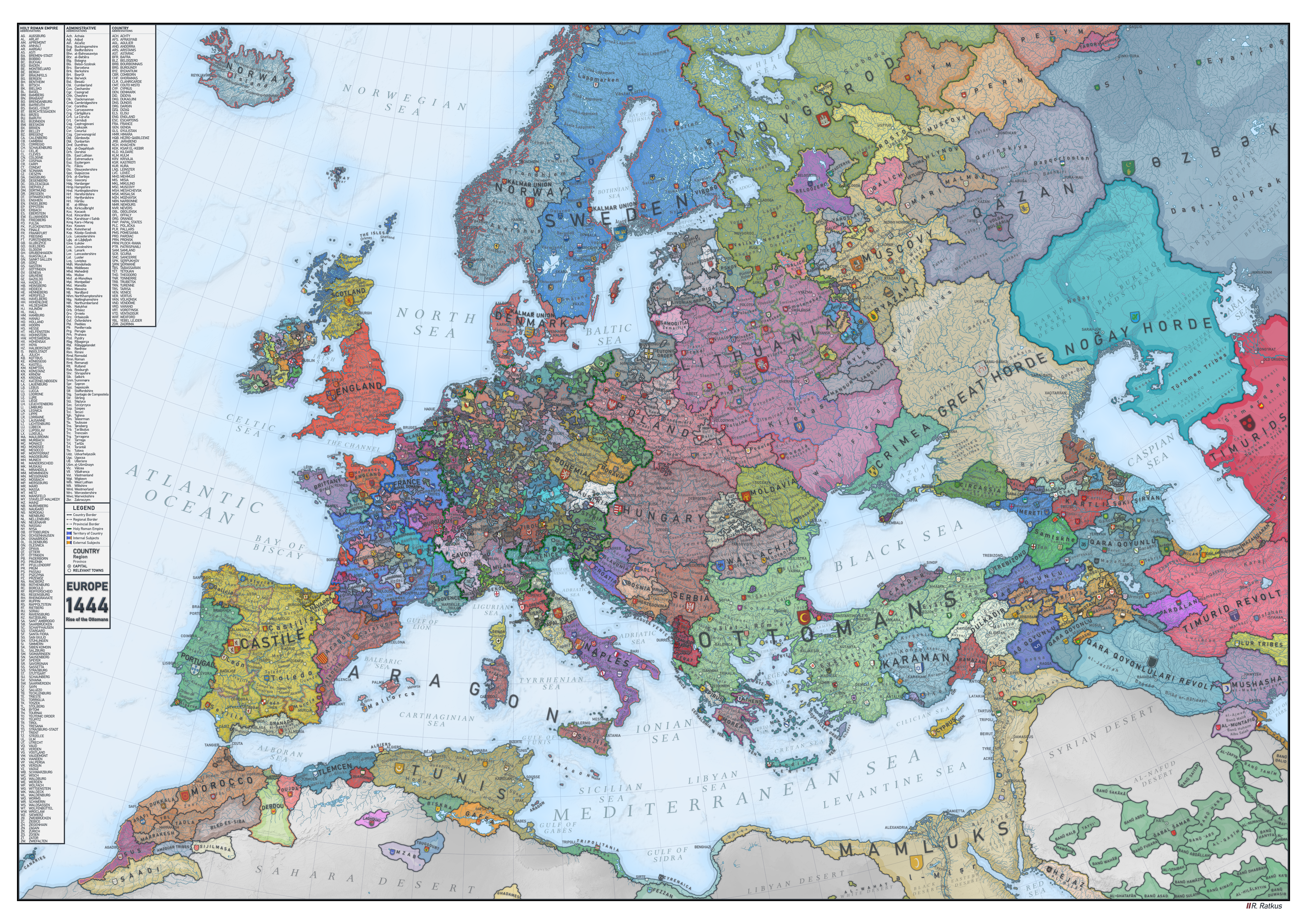
Europe and its fragmented city-state landscape of 1444.
See the full, zoomable hi-res version.
The Aladaghlar Mountains of northwest Iran.
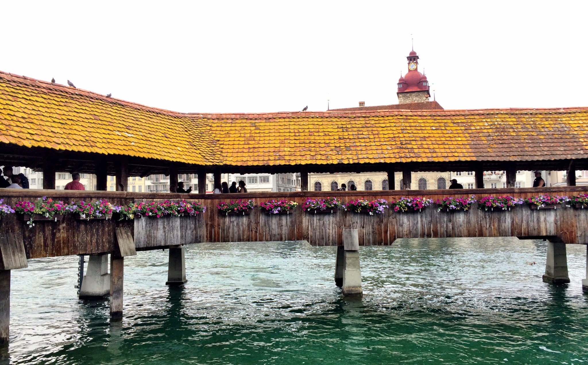
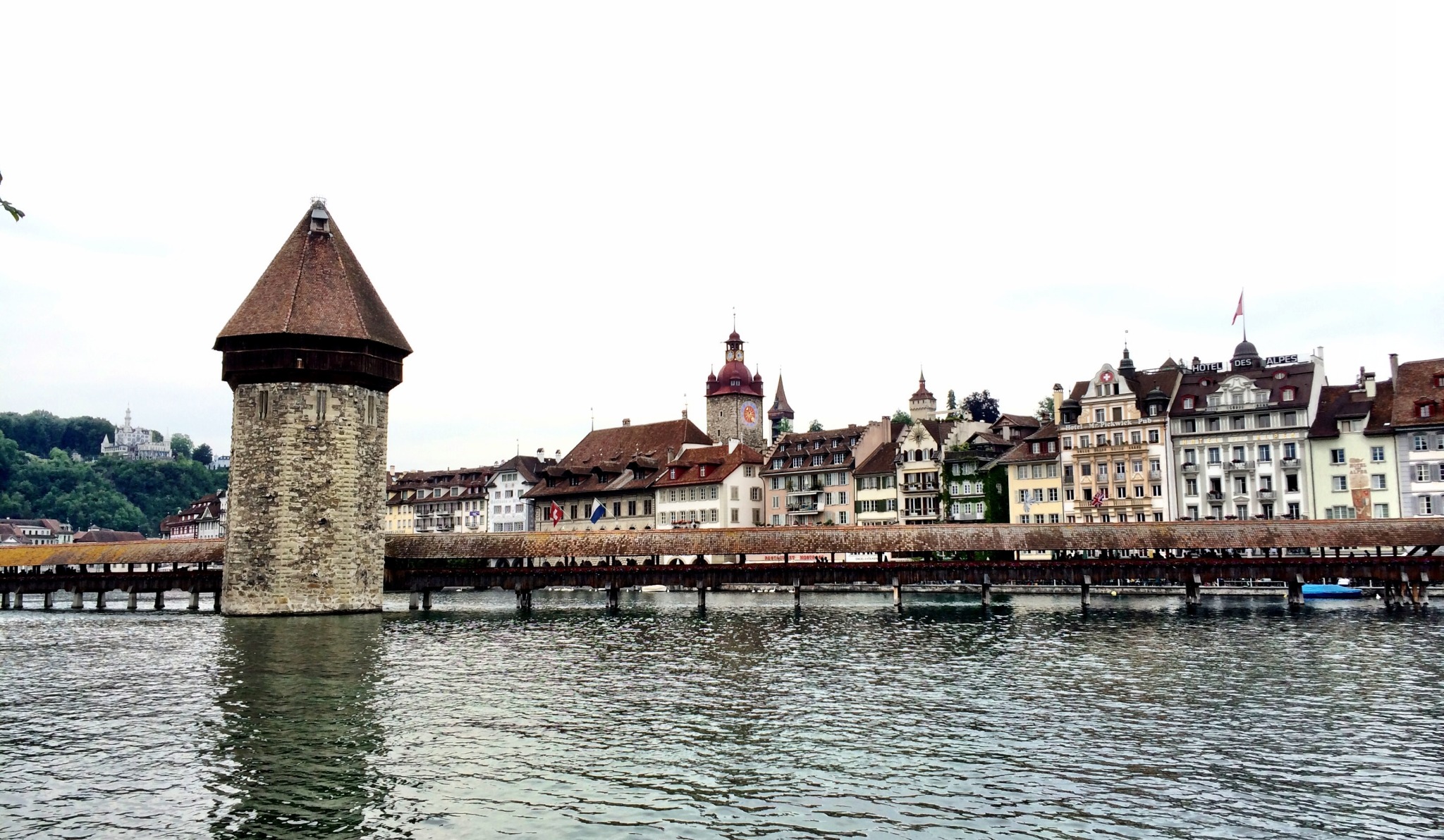
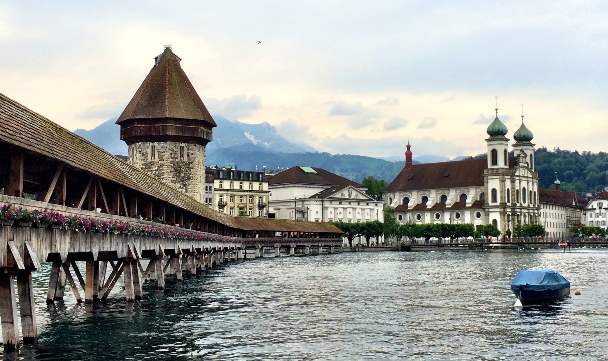
Lucerne’sKappelbrücke (Chapel Bridge) was built in 1360.
I got to walk across when I visited in 2014. Switzerland is like a 2-sided time warp: part medieval village, part urban futurescape.
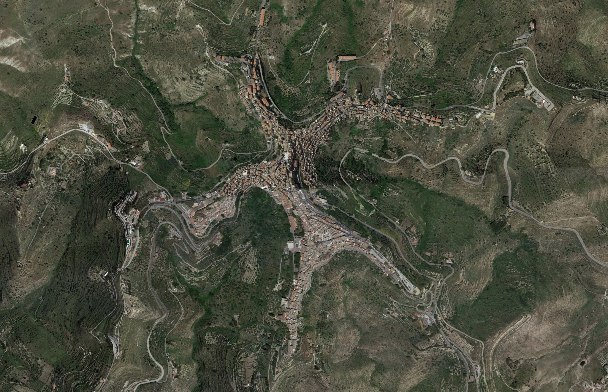
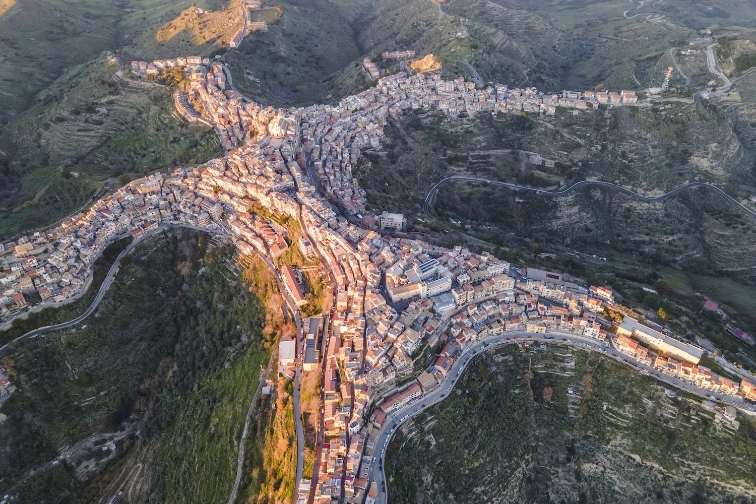
Centuripe — a Sicilian town that looks like a person.
Browsing maps is my favorite way into new rabbit holes. Now central Sicily is on the travel wishlist.
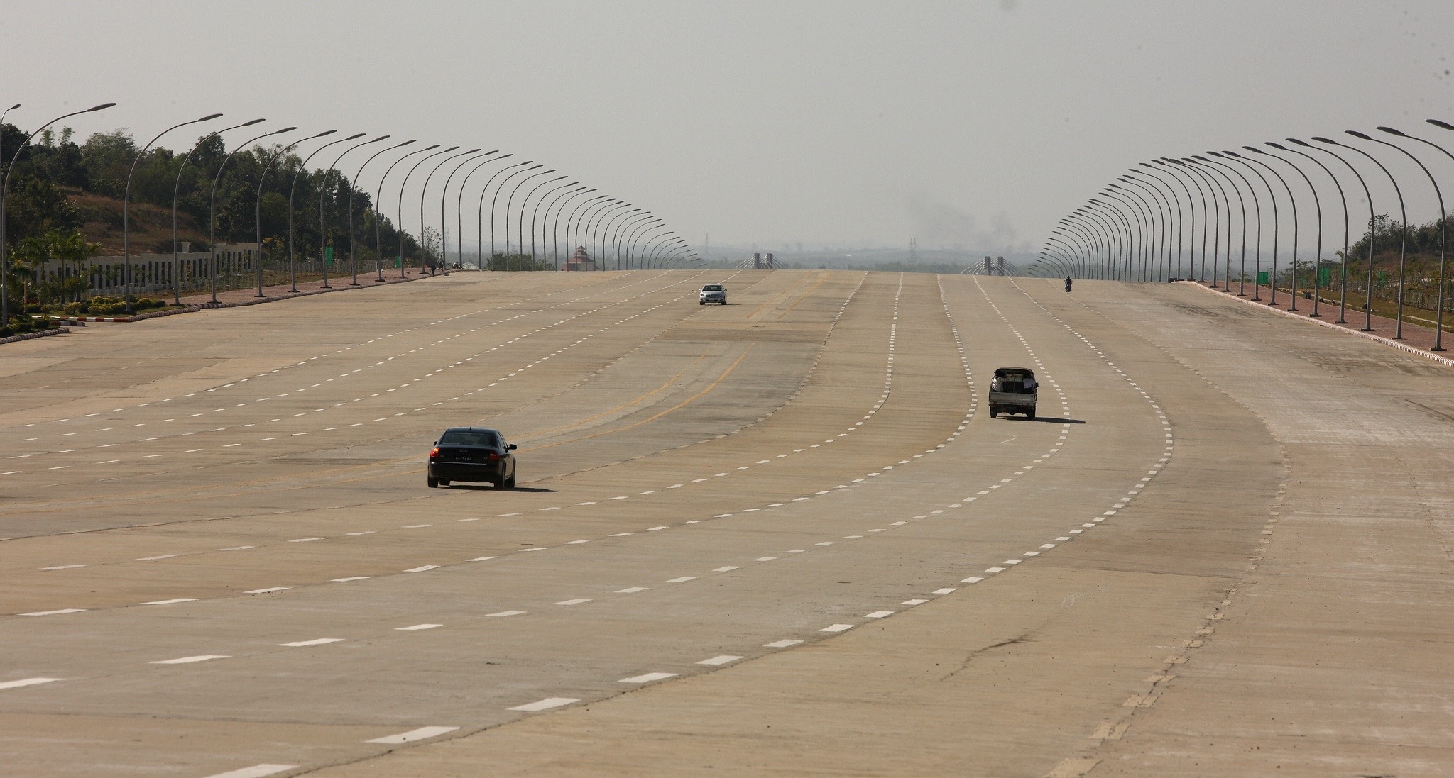
The barren highways of Naypyidaw.
Don’t listen to the high modernists. You can’t will cities into existence.
On the biogeographic boundary between Asia and Oceania, the Wallace Line.
The Cultural Tutor's architecture examples from every country.
Areography is 'geography' on Mars. This is a brief lesson in Mars's topography.
The English Channel with a phytoplankton bloom.
The beautiful meandering Tes River of Siberia and western Mongolia.
Tagging data with Turf, Curiosity high-res photo, and different kinds of easy.
Satellite data shows the expansive ancient shores of Lake Chad.
Mapping MiLB, renaming transit stations, and how soccer players play.
The Bahamas, Turks and Caicos, and Puerto Rico from the air.
Folds anf fjords of Western Australia's Kimbolton coastline.
Sediment flow from the mouth of a Siberian River.
A visualization of Planet's global constellation coverage.
The Mergui Archipelago off the coast of Myanmar.
Featuring one of the mountain climbs of the Tour de France, the Alps epic Col du Galibier.
The Great Slave Lake is the deepest lake in North America, and the tenth largest lake on Earth.
The red-hued saline lake of northern Tanzania.
“The Richat Structure geologic dome of northern Mauritania.”
The brain storing native language, Joe's work on hillshading, and living antifragility.
Reconstructing the map of Odysseus's travels.
Mapbox's 'Boundaries' product for enterprise customers provides an impressive base dataset.
Tom Patterson's beautiful topographic map.
“Viewing some of my favorite American geography from the air.”
Cartographer Daniel Huffman breaks down how he builds his map designs.
“Flying over Southern California's Salton Sea.”
“The vast wilderness of Alaska in ‘Coming Into the Country’.”
An intro to our Foresight products from Spatial Networks.
Mesmerizing 8K footage of the Earth from the air.
An interactive map to see what the Earth looked like in prehistoric time.
Visualizing all of human history as a time lapse on a map.
“A reminder of how great road cycling tours are for geographers.”
How we collect data at Spatial Networks, DJI maps the Camp Fire, and on mysterious geological records.
Mastery learning, Burundi moving its capital, and tools for SRTM data.
Topo map viewer from the USGS for National Map data.
Looking back on Parag Khanna's 'Connectography'.
A great mini documentary about some of the most remote structures humans have ever built.
“Part of Vox’s ‘Borders’ series, on the China-Hong Kong border.”
On Lloyd A. Brown's 'A Story of Maps'
Smart Keyboard Folio, defending 'climate optiism', and exploring place name data.
Attending the OSM mapathon during Geography2050 in November.
400 miles of solitary driving through northern Alaska.
A great article in this month's National Geographic about the wild and lawless Congo River.
The state of Louisiana is gradually eroding, and a number of groups are using maps to highlight the gravity of the situation.
A drilling accident in 1971 in Turkmenistan's Karakum Desert created this 70 meter-wide crater, when a Soviet rig hit a cavernous pocket of natural gas.
Thoughts on counterinsurgency doctrine.