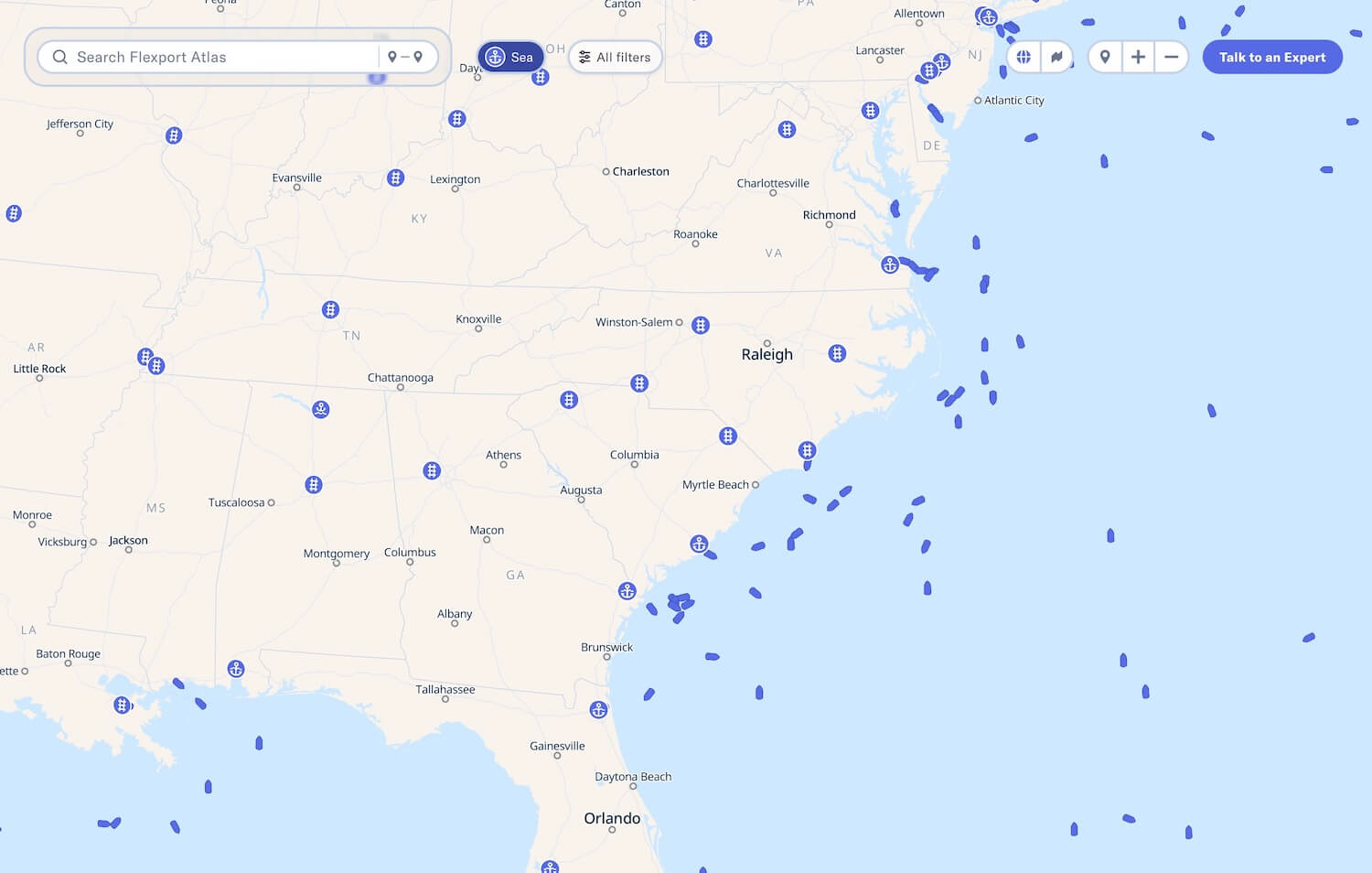
Coleman McCormick

Archive of posts with tag 'Maps'

March 3, 2025 • #

ā€œTopographic beauties straight from old geography booksā€, @egeberkina.

✦
January 16, 2025 • #

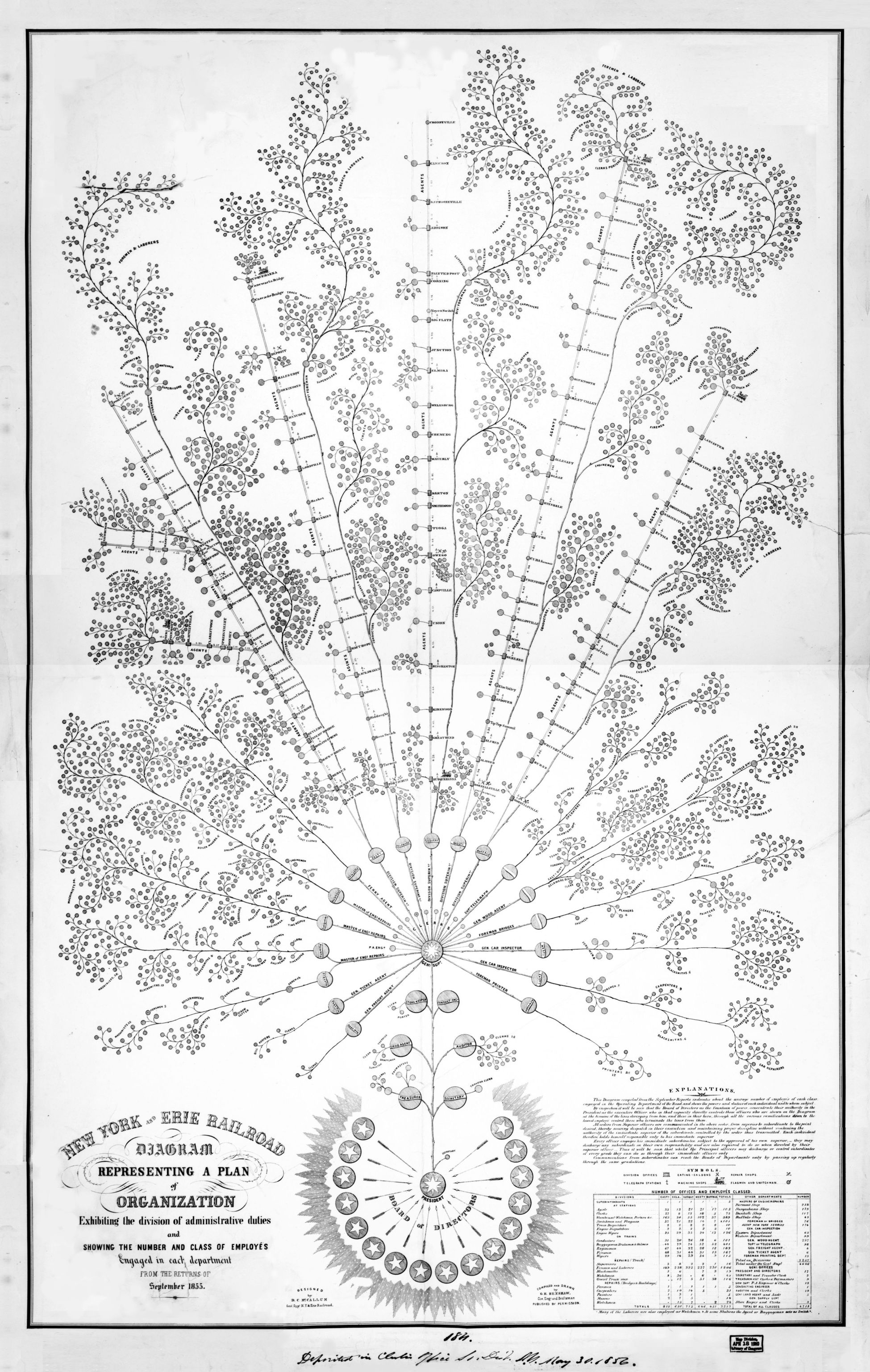
New York and Erie Railroad diagram, 1855.

✦
November 18, 2024 • #

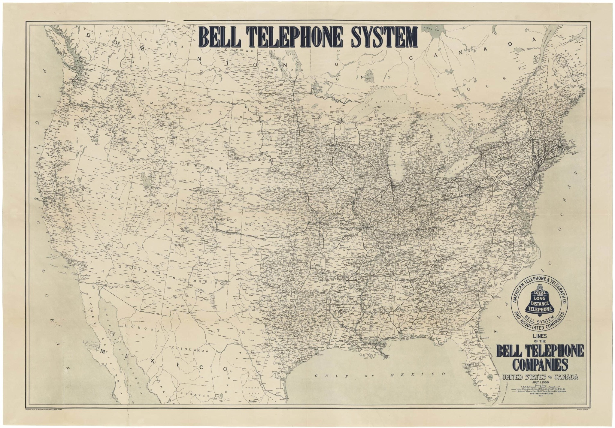
Map of the Bell Telephone System , 1909.

✦
April 10, 2024 • #

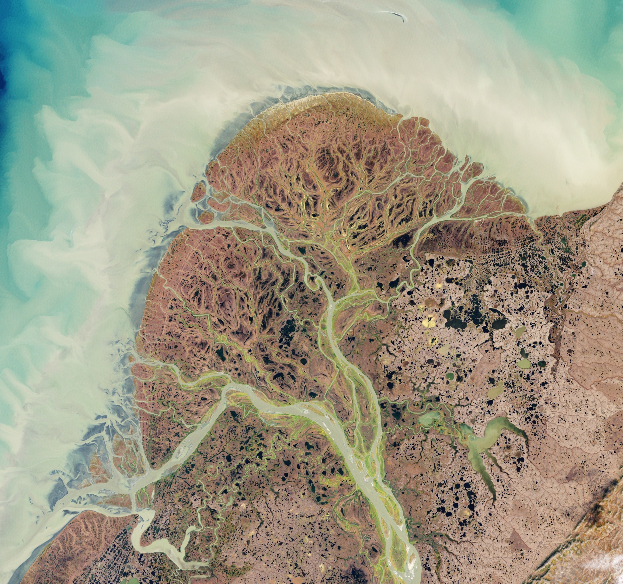
The Yukon River delta , Alaska.
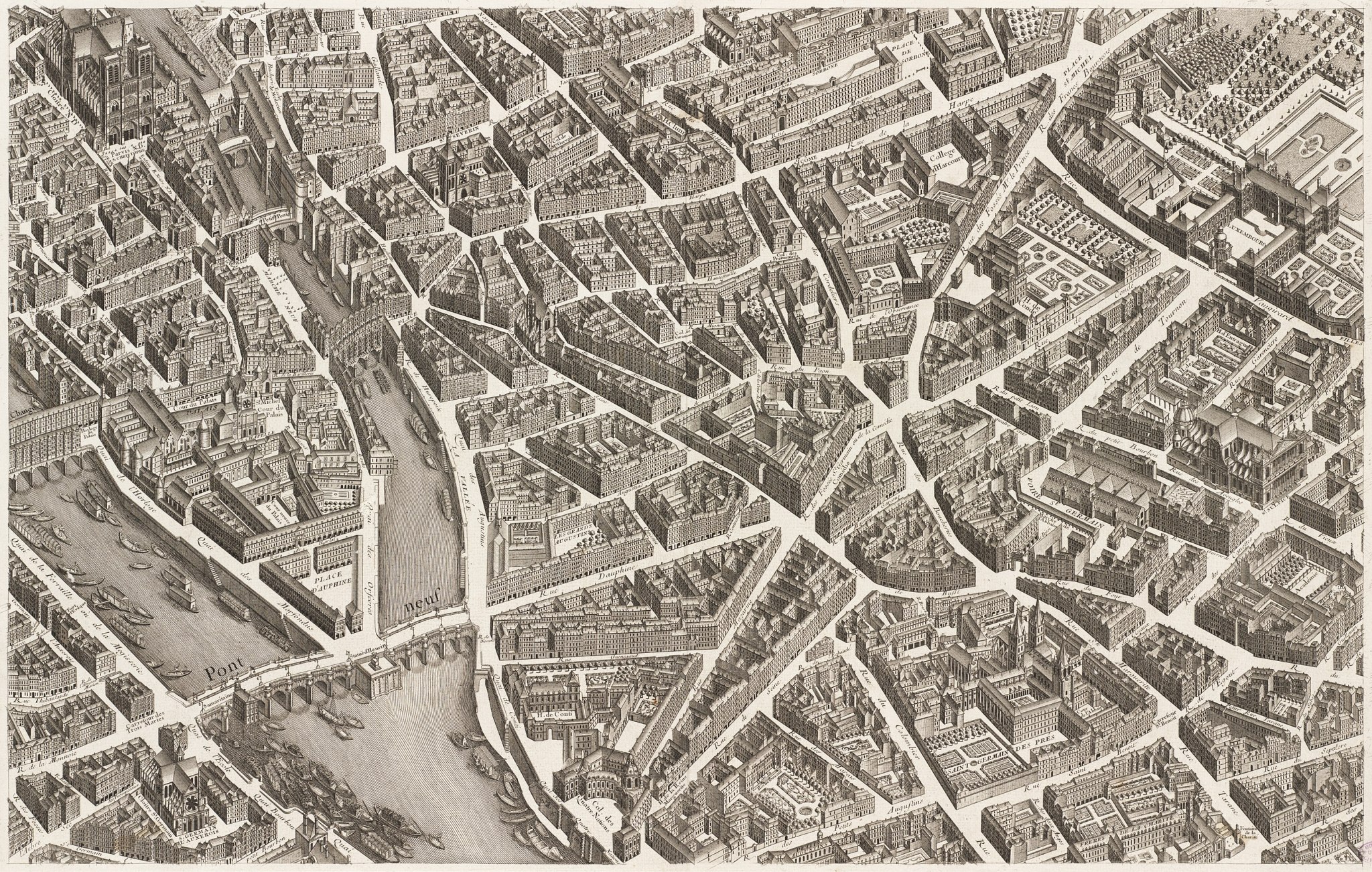
✦
April 3, 2024 • #

Map of Paris by Michel-Ɖtienne Turgot. 1739.

✦
April 2, 2024 • #

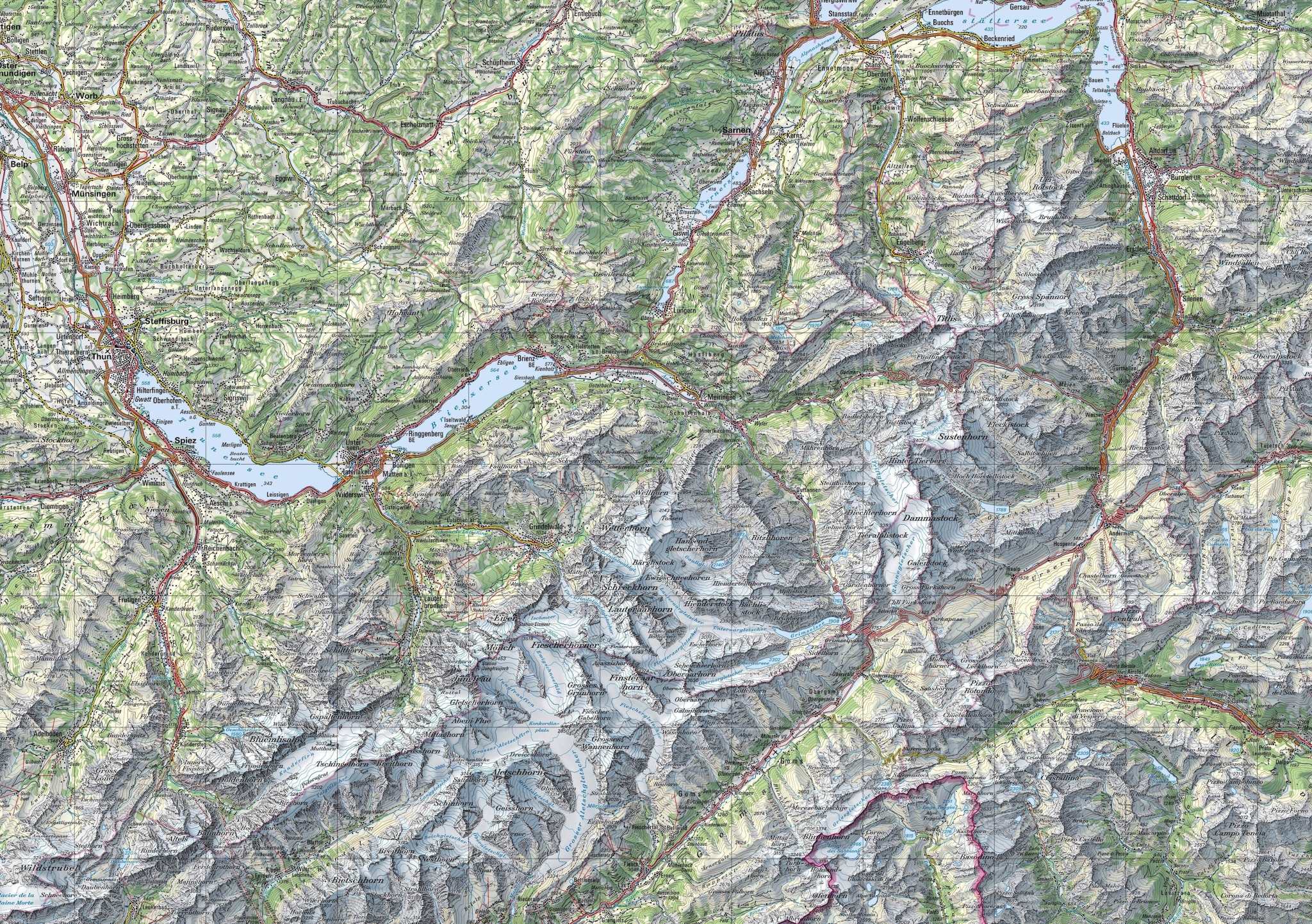
The beautifully rendered topography of Switzerland.

(full resolution)

✦
March 25, 2024 • #

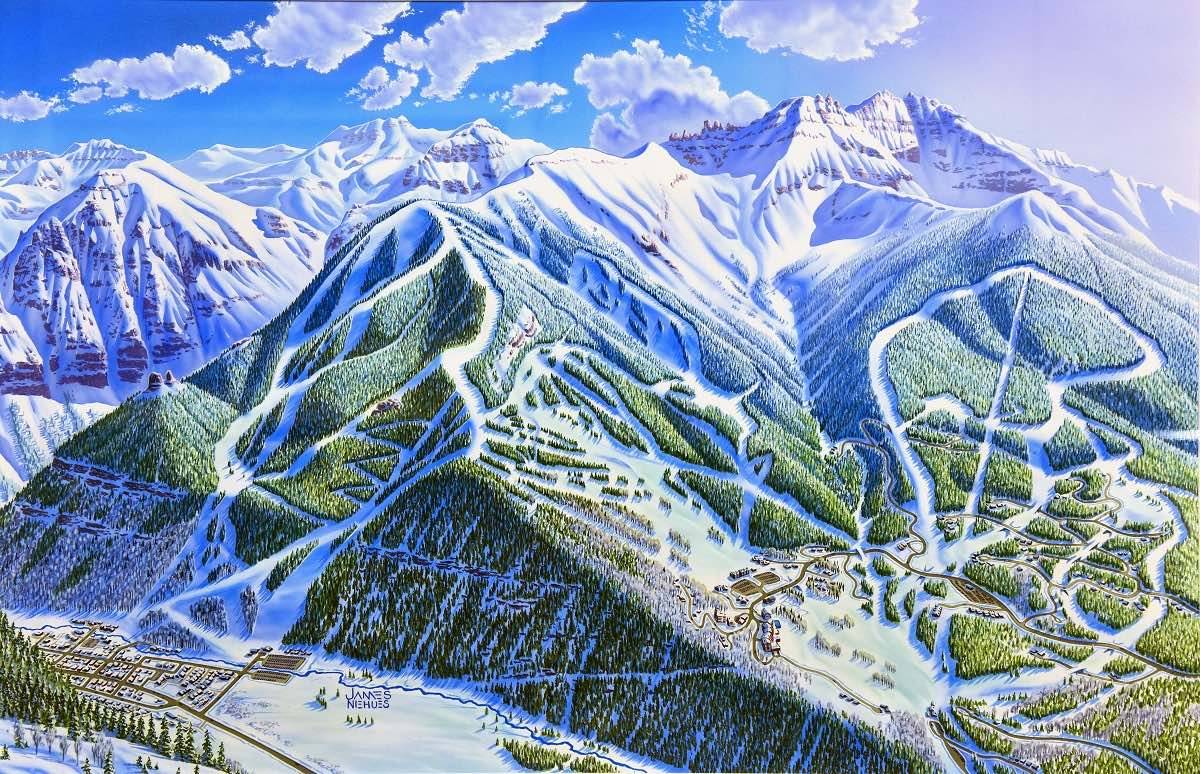
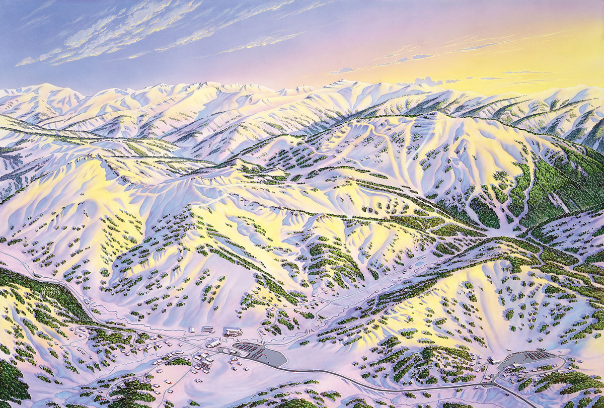
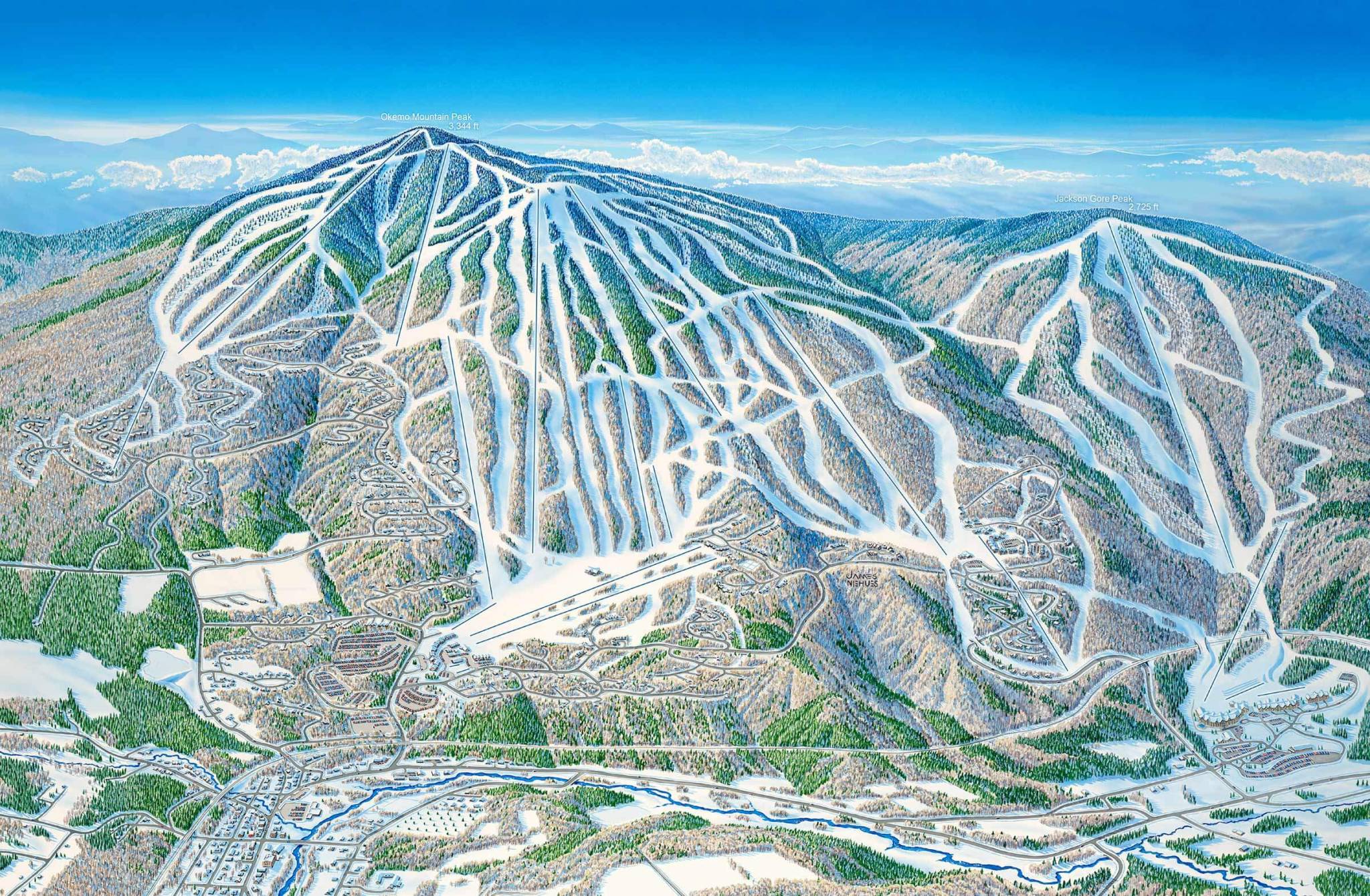
James Niehues’s famous ski resort maps.

✦
February 23, 2024 • #

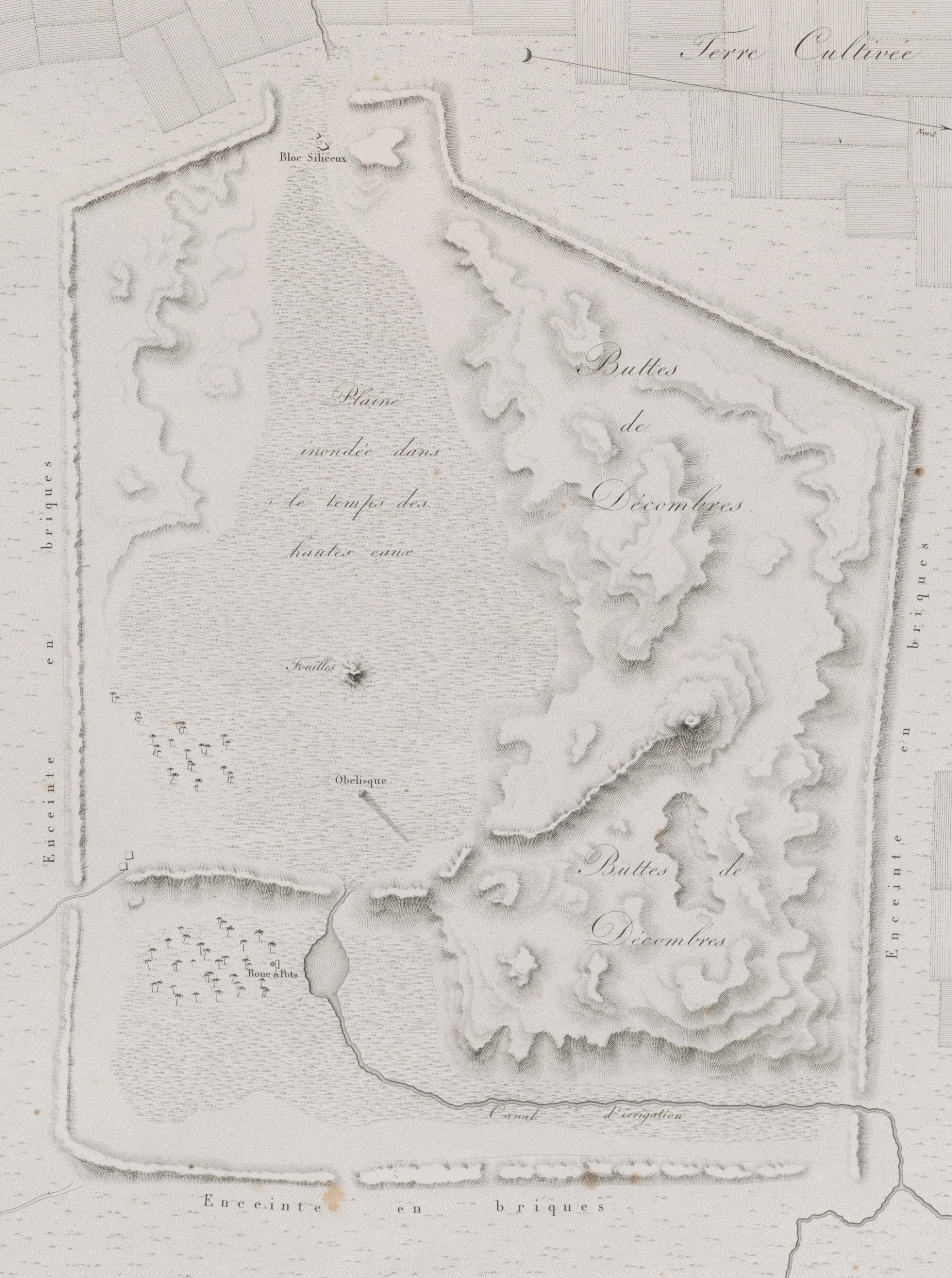
Heliopolis , from Description de l’Égypte , 1809.

✦
February 17, 2024 • #

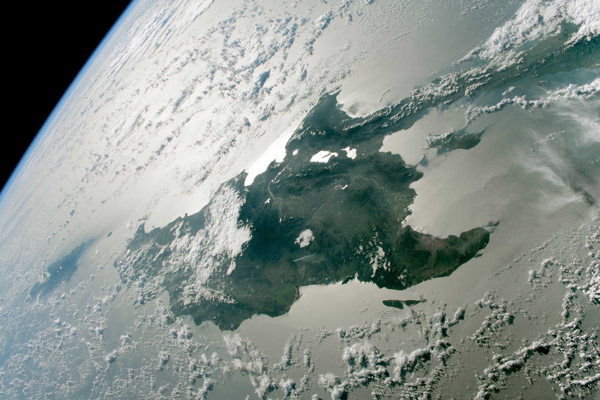
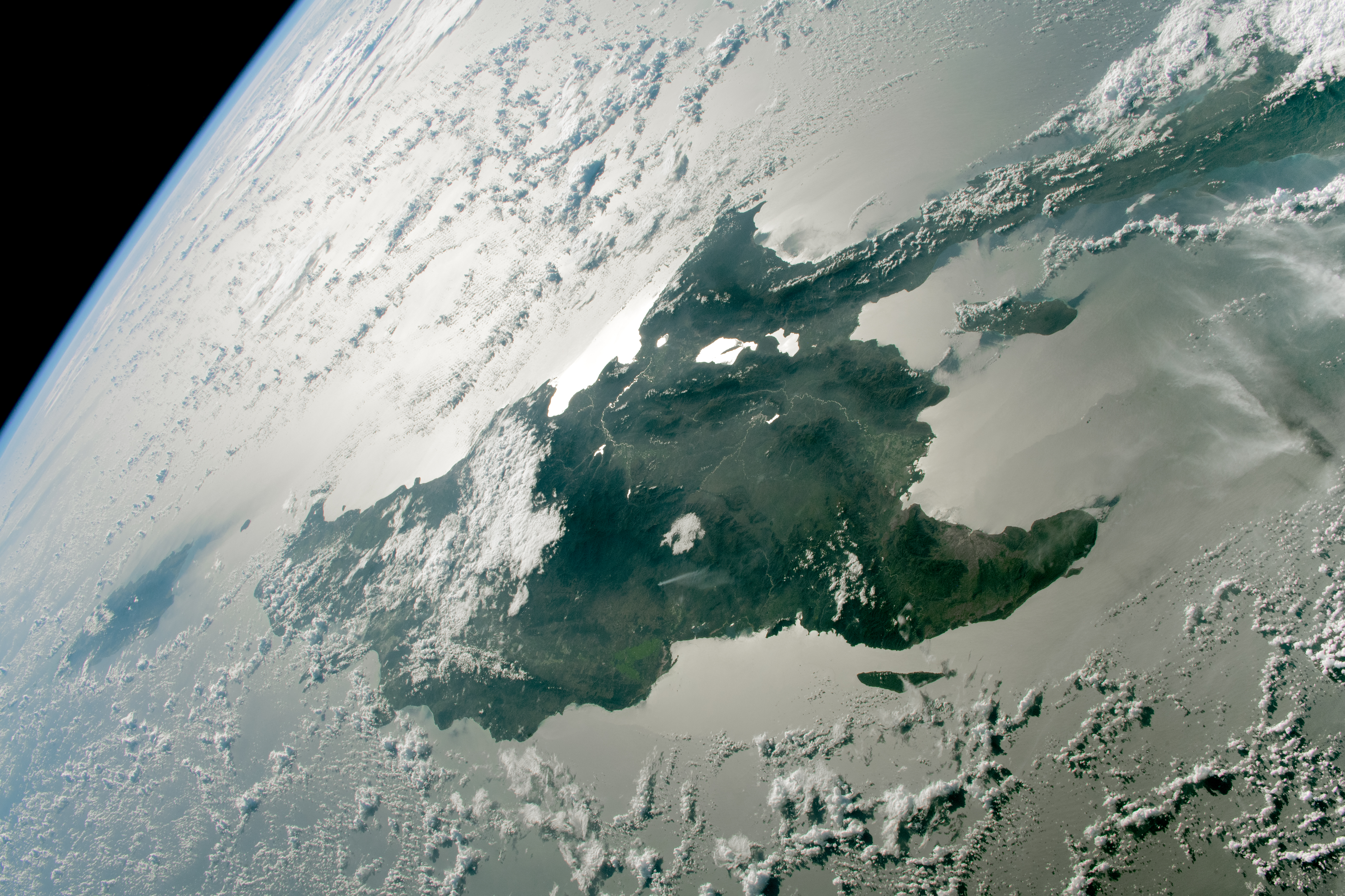
The island of Hispaniola , from the ISS.

(full resolution version)

✦
February 8, 2024 • #

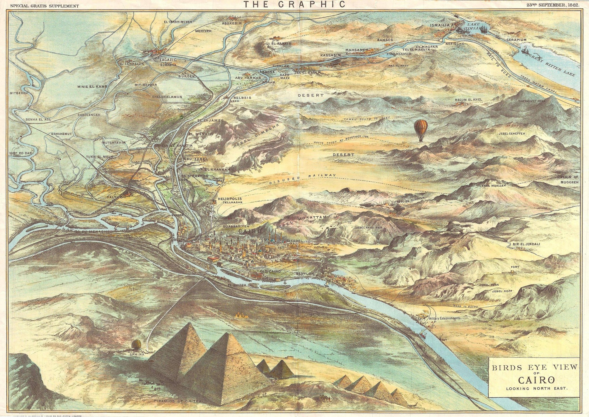
Bird’s eye view of Cairo , 1882.

✦
February 7, 2024 • #

TheCentral Pangean Mountains.

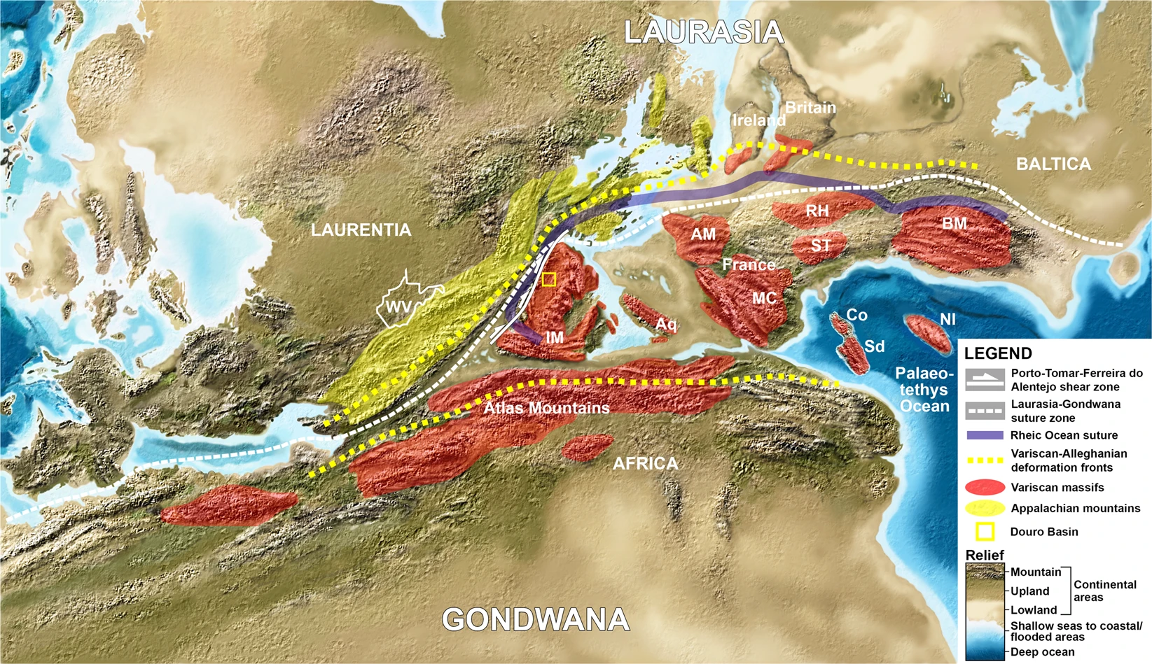
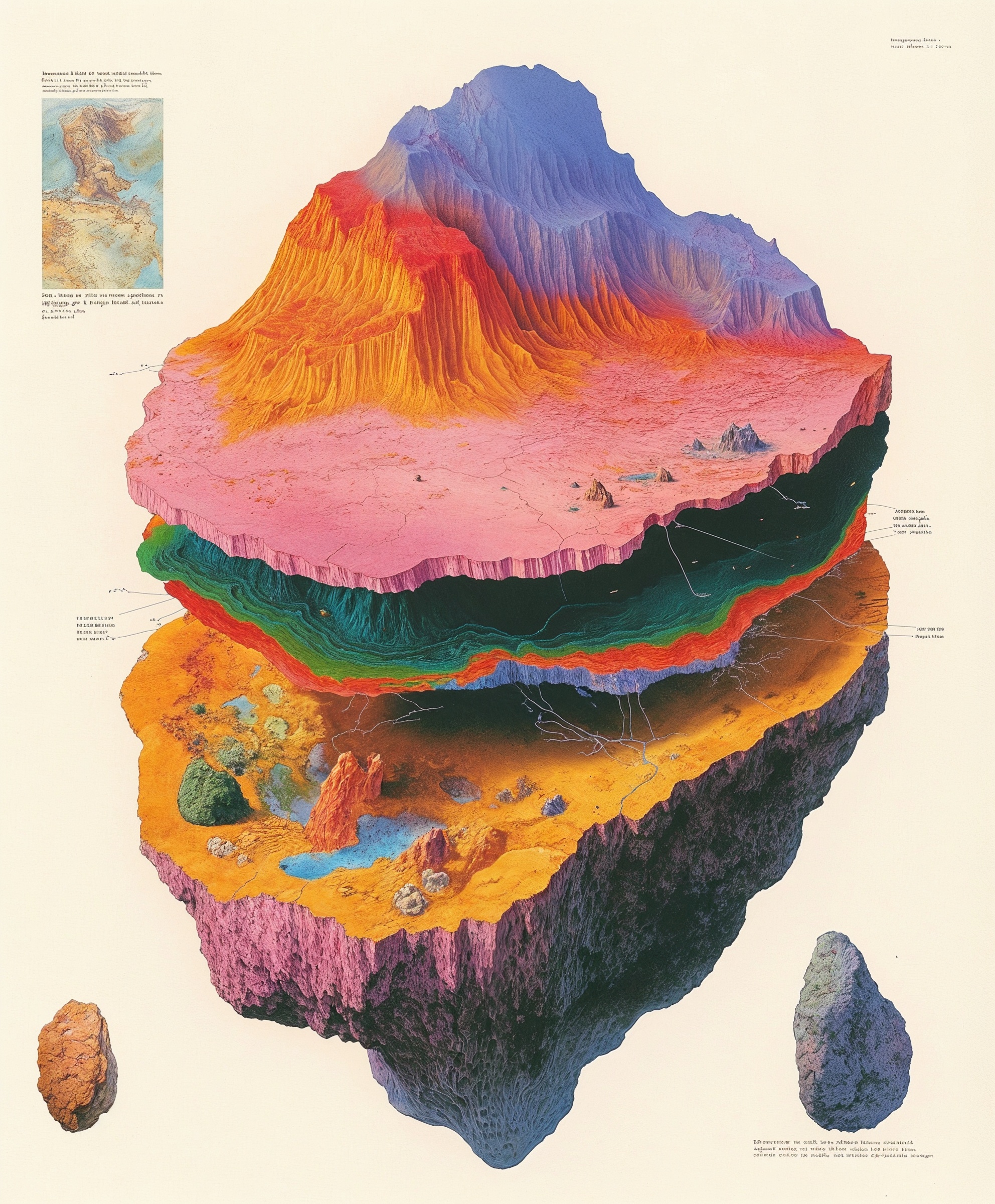
If you go back to the Permian, you’d find the Appalachians, Massif Central, Atlas Mountains, and Scottish Highlands were all part of a single range cutting through the Pangean supercontinent.

✦
February 2, 2024 • #

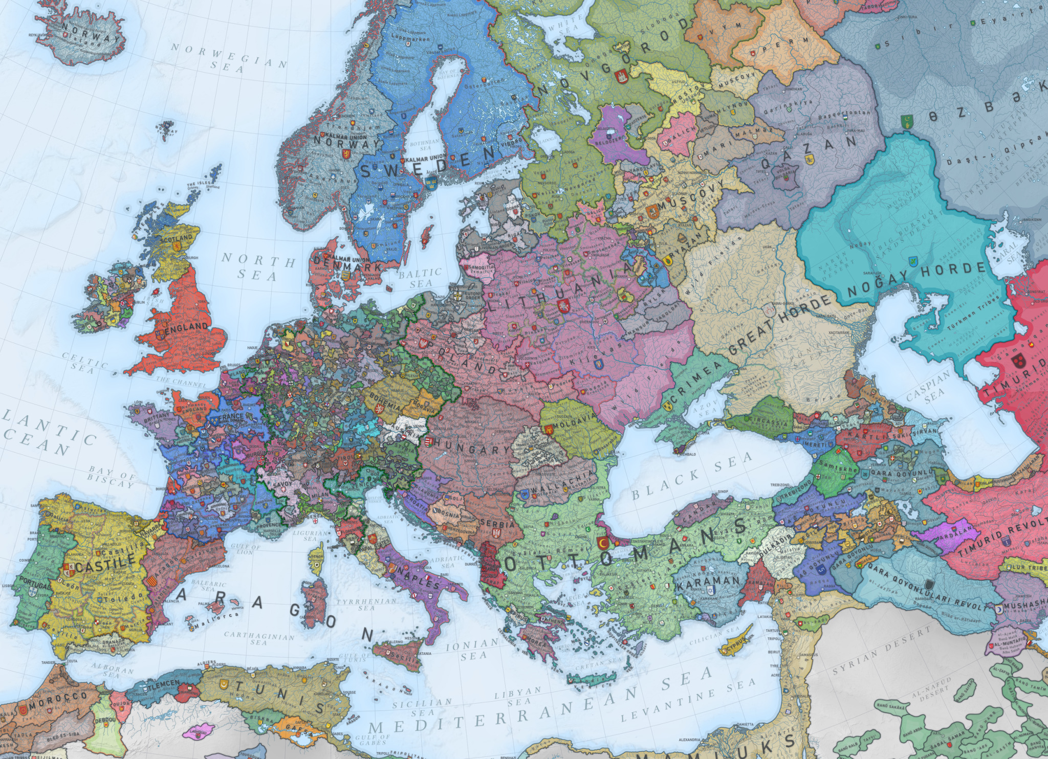
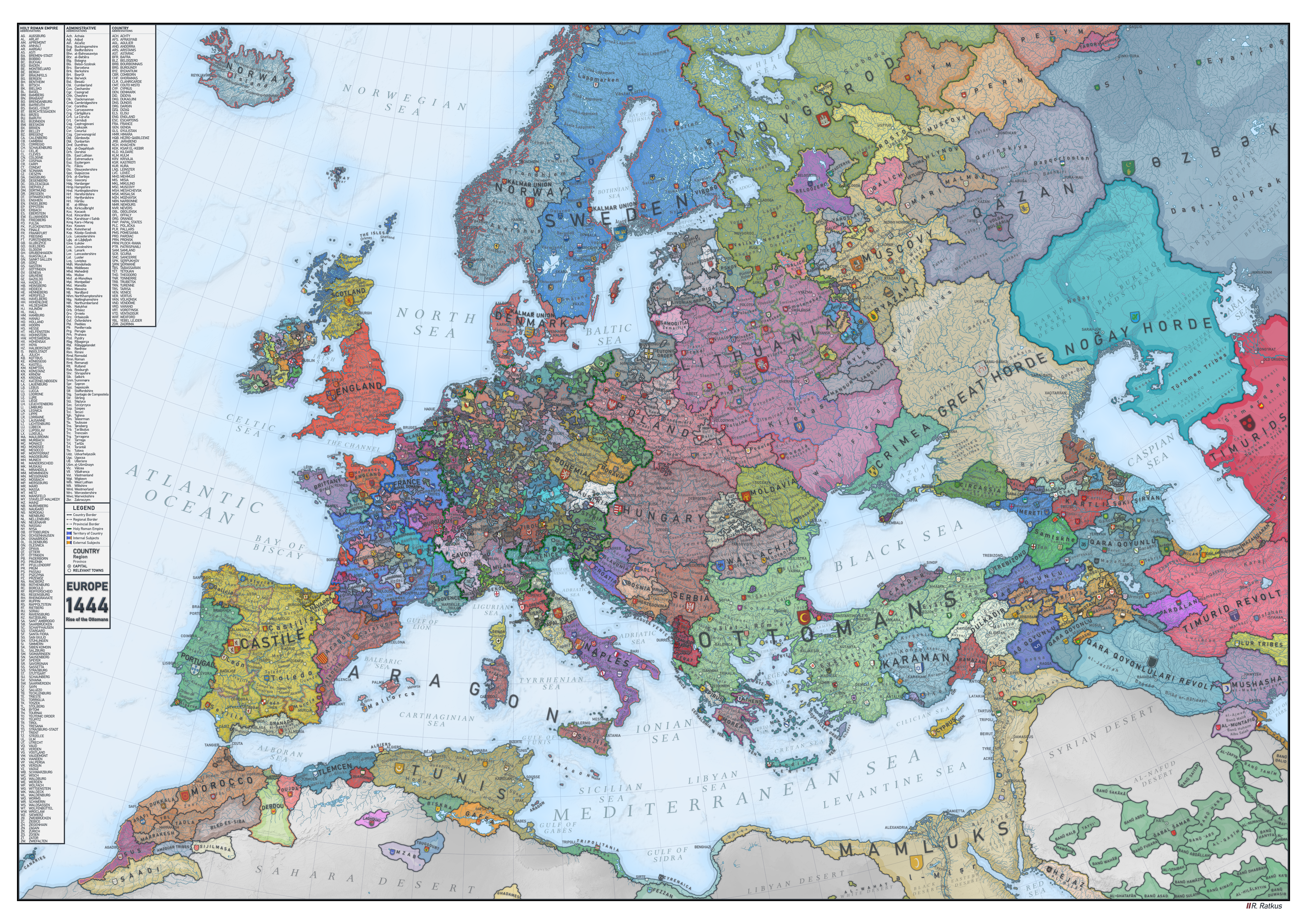
Europe and its fragmented city-state landscape of 1444.

See the full, zoomable hi-res version.

✦
February 1, 2024 • #

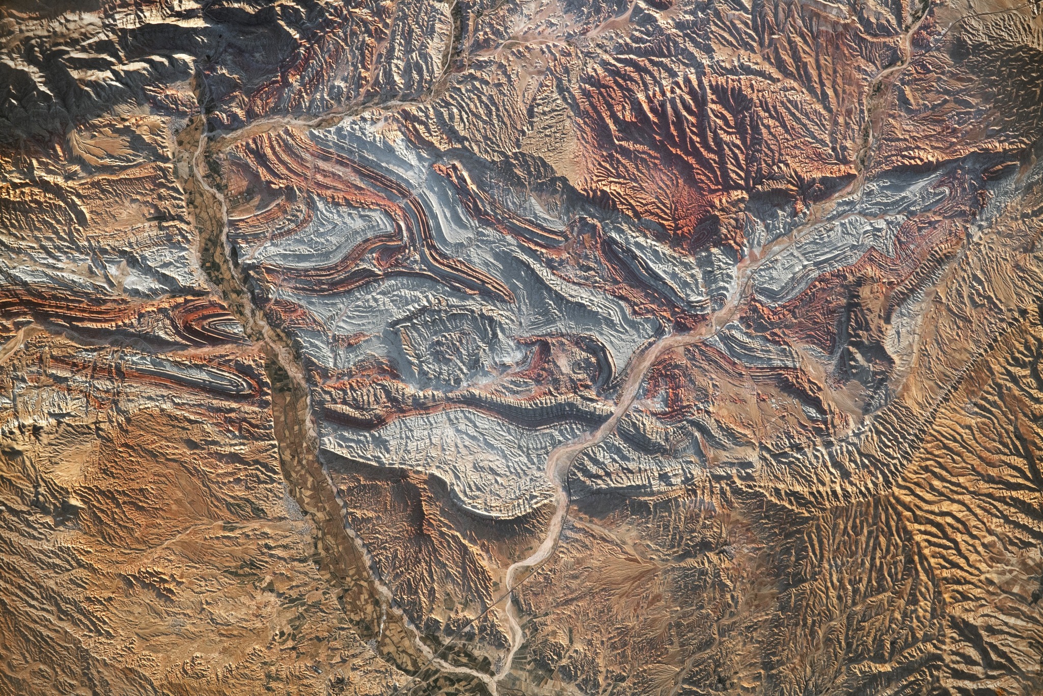
The Aladaghlar Mountains of northwest Iran.

✦
January 29, 2024 • #

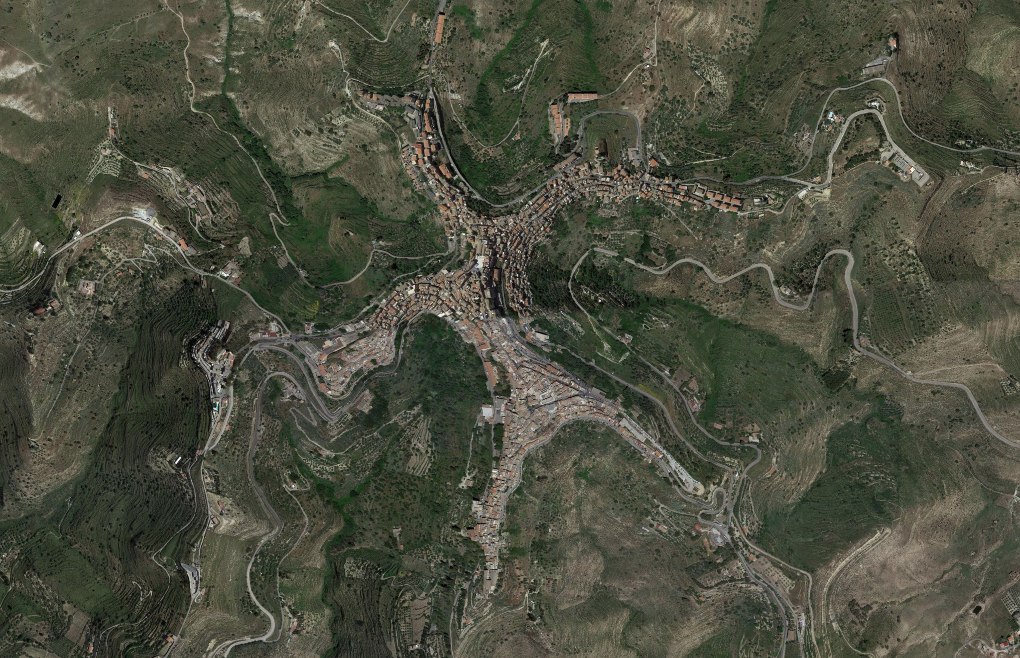
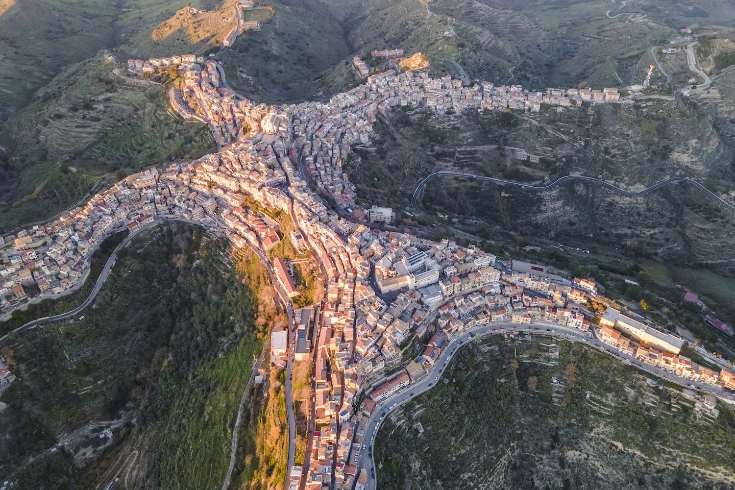
Centuripe — a Sicilian town that looks like a person.

Browsing maps is my favorite way into new rabbit holes. Now central Sicily is on the travel wishlist.

✦
January 29, 2024 • #

NearbyWiki: Wikipedia places nearby →

Neat tool for the curious when traveling.

✦
✦

The Spread of Writing

October 12, 2022 • #

The spread of written language around the world, from Egyptian hieroglyphics to today.

✦

The Challenge of High-Capital Startups

August 17, 2022 • #

Geospatial analytics company Descartes Labs recently sold to private equity, in what former CEO Mark Johnson calls a ā€œfire sale.ā€ This post is his perspective on the nature of the business over time, their missteps along the way in both company identity and fundraising, and some of the shenanigans that can happen as stakeholders start to head for the exits.

Not knowing much about Descartes’ actual business, either the original vision of the product or its actual delivery over the years, I don’t have much specific perspective to offer. But this story is a recurring theme in the world of spatial, earth observation, and analytics startups that have come and gone over the past 10 years or so. These businesses are built on extremely capital-intensive investments in satellites, space-based sensors, and data, which are major hurdles that cause many of them to get sideways in their fundraising structures very early in their business journeys.

The early years of a startup are always extremely volatile, with pivots and adjustments happening along the way as the company navigates the idea maze, looking for product-market fit. I think the heavy capital required up front compels funders to expect too much too soon in the product development process. There’s a chicken-and-egg problem — the PMF search in these kinds of businesses costs many millions. If you’re building a SaaS project management tool, you can wander around looking for fit for years with only a few people and limited seed money. But in satellite startups, the runway you need to do product-market experimentation is enormously expensive. Large enough funding pools also saddle the business with aggressive expectations for customer counts, growth, and revenue. With revenue targets set but no repeatable PMF, many of these startups do whatever they can to find dollars, which often leads to doing what are effectively custom services deals for a single or few customers. That’s necessary to make money of course, and it’s not valueless for product validation. But it’s too narrow to function as true PMF. Stay in this awkward state too long and you end up stuck down the wrong hallways of the idea maze. You’ll never find the fitness you need to build a lasting business. Bill wrote a great post on this recently, about this identity struggle between being a solutions, services, or product company.

The best thinking on the topic of EO and satellite data companies is my friend Joe Morrison’s newsletter, ā€œA Closer Lookā€. He leads product for Umbra, a startup specializing in SAR. He’s done a lot more thinking than me on this topic and has thoughtful takes on the satellite and geo market in general.

✦
✦
✦

Intro to Areography

February 7, 2021 • #

The resemblance between Martian and Terran topography is amazing. Mars has volcanism, plains, valleys, and hard evidence of water formerly everywhere.

Great shots here with renderings of Martian topography.

✦

Weekend Reading: Digital Librarians, Tech Trees, and Alternate Histories in Maps

November 22, 2020 • #

šŸ“‘ Chief Notion Officer

Julian Lehr is onto something here. All modern organizations are plagued with a problem of managing internal documentations. We have ample tools and keep squishing the problem from one place to another: wikis, search, tasks — it’s a game of whack-a-mole to find the right version of a document. He ponders at what size it makes sense to invest in a ā€œdigital librarianā€:

A friend at Stripe recently suggested – half-jokingly – that we should hire a librarian to organize all our internal data and documentation. The more I think about it, the more I like the idea. Perhaps every company should hire a Chief Notion Officer once it hits 100 employees??

🌳 The Tree of Up

Up created a tech tree representation of their product and roadmap. Genius.

šŸŒ Intriguing Maps That Reveal Alternate Histories

Speculative maps of alternate historical timelines.

✦
✦
✦

Places: The English Channel

June 28, 2020 • #
English Channel

This image from Landsat 8 shows the western end of the English Channel off the coast of Cornwall. A phytoplankton bloom spreads for dozens of miles, filling the St. Austell Bay.

The only time I was on the Channel was on the ferry from Dover to Calais, on a particularly rough but clear day.

English Channel :: 50°01' N, 4°31' W

✦

Weekend Reading: Children of Men, Google Earth at 15, and Slate Star Codex is Gone

June 27, 2020 • #

šŸ“½ How Children of Men Became a Dystopian Masterpiece

I didn’t realize until reading this piece that this movie was a commercial flop. $70m gross on a $76m budget. I remember seeing this several times in theaters, and many times after. This retrospective (from 2016) brought the film back to mind and makes me want to rewatch.

šŸŒ 15 Years of Google Earth and the Lessons That Went Unlearned

Brian Timoney:

Google Earth led us to vastly overestimate the average user’s willingness to figure out our map interfaces. The user experience was so novel and absorbing that people invested time into learning the interface: semi-complex navigation, toggling layers on and off, managing their own content, etc. Unfortunately, our stuff isn’t so novel and absorbing and we’ve learned the hard way that even those forced to use our interfaces for work seem very uninterested in even the most basic interactions.

It’s great to see Brian blogging again!

šŸ“„ Doxxing Scott Alexander is Profoundly Illiberal

What’s happening between the New York Times and psychiatrist-rationalist-blogger Scott Alexander is incredibly disappointing to see. In writing a story including him, they want to use his real name (which they found out somehow, S.A. is a pseudonym), which seems completely unnecessary and absurd to the point of disbelief — given the Times’ behavior and policies of late, there should be little benefit of the doubt given here. As a result of this, Scott has deleted his blog, one of the treasures of the internet.

✦

Weekend Reading: Optionality, Pangaea, and Regulatory Disappointment

May 16, 2020 • #

āš–ļø The Trouble with Optionality

A 2017 commencement address from Mihir Desai, critiquing the phenomenon of infinite optionality and lack of commitment pushed by modern universities:

I’ve lost count of the number of students who, when describing their career goals, talk about their desire to ā€œmaximize optionality.ā€ They’re referring to financial instruments known as options that confer the right to do something rather than an obligation to do something. For this reason, options have a ā€œHeads I win, tails I don’t loseā€ character—what those in finance lovingly describe as a ā€œnonlinear payoff structure.ā€ When you hold an option and the world moves with you, you enjoy the benefits; when the world moves against you, you are shielded from the bad outcome since you are not obligated to do anything. Optionality is the state of enjoying possibilities without being on the hook to do anything.

šŸ—ŗ Pangaea with Modern Day Borders

Nice paleocartography here. India abuts Antarctica, South Africa up against Argentina, and Iran was a peninsula.

šŸ­ World’s Largest Producer of Rubbing Alcohol Can’t Manufacturer Hand Sanitizer

This is the only image that comes to mind.

✦

Weekend Reading: Cloud Services, Cities After the Virus, and Corona Care Map

March 28, 2020 • #

ā˜ļø Value of Cloud Based Services in Times of Crisis

Bryan wrote this post about how Fulcrum is supporting the COVID response efforts.

šŸ™ Cities After Coronavirus

I speculated a bit about this sort of thing earlier this week. How might urban design change?

One of the most pressing questions that urban planners will face is the apparent tension between densification – the push towards cities becoming more concentrated, which is seen as essential to improving environmental sustainability ā€“ and disaggregation, the separating out of populations, which is one of the key tools currently being used to hold back infection transmission.

šŸ—ŗ COVID Care Map

Some colleagues in the geo community are working on this project to map health care resources by region and facility. All of the code and work is in the open on GitHub.

✦

Weekend Reading: LightSpeed, Kubernetes, and a Car-Free Market Street

March 14, 2020 • #

šŸ“± Project LightSpeed: Rewriting the Messenger Codebase

A technical piece describing the goals for Facebook’s rewrite of the Messenger app. Interesting to see them avoiding their own React Native for this, and doing things in native iOS/Android.

šŸ”© ā€œLet’s Use Kubernetes!ā€ Now You Have 8 Problems

A humorous post, but has a point. There’s pressure to add new tools that don’t do much but add moving parts and complexity. There’s nothing wrong with Kubernetes, but there’s a place for it (and your small team probably doesn’t need it).

The more you buy in to Kubernetes, the harder it is to do normal development: you need all the different concepts (Pod, Deployment, Service, etc.) to run your code. So you need to spin up a complete K8s system just to test anything, via a VM or nested Docker containers.

And since your application is much harder to run locally, development is harder, leading to a variety of solutions, from staging environments, to proxying a local process into the cluster (I wrote a tool for this a few years ago), to proxying a remote process onto your local machine…

🚲 How the Car-Free Policy Impacted Market Street Traffic

Mapbox digs into the impacts of San Francisco’s Market Street going pedestrians and bikes only.

✦

Weekend Reading: Figma's Typography, Xerox Alto, and a Timeline of CoVID

February 29, 2020 • #

āŒØļø I Pressed ⌘B, You Wouldn’t Believe What Happened Next

An entertaining talk about the complexity of typography, from Marcin Wichary at Figma’s recent Config conference.

šŸ–„ Restoring Y Combinator’s Xerox Alto

An technical piece on restoring Alan Kay’s Xerox Alto he donated to Y Combinator. Amazing piece of technology history, and inspired so many future developments in computing — graphical user interfaces, WYSIWIG text editing, bitmapped graphics, the mouse, and Ethernet for connectivity.

Xerox built about 2000 Altos for use in Xerox, universities and research labs, but the Alto was never sold as a product. Xerox used the ideas from the Alto in the Xerox Star, which was expensive and only moderately successful. The biggest impact of the Alto was in 1979 when Steve Jobs famously toured Xerox and saw the Alto and other machines. When Jobs saw the advanced graphics of the Alto, he was inspired to base the user interfaces of the Lisa and Macintosh systems on Xerox’s ideas, making the GUI available to the mass market.

🦠 Map and Timeline of CoVID-19 Outbreak

A timeline showing the spread of the coronavirus, with an accompanying map interface.

✦
✦
✦

Running Map 2019

January 19, 2020 • #

I finally got around to updating my local tracks database with all of the 2019 Strava data. I’ve been lax about updating it since I completed the Shore Acres project in the summer. Here are some fun snapshots:

St. Pete running coverage

This one shows how much of the St. Pete area I covered. Almost finished Snell Isle, as well, but missed a few segments. I might polish that off this year then work on the downtown area.

Half marathon Fort DeSoto

This was my first half marathon, and only time running out on Fort DeSoto. Great spot for this. Might try to do some of it for fun during the winter while it’s cooler. It was about 78°F at 7am when the race started that day.

Lots of runs on Venetian Isles

This is what my common running routes look like. This spot out at the end of Venetian Isles near my neighborhood is one of my normal routes. Looks wild to see how many times I’ve been on that sidewalk.

San Diego running

When I was out at FOSS4G in San Diego in the spring I got in a couple of long runs. The Mission Bay area is beautiful.

Just getting started on 2020, about 32 miles in so far. I’m a little behind schedule on my pace for 650 miles, but should be able to catch up and keep it going.

✦

Weekend Reading: MiLB, Naming Public Transit, and Soccer Playing Styles

November 30, 2019 • #

⚾ Mapping the New MiLB Landscape

Combining baseball and maps? Sign me up. The MLB has a plan to ā€œimproveā€ the MiLB system costs, standards, compensation, and other things through shuttering 42 ball clubs around the country. In this piece for FanGraphs, the authors use some GIS tactics to analyze how this shakes out for baseball fans falling within those markets:

So how many Americans would see their ability to watch affiliated baseball in person disappear under MLB’s proposal? And how many would see their primary point of access shift from the relatively affordable games of the minor leagues to major league ones? To work out how the closure of these minor league teams will affect access to baseball, we went to the map. More specifically, we took the geographical center of each ZCTA (a close relative of ZIP Codes used by the Census Bureau). We calculated the distance as the crow flies from each ZCTA to each ballpark in America, both in 2019 and in MLB’s proposed new landscape.

šŸš‡ The ā€˜Namewashing’ of Public Transit

Seems like a strange move for transit agencies to sell the naming rights to entire stations to private entities. Would it really raise revenues enough to make a dent in paying for operations or improving systems? Seems like the downsides outweigh the upsides here. I’m all for experimentation in improving public services, but this seems like a lazy method for raising a few million bucks.

I did learn a new handy phrase here:

There’s a phrase that urban geographers use for this private rebranding of public space: ā€œtoponymic commodification.ā€

⚽ Characterizing Soccer Players’ Playing Styles

Another one for the sports fan, an analysis and comparison of different players.

✦

Weekend Reading: Darwinian Gastronomy, Humboldt, and Taxes

November 16, 2019 • #

🌶 Darwinian Gastronomy

Turns out cultures from warmer climates evolved a taste for spicy foods to combat the presence of more diverse bacteria:

Alas, nothing in nature turns out to be that simple. Researchers now suggest that a taste for spices served a vital evolutionary purpose: keeping our ancestors alive. Spices, it turns out, can kill poisonous bacteria and fungi that may contaminate our food. In other words, developing a taste for these spices could be good for our health. And since food spoils more quickly in hotter weather, it’s only natural that warmer climates have more bacteria-killing spices.

🌲 The Pioneering Maps of Alexander von Humboldt

The German scientist Alexander von Humboldt is one of the most important figures in conservation and geography. He was one of the first scientists to use maps as a critical tool for communicating his discoveries and ideas:

Another of Humboldt’s groundbreaking illustrations came out of his five-year voyage to Central and South America with the French botanist AimĆ© Bonpland. In 1802, Humboldt and Bonpland ascended Chimborazo, a volcano just below the equator that was believed at the time to be the highest mountain in the world (at 20,564 feet, it’s more than 8,000 feet shorter than Mount Everest). The pair documented the mountain’s plant life, from the tropical rainforest at its base to the lichen clinging to rocks above the treeline. The image below, which Humboldt called Tableau Physique in the French version of his original publication, organizes these observations in an intuitively visual way, showing Chimborazo in cross-section, with text indicating which species lived at different elevations on the mountain.

šŸ’° Connecting Some Dots on Taxes

There was a roil over a Bill Gates interview from the recent DealBook conference, specifically around his comments on the upcoming election and his uncertainties around the Democratic candidates’ tax policies and consequences they might have. As is usual for Twitter, the rage machine was in full effect around Gates’s comments about ā€œhow much he’d have leftā€ if Elizabeth Warren had her way.

The notion commonly tossed around with regard to billionaires is that there’s no way that level of wealth accumulation could happen through non-nefarious (or illegal) means. Kevin Williamson does a good job in this piece picking apart the logic here (or lack thereof) around ā€œwealth transferā€ — a disingenuous way to describe a phenomenon where there was no coercion involved.

The idea that there is some big national slop bucket marked ā€œincomeā€ and that Gates et al. are grabbing up more than their fair share is breathtakingly primitive. A relatively small number of high-growth firms has accounted for a very large share of economic growth in the United States in the past several decades. That represents wealth creation, not a wealth transfer.

✦

Weekend Reading: Blot, Hand-Drawn Visualizations, and Megafire Detection

November 9, 2019 • #

šŸ“ Blot.im

Blot is a super-minimal open source blogging system based on plain text files in a folder. It supports markdown, Word docs, images, and HTML — just drag the files into the folder and it generates web pages. I love simple tools like this.

šŸ–‹ Handcrafted Visualization: Precision

An interesting post from Robert Simmon from Planet. These examples of visualizations and graphics of physical phenomena (maps, cloud diagrams, drawings of insects, planetary motion charts) were all hand-drawn, in an era where specialized photography and sensing weren’t always options.

A common thread between each of these visualizations is the sheer amount of work that went into each of them. The painstaking effort of transforming a dataset into a graphic by hand grants a perspective on the data that may be hindered by a computer intermediary. It’s not a guarantee of accurate interpretation (see Chapplesmith’s flawed conclusions), but it forces an intimate examination of the evidence. Something that’s worth remembering in this age of machine learning and button-press visualization.

I especially love that Apollo mission ā€œlunar trajectoryā€ map.

šŸ”„ The Satellites Hunting for Megafires

Descartes Labs built a wildfire detection algorithm and tool that leans on NASA’s GOES weather satellite thermal spectrum data, in order to detect wildfires by temperature:

While the pair of GOES satellites provides us with a dependable source of imagery, we still needed to figure out how to identify and detect fires within the images themselves. We started simple: wildfires are hot. They are also hotter than anything around them, and hotter than at any point in the recent past. Crucially, we also know that wildfires start small and are pretty rare for a given location, so our strategy is to model what the earth looks like in the absence of a wildfire, and compare it to the situation that the pair GOES satellites presents to us. Put another way our wildfire detector is essentially looking for thermal anomalies.

✦

Weekend Reading: Strasburg Tipping, RapiD, and TikTok Investigation

November 2, 2019 • #

āš¾ļø How the Nationals Fixed Stephen Strasburg and Saved Their Season

Strasburg tipping his pitches almost ended the Nats’ run:

He remembered the game Strasburg pitched in Arizona on August 3. The Diamondbacks pounded Strasburg for nine runs in less than five innings. The D-Backs knew what was coming. The Nationals broke down the tape and discovered Strasburg was tipping his pitches by the way he reached into his glove to grip the baseball near his waist, just before he raised his hands to the set position.

šŸ—ŗ Mapping Remote Roads with OpenStreetMap, RapiD, and QGIS

An annotated version of Mike Migurski’s workshop on RapiD and Disaster Maps from the NetHope Summit. Facebook’s work on this stuff looks primed to change the way everyone is doing OpenStreetMap contribution.

šŸ“± U.S. opens national security investigation into TikTok

I’ve never used TikTok, but it’s been a fascination tech story to follow its insane growth over the last 8-12 months. With the current geopolitical climate and the fact that it’s owned by Chinese owner ByteDance, it seemed like this CFIUS investigation was inevitable.

✦
✦
✦
✦

Weekend Reading: Ted Chiang, Renewable Energy, and ColorBox

September 21, 2019 • #

āœšŸ¼ Ted Chiang Uses Science to Illuminate the Human Condition

I enjoyed this interview with author Ted Chiang. It covers his recent short story collection Exhalation: Stories with nice context and background on the ideas behind each one. I just finished the book last week, and would have to say that The Truth of Fact, the Truth of Feeling was my favorite. A story about the fallibility of memory and what it would be like if our memories were recorded with perfect accuracy.

šŸ’” Can Renewable Energy Power the World?

Renewables map US

Analysis from Bloomberg on the state of renewables versus fossil fuels, with nice map graphics demonstrating the distribution of energy facilities by type in the US. The trends look positive in the United States, but the outlook in developing markets is still challenging, as one would expect:

In developing parts of the world, coal still dominates. China is home to the largest capacity of hydro, wind and solar power—and it remains the world’s biggest consumer of coal. Pakistan’s dream of generating 60% of its power from clean energy sources is still decades away. In Indonesia, coal plants are so cheap to run that the Southeast Asian nation is projected to nearly double its coal generation in the next 25 years.

The growing divide underscores a global dilemma: Wealthy nations can afford to turn their backs on coal, but it remains an easy fallback in countries where electricity is scarce, unreliable, or unaffordable.

šŸŽØ ColorBox

A tool from the Lyft design team for creating color ramps and gradients. Check out the blog post.

✦
✦

Weekend Reading: Observable Edition

September 7, 2019 • #

This week’s links are all interactive notebooks on Observable. Their Explore section always highlights interesting things people are creating. A great learning tool for playing with data and code to see how it works.

āŒØļø The Enigma Machine

Easily the most impressive interactive notebook I’ve ever seen. This one from Tom shows the electromechanical pathways of the German Enigma machine at work — enter a character and see how the rotors and circuits encrypt text.

🚲 A Bicycle Drivetrain Analyzer

Another great example of the power of interactive programs. This one lets you compute bicycle chainring gear ratios by speed setting. You can add multiple cassettes and chainrings to compare:

Bicycle drivetrain analysis

šŸŒ Mapping the Mediterranean

Have to include a map example. Here the author brings in DEM data then styles and generates it all in code with GDAL for data manipulation and D3 for graphics.

✦
✦
✦

Weekend Reading: Brain MRI, Flash Cards, and Movie Maps

July 27, 2019 • #

🧠 7 Tesla MRI of a Human Brain

This is one of the highest resolution scans ever performed on a human brain, at 100 micrometer resolution. Scroll down to see some awesome images.

šŸ‘ØšŸ»ā€šŸ« Anki

Anki is an open source framework for creating your own flash cards. A neat system for helping your kids with classwork, or even just testing yourself on topics.

Anyone who needs to remember things in their daily life can benefit from Anki. Since it is content-agnostic and supports images, audio, videos and scientific markup (via LaTeX), the possibilities are endless.

šŸ“½ Cinemaps

I got lost in these works by Andrew DeGraff. They’re super-detailed visualations of character movements and plot developments oriented spatially as the films move from beginning to end. My favorite is the multiple timeline architecture of Back to the Future.

✦

Weekend Reading: Rhythmic Breathing, Drowned Lands, and Fulcrum SSO

July 20, 2019 • #

šŸƒšŸ»ā€ā™‚ļø Everything You Need to Know About Rhythmic Breathing

I tried this out the other night on a run. The technique makes some intiutive sense that it’d reduce impact (or level it out side to side anyway). Surely to notice any result you’d have to do it over distance consistently. But I’ve had some right knee soreness that I don’t totally know the origin of, so thought I’d start trying this out. I found it takes a lot of concentration to keep it up consistently. I’ll keep testing it out.

šŸž Terrestrial Warfare, Drowned Lands

A neat historical, geographical story from BLDGBLOG:

Briefly, anyone interested in liminal landscapes should find Snell’s description of the Drowned Lands, prior to their drainage, fascinating. The Wallkill itself had no real path or bed, Snell explains, the meadows it flowed through were naturally dammed at one end by glacial boulders from the Ice Age, the whole place was clogged with ā€œrank vegetation,ā€ malarial pestilence, and tens of thousands of eels, and, what’s more, during flood season ā€œthe entire valley from Denton to Hamburg became a lake from eight to twenty feet deep.ā€

Turns out there was local disagreement on flood control:

A half-century of ā€œwarā€ broke out among local supporters of the dams and their foes: ā€œThe dam-builders were called the ā€˜beavers’; the dam destroyers were known as ā€˜muskrats.’ The muskrat and beaver war was carried on for years,ā€ with skirmishes always breaking out over new attempts to dam the floods.

Here’s one example, like a scene written by Victor Hugo transplanted to New York State: ā€œA hundred farmers, on the 20th of August, 1869, marched upon the dam to destroy it. A large force of armed men guarded the dam. The farmers routed them and began the work of destruction. The ā€˜beavers’ then had recourse to the law; warrants were issued for the arrest of the farmers. A number of their leaders were arrested, but not before the offending dam had been demolished. The owner of the dam began to rebuild it; the farmers applied for an injunction. Judge Barnard granted it, and cited the owner of the dam to appear and show cause why the injunction should not be made perpetual. Pending a final hearing, high water came and carried away all vestige of the dam.ā€

šŸ” Fulcrum SAML SSO with Azure and Okta

This is something we launched a few months back. There’s nothing terribly exciting about building SSO features in a SaaS product — it’s table stakes to move up in the world with customers. But for me personally it’s a signal of success. Back in 2011, imagining that we’d ever have customers large enough to need SAML seemed so far in the future. Now we’re there and rolling it out for enterprise customers.

✦
✦

Weekend Reading: Atlas of Moons, Opendoor and Redfin, and Thinking While Walking

July 13, 2019 • #

šŸŒ• The Atlas of Moons

This is an absolutely phenomenal project showcasing each of the major satellites in the Solar System. The full interactive maps of each one are incredible. It shows how much data we’ve gathered about all of these bodies with imagery on each one and thoroughly mapped with place and feature names.

šŸ  Opendoor and Redfin Partner

A cool piece of news here. We bought our house with Redfin and had a great experience with it, after using the website heavily during the house search process. Opendoor is also in the real estate space, but their core business is around buying up properties themselves, offering easy liquidity to homeowners needing a rapid sale. I like that Redfin sees the potential there. Hopefully it’s a good fit for each business.

šŸš¶šŸ»ā€ā™‚ļø Study Finds Walking Improves Creativity

The study found that walking indoors or outdoors similarly boosted creative inspiration. The act of walking itself, and not the environment, was the main factor. Across the board, creativity levels were consistently and significantly higher for those walking compared to those sitting.

I definitely feel like many of my best ideas and possible problem solutions come to me while running. This research shows that the act of cardiovascular activity spurs something creatively that you don’t have while sitting.

✦

Weekend Reading: Summer Solstice, Zoom Learnings, and TeachOSM

July 6, 2019 • #

šŸ“ŗ 5 Learnings from Zoom

Zoom is one of those admirable SaaS companies built on solid product and amazing execution. I love this — not relying on anything sexy or super inventive, just solving a known problem better than everyone else. My favorite bit is their retention; it proves what can be done even in SMB with lock-tight product market fit:

Zoom has 140% net revenue retention. This is similar to RingCentral from our last analysis and other leaders. Zoom also shows that yes, this can be done with smaller customers too, not just enterprises.

ā˜€ļø Visualizing the Summer Solstice

This is a great quick animation showing the sun’s path across the globe during the summer solstice. It shows very clearly why, as you move toward northern latitudes in the summer you get such long days, with perpetual sunlight above the Arctic Circle.

🧭 Training the Next Generation of Mappers

The TeachOSM crew has been doing grest work training teachers how to use OpenStreetMap in their classrooms. Geographic education is critical, especially in primary education, to form a baseline understanding of the world. I got to help out at one of these workshops last year and the outcomes were truly impressive.

Since 2016, TeachOSM has trained ~350 teachers and vocational educators in open mapping techniques. So giving open mapping workshops for teachers has become a staple of our programming over the last few years. In this post, I briefly outline what we do in our workshops, why it is vital work, and how you can help us to make OSM available in geography classes everywhere.

✦
✦
✦

Weekend Reading: The Next Mapping Company, Apple on Pros, and iPadOS Workflow

June 15, 2019 • #

šŸ—ŗ (Who will be) America’s Next Big Mapping Company?

Paul Ramsey considers who might be in the best position to challenge Google as the next mapping company:

Someone is going to take another run at Google, they have to. My prediction is that it will be AWS, either through acquisition (Esri? Mapbox?) or just building from scratch. There is no doubt Amazon already has some spatial smarts, since they have to solve huge logistical problems in moving goods around for the retail side, problems that require spatial quality data to solve. And there is no doubt that they do not want to let Google continue to leverage Maps against them in Cloud sales. They need a ā€œgood enoughā€ response to help keep AWS customers on the reservation.

Because of mapping’s criticality to so many other technologies, any player that is likely to compete with Google needs to be a platform — something that undergirds and powers technology as a business model. Apple is kinda like that, but nowhere near as similar to an electric utility as AWS is.

šŸ‘ØšŸ½ā€šŸ’» Apple is Listening

With the release of the amazing new Mac Pro and other things announced at WWDC, it’s clear that Apple recognizes its failings in delivering for their historically-important professional customers. Marco Arment addresses this well here across the Mac Pro, updates to macOS, iPadOS, and the changes that could be around the corner for the MacBook Pro.

šŸ“± iPadOS: Initial Thoughts, Observations, and Ideas on the Future of Working on an iPad

I’m excited to get iPadOS installed and back to my iPad workflow. This is a good comprehensive overview from Shawn Blanc, someone who has done most of his work on an iPad for a long time.

✦

Weekend Reading: Tissot's Indicatrix, National Park Fonts, and Starlink

June 8, 2019 • #

🌐 Tissot’s Indicatrix

This is a neat interactive tool to visualize distortion due to map projection using Tissot’s indicatrix, a mathematical model for calculating the amount of warp at different points:

Nicolas Auguste Tissot published his classic analysis on the distortion on maps in 1859 and 1881. The basic idea is that the intersection of any two lines on the Earth is represented on the flat map with an intersection at the same or a different angle. He proved that at almost every point on the Earth, there’s a right angle intersection of two lines in some direction which are also shown at right angles on the map. All the other intersections at that point will not intersect at the same angle on the map, unless the map is conformal, at least at that point.

šŸž National Park Typeface

A typeface designed to mimic the National Park Service signs that are carved using a router bit.

Perfect timing on finding this one. I’ve been working on a cartography project to simulate a USGS-style topographic map in QGIS, and this could work perfectly in that design. Excellent work from the Design Outside Studio.

SpaceX is developing a space-based broadband internet system of 24 satellites. The design of this hardware looks incredible. I hope it gets traction and sparks a consumerization of this sort of tech. Between projects like this and the work of Planet and others with microsatellites, that industry seems like it’s on the cusp of some big things.

✦

Places: Great Slave Lake

June 7, 2019 • #

Our place for today I found via NASA’s Earth Observatory feed: the Great Slave Lake of the Canadian Northwest Territory.

The Great Slave Lake

While it’s a big body of water when you pan over it on the map, it’s size is hard to fathom when compared to other geographic features:

If you are traveling on Canada’s Great Slave Lake, you will notice one characteristic right away: it is enormous. Roughly the size of Belgium, it ranks in the top fifteen largest lakes worldwide. It is the deepest lake in North America, diving about 615 meters (2,020 feet)—almost the same extent as the world’s second tallest building, the Shanghai Tower.

It’s strange to imagine that you could be on a body of water that’s oceanic in size, miles out of sight of land, but in the middle of the remote Canadian wilderness. The glaciated scarring of the Simpson Islands on the east side must be truly impressive in person. Massive rocks and hundreds of tiny islands dotting the deep water.

I would bet that, if polled, most people would have no idea that 2 of the 10 largest lakes in the world are in Canada. The Great Bear Lake further north is even larger!

The Great Slave Lake :: 61°40' N, 114° W

✦

Weekend Reading: Rays on a Run, Apple's Pivot, and Mapping Grids

May 18, 2019 • #

āš¾ļø The Rays are a Surrealist’s Delight

Love to see the Rays getting some deserved attention in the mainstream sports media. They’ve put together a great, diverse lineup of consistent hitters that have performed well all season:

The Rays emphasize power now, but in a different way: Through Monday, their hitters had the highest exit velocity in the majors, at 90.1 miles per hour, and their pitchers — who specialize in curveballs and high fastballs — allowed the lowest, at 86.3. Hard-contact rates enticed them to trade for Pham from St. Louis last July, and to land Yandy Diaz in an off-season deal with Cleveland. Pham was hitting .248 for the Cardinals, but the Rays assured him he had simply been unlucky; he hit .343 the rest of the season.

And I get to post this on the back of their 11th inning win over the Yankees this afternoon.

šŸ“± The Pivot

Great quick read from Horace Dediu on Apple’s Services business. As he points out in the piece, Apple’s business model is continually oversimplified and/or misunderstood by many:

This disconnect between what people think Apple sells and what Apple builds is as perplexing as the cognitive disconnect between what companies sell and what customers buy.

Companies sell objects or activities that they can make or engage in but customers buy solutions to problems. It’s easy to be fooled that these are interchangeable.

Conversely Apple offers solutions to problems that are viewed, classified, weighed and measured as objects or activities by external observers. Again, it’s easy to be fooled that these are the same.

🧭 Mapping Gridded Data with a Voronoi Diagram

This post goes into how the author put together a visualization of tornado trend data for Axios. Observable notebooks are so great. The interactivity lets you not only see the code and data to create it all, but can be forked and edited right there.

✦

Tidal Resiliency

May 17, 2019 • #

Yesterday evening I attended a community meeting in our neighborhood on the tidal resiliency plan the City of St. Pete is putting together to combat the periodic street flooding we get during high tidal or rainfall events.

The city planning folks in attendance were showing maps of the neighborhood and projected areas of high water during these events. The crux of the issue in Shore Acres is that during spring tides, water from the bay pushes back up the storm drain pipes and comes out the streetside storm drains in some of the lower intersections in the neighborhood. Parts of Shore Acres are like a bowl — the inside actually lower than the outer rim. With such low elevation all around, even a couple inches of difference can mean water covering the entire roadway or a homeowner’s yard.

Streets around our house can get bad:

Shore Acres flood areas

This graphic makes it look worse than it usually is. Even in high tide + high rainfall combo events, it isn’t this extreme. This is a projection of 30+ year storm events. It does definitely get wet out there, though.

With all of the studies and survey work they’ve done the past few years, the group presented a host of projected improvements that could be done to alleviate the problem — including bioswales, roadway elevation, force mains, pump stations, and even some aquatic plants (grasses, mangroves) out on the sand flats to reduce wave action.

Near our house would be a little bit of everything, if most of the plan goes through. I’m sure they’ll only end up doing a small fraction of the most critical improvements. The full scope of proposed options looks expensive. Most importantly, near the worst of the flooding on our route out of the neighborhood, they’ve proposed a pump station and force main to be installed in a piece of public land in the intersection:

Shore Acres tidal improvements

This would be a major overhaul to a decades-old problem of street flooding in Shore Acres. A long overdue bunch of improvements to keep everyone safe and able to get out of the neighborhood if needed.

The City’s overview map of the area really shows why this is a problem. The entire neighborhood was once an estuarine marsh that was essentially converted into manmade ā€œislandsā€.

Overview map

The lesson: it’s hard to fight mother nature.

✦
✦

Weekend Reading: Running Maps, Thinking, and Remote Work

April 20, 2019 • #

šŸƒšŸ»ā€ā™‚ļø On the Go Map

Found via Tom MacWright, a slick and simple tool for doing run route planning built on modern web tech. It uses basic routing APIs and distance calculation to help plan out runs, which is especially cool in new places. I used it in San Diego this past week to estimate a couple distances I did. It also has a cool sharing feature to save and link to routes.

šŸ”® As We May Think

I mentioned scientist Vannevar Bush here a few days back. This is a piece he wrote for The Atlantic in 1945, looking forward at how machines and technology could become enhancers of human thinking. So many prescient segments foreshadowing current computer technology:

One can now picture a future investigator in his laboratory. His hands are free, and he is not anchored. As he moves about and observes, he photographs and comments. Time is automatically recorded to tie the two records together. If he goes into the field, he may be connected by radio to his recorder. As he ponders over his notes in the evening, he again talks his comments into the record. His typed record, as well as his photographs, may both be in miniature, so that he projects them for examination.

šŸ‘ØšŸ½ā€šŸ’» Best Practices for Managing Remote Teams

I thought this was an excellent rundown of remote work, who is suited for it, how to manage it, and the psychology of this new method of teamwork.

Let’s first cover values. Remote work is founded on specific core principles that govern this distinct way of operating which tend to be organization agnostic. They are the underlying foundation which enables us to believe that this approach is indeed better, more optimal, and thus the way we should live:

  • Output > Input
  • Autonomy > Administration
  • Flexibility > Rigidity

These values do not just govern individuals, but also the way that companies operate and how processes are formed. And like almost anything in life, although they sound resoundingly positive, they have potential pitfalls if not administered with care.

I found nearly all of this very accurate to my perception of remote work, at least from the standpoint of someone who is not remote, but manages and works with many that are. I’m highly supportive of hiring remote. With our team, we’ve gotten better in many ways by becoming more remote. And another (perhaps counterintuitive) observation: the more remote people you hire, the better the whole company gets and managing it.

✦

Weekend Reading: Brains and Language, Hillshading in Blender, and Antifragility

April 13, 2019 • #

🧠 Your Brain Needs 1.5 MB of Storage to Master Your Native Language

ā€œIt may seem surprising but, in terms of digital media storage, our knowledge of language almost fits compactly on a floppy disk,ā€ the authors wrote in the study. In this case, that would be a floppy disk that holds about 1.5 megabytes of information, or the equivalent of about a minute-long song as an Mp3 file. [3D Images: Exploring the Human Brain] The researchers estimate that in the best-case scenario, in a single day, an adult remembers 1,000 to 2,000 bits of their native language. In the worst-case scenario, we remember around 120 bits per day.

šŸ—ŗ Yet Another Blender Hillshade Tutorial

My friend and co-worker Joe Larson has been doing some cool experiments with Blender for generating hillshades, jumping off of work from Andy Woodruff, Daniel Huffman, and Scott Reinhard. I’ve seen a few different hillshade / topo composites that look super cool.

šŸ“œ 10 Principles to Live an Antifragile Life

Nassim Taleb’s concept of ā€œantifragility is a fascinating philosophical framework; one which I’ve linked to and mentioned here before. This Farnam Street post summarizes 10 thinking concepts to help orient your own life and decision making toward antifragility:

In short, stop optimizing for today or tomorrow and start playing the long game. That means being less efficient in the short term but more effective in the long term. It’s easy to optimize for today, simply spend more money than you make or eat food that’s food designed in a lab to make you eat more and more. But if you play the long game you stop optimizing and start thinking ahead to the second order consequences of your decisions.

✦
✦
✦
✦
✦

Weekend Reading: LiDAR, Auto Generated Textbooks, and Paleo Plate Tectonics

February 9, 2019 • #

šŸ›£ Creating Low-Cost LiDAR

This is a great breakdown of the different elements of LiDAR technology, looking at three broad areas: beam direction, distance measurement, and frequencies. They compare the tech of 10 different companies in the space to see how each is approaching the problem.

šŸ“š An Algorithm to Auto-Generate Textbooks

Taking off of the Wikibooks project, this team is aiming to generate books from Wikipedia content using ML techniques.

Given the advances in artificial intelligence in recent years, is there a way to automatically edit Wikipedia content so as to create a coherent whole that is useful as a textbook? Enter Shahar Admati and colleagues at the Ben-Gurion University of the Negev in Israel. These guys have developed a way to automatically generate Wikibooks using machine learning. They call their machine the Wikibook-bot. ā€œThe novelty of our technique is that it is aimed at generating an entire Wikibook, without human involvement,ā€ they say.

šŸŒ Paleogeographic History of Plate Tectonics

This simple app lets you slide from the Jurassic to the Holocene. A vivid demonstration of how long 200 million years really is.

Paleo Plate Tectonics

✦
✦

The History of the World on One Map

January 14, 2019 • #

Every year since the pre-Stone Age area, visualized as a time lapse on a map.

This is amazing and puts into context what was developing where over time. I know when I read the history of one culture, like Ancient Greece, it’s hard to keep in the mind what was happening elsewhere in the world during the same time period. This video could be a good reference point to pull up to get a sense of what happened during, before, and after any period in human history.

It’s also hard to believe that in 3000 BC the global population estimate was only 30 million people, or roughly the population of modern Nepal.

✦

Weekend Reading: RoboSat, the State of Security, and the Equal Earth Map

January 12, 2019 • #

šŸ›° Buildings from Imagery with RoboSat

This excellent guide shows how to combine take imagery from OpenAerialMap and buildings from OpenStreetMap, and combine to train a model for automated feature extraction. It uses an open source tool from Mapbox called RoboSat combined to compare a GeoTIFF from OAM with a PBF extracts from OSM. Very cool to have a generalized tool for doing this with open data.

šŸ” The State of Software Security in 2019

An excellent roundup (with tons of ancillary linked sources) on the state of various parts of computer security, from programming, to browsers, to social engineering.

šŸŒ The Equal Earth Map

From Tom Patterson, the Equal Earth map uses the equal earth projection to show countries with their true relative sizes. No more ginormous Russia or Africa-sized Greenland.

✦

Topography, Bathymetry, Toponymy

December 27, 2018 • #

In this latest cartography project I’m working on, I’m rediscovering the tedium of searching for appropriate data. I’ll grant that it’s amazing how much high quality data is produced and freely distributed, but given the advances of web technology, it’s frustrating to see how bad many of the web map content management systems are.

Of course the difficulty of finding data depends on the geographic area. I happen to be working on a region that’s pretty sparse, so some data (like rasters) can be harder to find.

Here are a few resources I’ve either found or rediscovered worth sharing:

  • GEBCO Gridded Bathymetry — Quality bathymetric data for wide areas is hard to find, which is no wonder considering how difficult it is to create. This GEBCO dataset has 30 arc-second and 1 arc-minute resolution grids, which are pretty good for smaller scale (wide area) maps.
  • The National Map Downloader — The main datasource for open content from USGS. I’m using this for some DEM data and contours, but there’s also NAIP imagery, hydrography products, and GNIS place names. I even found where you can browse their staged products in raw format directly on S3, versus navigating the downloader GUI.
  • GeoNames — I want a deep source for place names on the map, but not just cities. I’m looking for natural features like capes inlets, mountains, islands, rocks, shoals, creeks, and others. I’ve also got OpenStreetMap for this, but it’s inconsistent in rural areas especially. GeoNames can’t be beat for this level of depth and consistency. Wherever anything obvious is missing, I can fill in with my own data layers.

Another thing this project has prompted is a revivifying of my gazetteer project for working with GeoNames data1. The dataset has evolved in format and been updated since I last touched this tool in ~2013, so I had to make some changes to get it to work again. Since GeoNames is delivered in a raw text format, the goal of this tool is to automate loading the data into PostGIS for easier, faster use in QGIS.

  1. This deserves a full post at some point later. I’ve always had a soft spot for place name data, so more attention on GeoNames and tools for working with it is worth it. ā†©

✦
✦

24 Days of QGIS

December 23, 2018 • #

Each year GIS developer and cartographer Nyall Dawson puts together a thread of daily tweets leading up to Christmas, each with a helpful tip for QGIS. You can see all of them at the hashtag #24daysofqgis.

Here are a few of my favorites:

✦

Weekend Reading: Largest Islands, Linework, and Airline Mapping

December 22, 2018 • #

This week is some reading, but some simple admiring. I wanted to highlight the work of two cartographers I follow that is fantastic. We live in a great world that people can still make a living producing such work.

šŸ Hundred Largest Islands

A beautiful, artistic work from David Garcia sorting each island’s landmass by area. My favorite map projects aren’t just eye candy, they also teach you something. I spent half an hour on Wikipedia reading about a few of these islands.

šŸ›© On Airline Mapping

This is a project from cartographer Daniel Huffman using a combination of open datasets, projection twisting, meticulous design, and Illustrator skills. The finished product is really amazing. The attention to detail is stunning. I love the detailed step-by-step walkthrough on how it came together.

šŸ—ŗ Project Linework

A library of vector graphics for cartographic design. Each one has a unique style and could be used in other products, since it’s public domain (awesome). This is another cool thing from Daniel Huffman.

Both of these guys do amazing work. Find more on their websites:

✦

A Globe of Connections

December 19, 2018 • #

Borders in today’s world are remarkably static, ever-present lines we all get used to separating territories as if there are hard barriers to interaction between the multicolored countries of your average political map of the world. Centuries of perpetual war, invasions, treaties, intermarrying monarchs, imperialism, and revolutions redrew the global map with regularity, but today we don’t see this level of volatility. When a new country is formed, a disputed territory shifts, or a country is renamed, it makes global headlines. It’s only every few years that you see territorial shifts.

This level of stability can be attributed to the interconnectedness of modern global society. In Connectography, Parag Khanna makes a compelling case for the dissolving relevance of international borders. His thesis is that cities are now the dominant focal point of human engagement and productivity rather than states, and that the grid of connection points between cities has largely superseded the importance of international borders: ā€œa future shaped less by national borders than by global supply chains, a world in which the most connected powers—and people—will win.ā€

Asia's web of connections

Worldwide economic growth has created a level of stability unprecedented in human history. In Thomas Friedman’s 1999 book The Lexus and the Olive Tree, he posits the ā€œGolden Arches Theoryā€ — that ā€œno two countries that both had McDonald’s had fought a war against each other since each got its McDonald’s.ā€ Meaning once economies are significantly integrated with one another, the cost of conflict increases, thereby deterring each side from sparring with one another. While this tongue-in-cheek theory offers an overly simplistic view of the world, the point still largely holds up today. Nations go to ā€œeconomic warā€ more readily than armed conflict.

Expanding on Friedman’s theory from 20 years ago, Khanna clarifies that it isn’t specific enough to attribute stability to ā€œglobalizationā€ in some broad sense. More concretely, it is interconnectedness that creates a shared sense of motivation, collaboration, and responsibility for progress. As he points out, some of the least connected places on earth are the ones with the least stability:

ā€œImportantly, the geographies not knitting themselves together into collective functional zones—the Near East and Central Asia—are also generally where one finds the most failed states.ā€

The concept of ā€œglobal citiesā€ started to take hold in the nineties — cities that function as nodes on the global interconnected network thanks to the connective tissue of infrastructure: Shanghai, New York, London, Singapore, Hong Kong, and others. Modern telecommunications, energy distribution, and transportation networks wire people closely together while ignoring the man-made boundaries between nations, the social barriers of language and culture, and even the physical barriers in mountains and oceans. Khanna makes the case that we should redraw our maps to more vividly represent reality on the ground:

ā€œThe absence of the full panoply of man-made infrastructure on our maps gives the impression that borders trump other means of portraying human geography.ā€

With increasing human migration to to urban areas, the city is where human activity now takes place. Cities (especially global ones) are beginning to form economic and diplomatic bonds with one another, regardless of the proximity or cultural similarity of their respective states. Central to Khanna’s point is that this economic and technological expansion has enabled supply chains to drive the social order:

ā€œSupply chains are self-assembling and organically connecting. They expand, contract, shift, multiply, and diversify as a result of our collective human activity. You can disrupt supply chains, but they will quickly find alternative pathways to fulfill their missions.ā€

Globalization and the ever-multiplying division of labor allows for even historically landlocked places excluded from the global economy to specialize and ā€œplug intoā€ the network, taking their place in the flexible supply chain. The competition to become a new link in the supply chain creates positive forces that motivate people to create value for others up the chain. What used to be a hierarchical order between large states has dissolved into hundreds or thousands of largely-independent nodes that invest in their own specialties, a decentralization that reworks the old world order:

ā€œThe interstate puzzle thus gives way to a lattice of infrastructure circuitry. The world is starting to look a lot like the Internet.ā€

One focal point of the book is on the policy tactics cities are using to embrace connection and openness within their current constraints of monarchy or centralized control. The ā€œSpecial Economic Zoneā€ (SEZ) is a tool in the arsenal gaining acceptance around the world to invite foreign investment in the form of corporate presence inside of a nation’s borders. As Khanna points out, they’re gaining in popularity with ā€œmore than four thousand SEZs around the world, the pop-up cities of a functional supply chain world.ā€ Acting as if there’s little to no barrier to collaborative development, a US-based company can establish a presence in Shenzhen, Dubai, or Batam that was impossible 20 or 30 years ago. Powered by the infrastructural connections brought about by the internet, containerized shipping, and international financial investments, these SEZs provide havens for countries to ignore one another’s political boundaries. In places like China’s Pearl River Delta, this interconnectedness with other global cities has enabled unprecedented growth — now with nearly 60 million people plugged into an economy by leveraging its network proximity to the other centers of gravity, like a critical router in a network topology diagram. The savvy of the local government in attracting multinational corporate investment (even though counter to much of the party dogma) can be credited with an enormous jump in quality of life for millions of former rural Chinese that have since migrated to the region.

A lively, connected Arctic

The book is full of rich examples of locales as diverse as colonial Southeast Asia, the Caucasus, the Near East, and East Africa. A theory this compelling on modern economic freedom and progress requires connecting the dots of history to understand how we arrived here. Throughout the book there are maps peppered in to visualize the pervasiveness of infrastructural connection. There’s even a website devoted to making the maps interactive, so you can see for yourself how interconnected the world already is, regardless of political rhetoric of the day.

Connectography is an engaging read for anyone interested in geopolitics, international relations, and geography. Khanna has developed a thought-provoking theory of economic development for the modern era.

Some fun facts from the book:

  • šŸ™ In 1950, the world had only two megacities of populations larger than 10 million: Tokyo and New York City. By 2025, there will be at least forty such megacities.
  • šŸ‡²šŸ‡½ The population of the greater Mexico City region is larger than that of Australia, as is that of Chongqing, a collection of connected urban enclaves spanning an area the size of Austria.
  • šŸ— China consumed more cement between 2010 and 2013 than America did in the entire twentieth century.

For more on Khanna’s work on Connectography, check these out:

✦

Video Mapping in OpenStreetMap with Fulcrum

December 16, 2018 • #

With tools like Mapillary and OpenStreetCam, it’s pretty easy now to collect street-level images with a smartphone for OpenStreetMap editing. Point of interest data is now the biggest quality gap for OSM as compared to other commercial map data providers. It’s hard to compete with the multi-billion dollar investments in street mapping and the bespoke equipment of Google or Apple. There’s promise for OSM to be a deep, current source of this level of detail, but it requires true mass-market crowdsourcing to get there.

The businesses behind platforms like Mapillary and OpenStreetCam aren’t primarily based on improving OSM. Though Telenav does build OSC as a means to contribute, their business is in automotive mapping powered by OSM, not the collection tool itself. Mapillary on the other hand is a computer vision technology company. They want data, so opening the content for OSM mapping attracts contributors.

I’ve been collecting street-level imagery for years using windshield mounts in my car, typically for my own purposes to add detail in OSM. Since we launched our SpatialVideo feature in Fulcrum (over 4 years ago now!), I’ve used that for most of my data collection. While the goals of that feature in Fulcrum are wider than just vehicle-based data capture, the GPS tracking data with SpatialVideo makes it easier to scrub through spatially to find what’s missing from the map. My personal workflow is usually centered on adding points of interest, but street furniture, power infrastructure, and signage are also present everywhere and typically unmapped. You can often see addresses on buildings, and I rarely find new area where the point of interest data is already rich. There’s so much to be filled in or updated.

This is a quick sample of what video looks like from my dash mount. It’s fairly stable, and the mounts are low-cost. This is the SV player in the Fulcrum Editor review tool:

One of the cool things about the Fulcrum format is that it’s video, so that smoothness can help make sure you’ve got each frame needed — particularly on high speed thoroughfares. We built in a feature to control the frame rate and resolution of the video recording, so what I do is maximize the resolution but drop the frame rate well below 30 fps. This helps tremendously to minimize the data quantity that’s got to get back to the server. Even 3 or 5 fps can be plenty for mapping purposes. I usually go with 10 or so just to smooth it out a little bit; the size doesn’t get too bad until you go past 15 or so.

Of course the downside is that this content isn’t available to the public easily for others to map from. Not a huge deal to me, but with Fulcrum Community we’re looking at some ways to open this system up to use for contribution, a la Mapillary or OSC.

✦

Weekend Reading: Ubiquitous Computing, Versioning SQL, and Video Game Maps

December 15, 2018 • #

šŸŽ™ Computing is Everywhere

A great interview with Bret Victor on the Track Changes podcast. His work has always been an inspiration for how to think about both creating things and teaching people.

šŸ“Š Git Your SQL Together

This post from Caitlin Hudon is a great reminder for anyone that works with data. Combining git versioning with your SQL is super helpful for archiving and searching previous analysis queries.

  1. You will always need that query again
  2. Queries are living artifacts that change over time
  3. If it’s useful to you, it’s useful to others (and vice versa)

šŸŽ® The Brilliance of Video Game Maps

I love the map and exploration of Skyrim. As an artistic achievement, the map there isn’t as eye-catching as Grand Theft Auto, the Ultima games, or even previous Elder Scrolls games. But I love the unlabeled overhead picture of the world that forces you to get out and walk to find your way.

The absolute piece de resistance of a game world map has to be the continent of Tamriel for The Elder Scrolls. People have tried to wrangle Skyrim’s map into submission with mods and interactive versions of it, but it fundamentally is a map that doesn’t explain itself to you or aspire to be particularly helpful. The world is what it is - now you have to go and find your way across it.

✦

An In Depth History of Maps

November 28, 2018 • #

This is the first book review post since I put up my library section. I hope to do more of this in the future with each new book I add to the collection. Enjoy.

The Story of Maps took me a while to get through, but it’s the most comprehensive history I’ve seen on the history of geography and cartography.

Of particular note was the history of the figures in antiquity, their discoveries, and the techniques they used to advance the science of mapmaking. From Strabo, Eratosthenes, and Ptolemy to Ortelius, Mercator, and Huygens, Brown is extremely thorough in giving each of the critical figures their space on the page. The book is peppered with illustrations that give visual context to many of the maps and equipment devised by the cartographers, scientists, and inventors. I found myself down numerous Wikipedia rabbit holes whenever I’d see arcane place names in the periphery of the worlds known to the Greeks, Romans, or Carthaginians.

Naturally I had a good understanding of how most geographical systems and tools work — longitude and latitude, equinoxes, the tropics, time zones. What was a delight to read was the historical context in which these things were discovered or developed by people with little to no access to anything we’d consider ā€œtechnology.ā€ For millennia, making maps meant getting on a ship, horse, camel, or your feet, writing down what you saw, observing celestial patterns in the sky (or Jupiter if you were really clever), and tediously aggregating enough detail to make a representative picture of the world. Today we laugh at the distorted, backward views that scientists like Strabo assembled as his ā€œknown world,ā€ but given the available resources, it’s honestly stunning anyone could map anything beyond their own village.

The world according to Strabo

Brown addresses this in the introduction, that the history of science is one of failure and persistence:

The history of science as a whole is the record of a select group of men and women who have dared to be wrong, and no group of scientists has been more severely criticized for its errors than cartographers, the men who have mapped the world. Hundreds of weighty tomes have been written to prove how very wrong were such men as Ptolemy, Delisle, and Mitchell. For every page of text, for every map and chart compiled by the pioneers of cartography, a thousand pages of adverse criticism have been written about them by men who were themselves incapable of being wrong because they would never think of exposing themselves to criticism, let alone failure.

As cartoonish and silly as most maps made prior to the Renaissance appear, the historical frame Brown assembles around these works gives a great appreciation to the struggles of the pre-modern cartographer’s reality.

Venturing Into the Unknown

For most of human history, the map of the world was really one of the Mediterranean Sea. We’ve all seen ancient maps with extreme distortion beginning only a few hundred miles from the Med coast. One of my favorite sections of the book is about the Phoenician pioneering of navigation and sea charts, one of the earliest forms of map that had practical use beyond the artistic. Rather than an academic approach to the development of charts, the Phoenician methodology was driven by necessity. As a trading civilization with origins in modern-day Lebanon, seafaring was essential to the growth of the empire, therefore the need for charts purely for livelihood was paramount. As far back as 1200 BC, Phoenician sailors were cruising throughout the Mediterranean and Adriatic, and are even thought to have circumnavigated Africa in 600 BC. The role their knowledge of geography played put them at the center of importance to dozens of neighboring civilizations, making them the first truly expansive ā€œtradingā€ nations:

They mastered many of the ā€œsecrets of the seaā€ and the more important secrets of the heavens, but just how much they knew about the sea and the universe as a whole, and how far they were able to develop the science of navigation, history does not say. Certainly the Phoenicians never said. Their skill and their willingness to sail where others dared not go gave them a peculiar power over more powerful nations bordering on the Mediterranean who depended on them to transport their merchandise and fight their naval engagements for them. They were indispensable to the great political powers. Sennacherib, Psammetichus, Necho, Xerxes, and Alexander all depended on them to maintain their supply lines and transport their legions.

But they left no written record of their knowledge. What we know about their contributions and extents of their exploits is through the marks they left on the places they visited. The lack of any left-behind documentation was likely intentional — they guarded intensely their knowledge of sea lore:

It was all the same to the Phoenicians. They knew what they had and guarded their secrets concerning trade routes and discoveries, their knowledge of winds and currents, with their lives. The influence of sea power began to manifest itself at an early date, and the Phoenicians were cordially detested in Greece if not elsewhere. They were also feared.

This brings to the forefront an interesting thread that runs throughout the story: the intimate connection between mapmaking, military intelligence, and corporate competitive secrecy.

War & Commerce Drive Discovery

A common theme with many advancements in science, not just geography and cartography, is the need for intelligence to defeat an adversary. War-making has a longstanding relationship with geography since the time of the Babylonians and Greeks, and still does today. Throughout the Age of Discovery, many of the modern inventions we still use todayfor surveying, navigation, and cartography — coordinate systems, projections, and more — were endeavors financed by kings and tyrants in service of conquest. Until most of the seas were explored and documented by the 19th century, the domain of cartography was divided between three main groups: private enterprise, government sponsorship, and commercial atlas publishers (who were only left with the scraps the other two didn’t care about, which wasn’t much). In the first two concerns, secrecy was a default — a necessary element to maintaining an edge over the market or the enemy. In the 17th century, the Dutch East India Company developed a ā€œSecret Atlasā€ for the exclusive use of the Company. Like a Google or Apple of 400 years ago, they invested heavily in developing maps to leverage for commercial gain, employing their own cartographers to develop highly protected data. Though unlike today’s private enterprise, they saw no advantage from exposing any of their work to the public:

This remarkable lot of 180 maps, charts, and views was made for the exclusive use of the Company by the best cartographers in Holland. Included in the collection, and of the utmost importance, was a series of consecutive survey charts, which, when pieced together, show the fairway through the Indian Archipelago, the route to India along the coast of Africa and through the Indian Ocean, and the best course to China and Japan. In addition there were many single charts on a larger scale which showed in detail the small islands and atolls that played an important part in the hit-and-run battles on the high seas. There are Colombo on Ceylon, Bantam, Makassar, Atjeh, and the Portuguese stronghold of Goa; Ternate and Makian and the strategic outpost of Mauritius.

The ties were close between the East India Companies and their patrons in their respective governments. The explorers of the age were all funded by monarchs in search of claim-staking, empire-building, trade, and colonization. Navigators saw themselves as the ā€œkeepers of secret knowledgeā€ when it came to fundamentals we consider givens today (even obsolete) — like the development of the astrolabe, the quadrant, celestial charts, and accurate marine chronometers for measuring longitude1.

The French were early pioneers in geodesy

The ā€œModernā€ World of Geography

Even in the modern era, for many decades governments were the only entities capable of bringing to bear the resources to map countries or continents. Today it’s easy to discount the monumental effort required to create a map of an entire country, since we have hyper-large-scale data accessible on our phones and watches. But for most of human history, knowing a place meant putting feet on the ground there. As late as the Second World War this was how mapping was done. Here’s Brown on the Allied strategy for gaining an edge on the Axis:

The fundamental data in many cases were not to be had by gift, theft, or purchase. A map is no better than the sources from which it is compiled, and too often the sources were not to be had, at least so far as the Allied nations were concerned. No amount of synthesis, scientific or artistic, no amount of high-speed printing on fine paper could remedy the fundamental lack, the basic objective of cartography — an accurate survey of the ground.

At the time of the book’s publishing (1949), the author couldn’t have imagined the world we live in now. Near the end, Brown sums up the current state of mapmaking as one driven by government bureaus and the post-war surge in the number of skilled surveyors, newly-minted after years of investment in the effort to supply mapping intelligence to warring nations around the world. Since the 1960s, the world of mapping has been propelled by the Space Age — from U-2 spy planes and Corona satellites during the Cold War to the Key Hole program that began for reconnaissance purposes and kickstarted the commercial satellite industry. While governments and militaries are still enormous contributors to Earth sciences and geography, private enterprise has taken the mantle of cutting-edge map data collection. All of us consume maps as a default behavior today, geotagging pictures, navigating with turn-by-turn directions, and searching for the next restaurant to visit happen as a matter of course. Machines are gathering data at a rate we aren’t even able to consume. For thousands of years, people were content if the could know only the physical space. Today physical geography is seen largely as a ā€œsolvedā€ problem. We’re now able to map human movement patterns, financial transactions, weather, wildlife, events, and anything else that happens in space and time.

A Mine of Information

The bibliography is a treasure trove of further historical works. I still have to parse through it and flag other books that look interesting for further reading.

The one major critique I have of the book is its encyclopedic depth. If it were written today, much of the excruciating detail would be left on the cutting room floor, probably, but it’s bearable once your expectations are set. For certain elements of the history, I actually welcomed the level of detail. It prevented me from having to do further Googling to dig in on the parts I was more interested in. But quite a bit of it is unnecessary belabored.

I highly recommended The Story of Maps to the geographer with an interest in history. I haven’t found a better resource that starts at the true beginning. Most histories of science or cartography won’t go all the way to Anaximander and Strabo, but Brown showed no fear in devoting 100+ pages to the foundations of the science.

  1. Dava Sobel’s Longitude is the canonical resource for that story. On John Harrison and his craft of chronometers. ā†©

✦
✦
✦
✦

The Map Collection

October 17, 2018 • #

I’ve been collecting paper maps for years. It’s one of the few collection habits I’ve allowed myself to keep (well, including books). Some time back I wanted to inventory all of them. So I built an app in Fulcrum to log the title, source, publishing date, and photos of each.

Map Collection

My collection’s up to 210 now. I’m working on a way to publish this. The other similar app I built a while back is a ā€œmap of mapsā€, basically a similar structure to my collection, but actually geotagging out in the world where I run across maps — park signage, street areas, outdoor mall floor plans, transit maps, and the like. I should set up a Fulcrum Community project to share out for folks to help build the ultimate map of public maps.

Map of Maps
✦

Recent Links: Mapping Air Quality, the Problem with Agile, Indie Jazz

November 29, 2017 • #

ā± Mapping Street-Level Air Quality in California

This is amazing work by Google putting air quality sensors on their Street View cars to collect air quality data. The resolution of this is amazing — to see how drastically the pollutant level changes from street to street.

šŸ” Running in Circles

I love Ryan Singer’s perspective on product development. In this post he levels critique at the now-commonplace ā€œagileā€ software development process. It’s been distorted into a simplistic set of tactical process methods (building in ā€œcyclesā€), and has lost what its original value was as an upgrade from the old school ā€œwaterfallā€ approach.

Agile became synonymous with speed. Everybody wants more, faster. And one thing most teams aren’t doing fast enough is shipping. So cycles became ā€œsprintsā€ and the metric of success, ā€œvelocity.ā€

But speed isn’t the problem. And cycles alone don’t help you ship. The problems are doing the wrong things, building to specs, and getting distracted.

šŸŽ· The Best Jazz on Bandcamp: October 2017

Bandcamp’s blog is one of my favorite places to find new music these days. They do an excellent job surfacing the interesting things from the community and featuring them like this. Must be some real music nerds over there; just browse their blog post titles and see what I mean.

✦

Weekly Links: Cartography's Future, Interactive Maps, and Building Moats

April 27, 2017 • #

šŸš™ Cartography in the Age of Autonomous Vehicles

An excellent, extremely detailed analysis from Justin O’Bierne on how maps and cartography might evolve if autonomous vehicles negate our need for turn-by-turn navigation.

We can’t apply today’s maps to tomorrow’s cars – but this is exactly what those who think cartography is dying are doing. (It’s not that we’ll no longer be navigating, it’s that we’ll be navigating different things – and we’ll need new kinds of maps to help us.)

šŸŒŽ Few Interact With Our Interactive Maps–What Can We Do About It?

Brian Timoney’s done some great writing on this topic over the last few years. In the GIS world, enormous amounts of money are spent by governments to build and host map portals. The goals are typically noble (transparency, openness, providing access to citizens), but the results are mixed. Much of the spend is in making the information interactive. The dirty secret is that people don’t actually interact with these maps. He proposes a number of ideas of how to get the best of both: lower costs to create with the same (or higher) consumer engagement. For example, static maps cost much less to create and could even do better at directing a reader to the right information:

Just because you’re publishing a map to the web, doesn’t mean it has to be a web map. If a user is only going to spend 10-15 seconds with your map without interacting, why spend two weeks wrestling with your Javascript? And the great thing is the focus a static map brings–a single view, a single story: don’t bury the lede.

šŸ’” The New Moats

Jerry Chen from Greylock thinks ā€œsystems of intelligenceā€ will be the next business model for software companies to create defensible value. He differentiates ā€œsystems of recordā€ and ā€œsystems of engagementā€ as two layers in a stack of software applications that have existed since the dawn of the IT revolution in the 1990s.

These AI-driven systems of intelligence present a huge opportunity for new startups. Successful companies here can build a virtuous cycle of data because the more data you generate and train on with your product, the better your models become and the better your product becomes. Ultimately the product becomes tailored for each customer which creates another moat, high switching costs.

✦

Aerial imagery with the Mavic

April 24, 2017 • #

At work we’ve been building an integration between Fulcrum and DroneDeploy, a service for automating drone flight and data capture for aerial imagery. It’s compatible with the Mavic, so I gave it a shot with some test flights over my house.

The idea is simple: use DroneDeploy to draw on a map the area you want to survey from above, and their app handles building the flight plan, sending it to the drone, and flying the waypoints to take all the photos. You then take the pictures from the drone’s storage and upload to your DroneDeploy project for processing. It stitches them into a single mosaic and does a few other data processing functions to give you maps of NDVI plant health, elevation, and even a 3D model of the scene.

Aerials of my house

This data is from a 3 minute flight over my house at about 150 feet. The post-processed scene reports 0.75 acres at 0.6 in/pixel resolution. Only 13 stills required to create this image. It’s pretty impressive for a few minutes of setup and a few minutes of flying. In the full-res images you can actually see Elyse and I clearly standing in the backyard. She was a little spooked as it took off, but loved the landing!

✦

Weekly Links: OSM on AWS, Fulcrum Editor, & Real-time Drone Maps

April 21, 2017 • #

Querying OpenStreetMap with Amazon Athena šŸ—ŗ

Using Amazon’s Athena service, you can now interactively query OpenStreetMap data right from an interactive console. No need to use the complicated OSM API, this is pure SQL. I’ve taken a stab at building out a replica OSM database before and it’s a beast. The dataset now clocks in at 56 GB zipped. This post from Seth Fitzsimmons gives a great overview of what you can do with it:

Working with ā€œthe planetā€ (as the data archives are referred to) can be unwieldy. Because it contains data spanning the entire world, the size of a single archive is on the order of 50 GB. The format is bespoke and extremely specific to OSM. The data is incredibly rich, interesting, and useful, but the size, format, and tooling can often make it very difficult to even start the process of asking complex questions.

Heavy users of OSM data typically download the raw data and import it into their own systems, tailored for their individual use cases, such as map rendering, driving directions, or general analysis. Now that OSM data is available in the Apache ORC format on Amazon S3, it’s possible to query the data using Athena without even downloading it.

Introducing the New Fulcrum Editor šŸ”ŗ

Personal plug here, this is something that’s been in the works for months. We just launched Editor, the completely overhauled data editing toolset in Fulcrum. I can’t wait for the follow up post to explain the nuts and bolts of how this is put together. The power and flexibility is truly amazing.

Real-time Drone Mapping with FieldScanner 🚁

The team at DroneDeploy just launched the first live aerial imagery product for drones. Pilots can now fly imagery and get a live, processed, mosaicked result right on a tablet immediately when their mission is completed. This is truly next level stuff for the burgeoning drone market:

The poor connectivity and slow internet speeds that have long posed a challenge for mapping in remote areas don’t hamper Fieldscanner. Designed for use the fields, Fieldscanner can operate entirely offline, with no need for cellular or data coverage. Fieldscanner uses DroneDeploy’s existing automatic flight planning for DJI drones and adds local processing on the drone and mobile device to create a low-resolution Fieldscan as the drone is flying, instead of requiring you to process imagery into a map at a computer after the flight.

✦

Mavic Pro First Impressions

April 19, 2017 • #

I bought a Mavic Pro a couple weeks ago and just got a chance to take my first flights this past weekend. In short, it’s the most impressive technology product I’ve used in years. I’ve never owned any drone, so this is pretty cool for someone in the mapping industry. Let’s dive in.

Mavic Pro

Since going out to fly aerial mapping missions with some partners of ours a couple months back, I wanted to buy one of DJI’s drones — either the larger Phantom 4 Pro, or the smaller Mavic. Extensive research led me to the portability and almost-equivalent technical specs of the Mavic over the P4. It’s so close in most of its capabilities, but the compactness of it is remarkable. I got the kit with the carrying bag, and it’s so small you could literally take it anywhere. I love the prospect of having this as a photography platform while traveling.

I did my first test flight in the backyard, plopped it down on the patio and kicked on the drone and remote control. Everything linked up right away and the DJI Go app was ā€œReady to Flyā€. It’s so simple it seems like you’re doing something wrong. It feels like there should be more configuration. As long as you’ve got a clear GPS signal and you’re in ā€œbeginnerā€ mode, you can just take off.

My first reaction was how easy it is to fly. You don’t have to do anything and the drone just hovers. Let go of the controls at any time and it stays put. The controller sensitivity feels smooth and intuitive; I was strafing sideways, rotating, and descending to create cool sweeping shots within 2 minutes. With a little practice you could do pro-level photography with this. Landing was just as easy: you descend where you want to land and as you approach the ground the drone halts at about 18ā€ using its collision detection sensors. With another long hold on the left stick, it initiates the landing sequence and slowly touches down. I also tried the ā€œReturn to Homeā€ feature, which is enabled as long as you let the drone get a good locked home location before takeoff. It’s so cool to see it work. The drone can be away from you and when you tap Return to Home on the app, the drone comes home and makes a smooth and careful landing. In a couple of tests it came home and landed in a 5-10 foot radius from the takeoff point.

Next is the software. The DJI Go app is what you use when you dock your device with the controller to get the live video, heads-up display, and settings controls, and it’s an amazing piece of software. I hadn’t used earlier versions, but in version 4, you can control everything from the app. The video feed from the drone and the HUD view of all the needed metrics looks great (altitude, bearing, distance). Triggers on the sides of the remote snap photos and start recording video. DJI has honed the system down to the simplicity of a video game. I’ve only done a couple of flights, but the video and photo quality is excellent. 4K video from this tiny airframe and camera is a stunning feat.

One of my flights was in about 15 knot winds, and the little guy held up well. The camera’s gimbal was rock steady even in breezy conditions. I noticed a tiny bit of jitter when flying into the teeth of the wind, but not enough to make a difference. I flew one mission of aerial imagery with DroneDeploy, but will dive deeper on that in a future post when I can do more flights.

A few other things on the docket to try:

  • Object detection and tracking — you can lock onto a moving object and the drone and camera will follow. When I find a use case for it I’ll try it out and report back. Looks neat from videos I’ve seen.
  • Flying at high altitude — so far I haven’t gone above about 150 feet.
  • Flying at longer ranges — haven’t yet gone farther than a few hundred yards away, but the range on this thing is huge. When I get more confident with it I’d like to do some longer flights for cool video. Thinking about our Florida Keys trip to Marathon in June!
✦
✦

Addresses and Geocoding: Do New Systems Improve What We Have?

August 8, 2015 • #

There’s been a boom in the last couple years of big tech companies trying to reach to the periphery of the globe and bring Internet access to people without connectivity. Facebook is launching giant solar-powered drones with lasers, Google is floating balloons with antennae into the stratosphere, and smartphones are cheaper than ever.

The success rate of these projects is hard to quantify, it’s too early. But for the mapping industry, it’s a fact that billions of people don’t have access to the kinds of map data we have in the US or Europe, and the immaturity of infrastructure and public services like managed street addresses and quality map data are holding back the advance of mobile location-based services. E-commerce companies like Amazon and logistics providers like UPS and FedEx rely on quality geographic data to conduct business. Cities like Lagos, Dhaka, or Kinshasa are enormous booming urban centers, but still don’t have reliable addressing systems for navigating city streets.

House number address

Given the combination of expanding connectivity to disconnected places and the vacuum of reliable geodata, a number of services have sprung up in recent years with systems for global wayfinding and geocoding. The particular focus here is to bring a mechanism for providing addresses to places where there are no other alternatives. When I first read that people were building new systems for geocoding it piqued my interest, so I dug into them to see what they’re all about, and what they might be bringing to the table that we don’t already have.

The Problem

The first step in understanding the problem at hand is to lay down some definitions that differentiate an ā€œaddressā€ from a ā€œcoordinateā€. An address is an identifier for a place where a person, organization, or the like is located or can be found, while a coordinate is a group of numbers used to indicate position in space.

This fundamental difference is important because addresses only truly matter where there are people, but coordinates are universal identifiers for anywhere on the globe. A location in the center of the North Atlantic has a position in any global geographic coordinate system, but having a human-readable address isn’t important; it’s unnecessary for everyday use. Coordinate or grid systems can function as addresses, but the reverse isn’t always the case.

I thought I’d compare some different geocoding systems to see where the pros and cons are. Are they really necessary, or can we make use of existing proliferated systems without reinventing this wheel?

The ā€œneo-addressingā€ systems

Coordinates in several systems

These systems all provide similar capabilities, with a primary focus of providing memorable human-friendly identifiers for places. There are others out there in the wild, but I’ll just talk about some of the prominent ones I’ve run across:

  • Mapcode - Created by a Dutch non-profit founded by former TomTom employees
  • what3words - A system based on a global grid of 3m x 3m squares, with identifiers composed of triplets of everyday words
  • Open Location Code - An open source system developed and sponsored by Google

Each of these geocoding services have similar sets of objectives: to make addresses derivable for anywhere on Earth using algorithms, assign shorter and more memorable codes than coordinate systems or postal codes, and to have codes that reduce ambiguity (not contain ā€œOā€ and ā€œ0ā€, or by using distinctly different words and phrases). The interesting thing with all of them is that by deriving coordinates deterministically, the result can be controlled and forcefully made more human-friendly. In the case of what3words, it generates shorter and more memorable word combinations in areas with higher population density. So lives.magma.palace will take you to Philadelphia’s Independence Hall, while conservatory.thrashing.incinerated will get you to the remote Arctic islands of Svalbard. This is a clever method to optimize the pool of words for usage frequency, and obviously not something that can be controlled with traditional coordinate systems.

Algorithmic systems can also allow a user to shorten the code for a less granular location. With OLC, you can knock off the last couple characters and get a larger area containing the original location. 76VVQ9C6+ encompasses the few city blocks around our building. 76VVQ9C6+9M gets you right to my office. Because it represents an area rather than only a point, truncating to get successively larger areas is possible. Truncating a lat/lon coordinate moves the point entirely.

The what3words approach seems the most creative and truly memorable method, though it sounds sort of gimmicky. They’ve done a lot to accommodate for things like offensive words, avoiding homophones, removing ambiguous combinations, and even providing the system in several languages.

Spreading adoption for any of these systems will be an enormous challenge. They all seem to be different varieties of the same wheel. If I was developing mapping applications, which system should I support? All of them? Software developers will have to buy into one or more new systems and users will have to understand how they work.

Another issue is one of ownership. If a new scheme for addressing requires a special algorithm or code library for calculating coordinates, it should be in the public domain and serve as an open standard (if anyone expects adoption to grow). In the age of open source, no platform developer is going to license a proprietary system for generating coordinates with so many open alternatives out there. Both OLC and Mapcodes have an open license, but what3words is currently proprietary.

Let’s compare these tools to what existing coordinate schemes we already have.

Existing models, grids, and coordinate systems

USGS topographic map

Addresses in the classic sense of ā€œ123 Main Stā€ make sense for navigation, particularly due to a hundred years of usage and understanding. When I’m searching for ā€œ372 Woodlawn Courtā€ in my car, there are some conventions about addressing that help me get there without knowing specific geographic coordinates–odd numbers are on one side and even on the other, numbers follow a sequence in a specific direction–so people can still do some of the wayfinding themselves. Naturally this is reliant on having a trusted, known address format, but nonetheless, adoption of new geocoding systems should be valuable for everyone, not just in places without modern address systems.

How do new means of addressing physical space stack up to the pre-existing constructs we’ve had for decades (or centuries)? Do the benefits outweigh the costs of adopting something new?

Here are several of the common coordinate systems used globally for navigation and mapping:

  • Plain latitude and longitude - in decimal or degree-minute-second format
    • Example: 27.79987, -82.63402 or 27°47’59.5314ā€ N 82°38’2.472ā€ W
    • Pro: In use for centuries, supported across any mapping tools
    • Con: Lengthy coordinates needed to get accurate locations
  • UTM (Universal Transverse Mercator) - a grid-based map projection that segments the world into 60 east/west ā€œzonesā€ of 6° each, with coordinates expressed as a number of meters north of the equator and east of the zone’s central meridian (ā€œnorthingā€ and ā€œeastingā€)
  • Example: 17N 339031 3076104
    • Pro: Uses meters for measurement, great for orienteering with paper maps, nearby coordinates can be compared to measure distance easily
    • Con: Long coordinates, requires knowledge of reference zones to find position, some tools don’t support
  • MGRS (Military grid reference system) - another grid-based standard used by NATO militaries, similar to UTM, but with different naming conventions
    • Example: 17R LL 39031 76104
    • Pro: Same as UTM, somewhat more intuitive scheme with smaller grid cells
    • Con: Same as UTM
  • Geohash - an encoded system similar to the ones mentioned earlier, but the underlying algorithm has been in the public domain since 2008, and there are existing tools that already support it
    • Example: dhvnpsg9zz2
    • Pro: Existing algorithm-based system, open standard, short codes
    • Con: Not human-readable
MGRS grid coverage in the US

These systems have some distinct advantages over building something new (and naturally some disadvantages). But I think the gains had with algorithmic libraries and services like those mentioned above aren’t enough to warrant convincing millions of people to adopt something new.

If you look back at the primary benefits of Open Location Codes or what3words, it’s memorability. I’ll grant that what3words has a leg up in this department, but the others, not so much. Is 17RLL3861573116 really that much worse than 76VVQ9F6+4V? Neither are very human-friendly to me, but at least something like MGRS has a worldwide existing base of understanding, users, and tools supporting it.

I would concede that memorability and reduced ambiguity could help to replicate the ease-of-use we get with classic addresses. But in the days of ubiquitous GPS, smartphones, and apps, people don’t realistically memorize anything about location anymore. We punch everything into a mapping app or the in-car navigation system. Given that, what benefit are we left with inventing a new system of expressing location?

I think it’s wise to spread adoption of widespread systems like MGRS or UTM before we start asking citizens of developing countries to adopt systems that no one else is using yet, even if those systems do come with some new benefits.

Other Interesting Reading

If you’re interested in reading more background on some of these systems, check out these links:

✦

A Comparison of Activity Trackers

July 16, 2014 • #

The concept of activity tracking is getting ever closer to ubiquitous nowadays with the prevalence of dozens of mobile apps, wearable wristbands, and other health monitoring tools like Bluetooth-enabled scales and video games based on exercise. Now the world’s largest tech company is even rumored to be working on some form of wearable hardware (and software APIs), at which point the whole concept of ā€œlife trackingā€ will reach 100% penetration. Everyone will be tracking and recording their lives like characters in cyberpunk literature.

I’m a casual runner and cyclist, and started testing a handful of fitness tracker mobile apps to map my activity. Since I’m a stats and data junkie, I did some extensive experimental testing with these four apps to size up the advantages of each in terms of technical capability, as well as the feature-set of services provided by each within their online social systems:

There are dozens of other options for wearable hardware for tracking activity, location, and more, but I still think most of them are either too costly or not mature enough to invest my money in. I seriously debated buying a Fitbit or Up, but I’m glad I haven’t given Apple’s potential push into that market.

Let’s run through the details of each and compare what they have to offer.

Basics

Each of these apps has its focus, but they all promise the same basic set of features (with the exception of Moves, which I’ll get to in a moment):

  1. Allow user to log an activity of specific type — running, walking, cycling, hiking, kayaking, skiing, etc.
  2. Calculate metrics about the activity including time, distance, map location (in the form of a GPS track), speed, pace, calories, elevation, etc.
  3. Share your activities with friends, and join a social network of other active people (including professional athletes)
  4. Compete against others in various ways
  5. Set goals and measure your progress toward said goals

Moves is a different style of app. It’s a persistent motion tracker that runs continuously in the background on your device, mostly for calculating steps and distance per day for all of your activity. No need to open the app and record independent activities. I wanted to include Moves in the mix primarily for its deep data recording and mapping capabilities. I’ll revisit Moves’ data quality later on when discussing data.

Mobile Apps

I’m an iPhone user, and iOS has matured to the point that serious, veteran app developers have ironed out most of the annoyances and kinks of basic app design concepts. Most of the conventions around app UI have arrived at general consensus in presentation, using a couple of well-known paradigms for structuring the user interface. Both RunKeeper and Strava use the home-row tab button UI layout, with standard ā€œ5-buttonā€ options list across the bottom. MapMyRun uses the sidebar/tray strategy to house its options, like most of Google’s iOS apps.

Activity trackers

The basic interfaces of all three of these apps are nice. RunKeeper and Strava are almost exactly level on features on the mobile side. They both have a basic social presence or feed of your friends’ activity, activity type selectors, and big ā€œStartā€ buttons to get going with minimal fiddling. MMR’s look is a little cluttered for me, but it does include other functions on the mobile side like weight entry and nutrition logging.

All of them support configurable audio announcements of progress during an activity. A voice will chime in while you’re running to give you reports on your current distance, pace, and time since the start. Each also can be paired up via Bluetooth with an array of external sensors like heart rate monitors, bike speedometers, and others. Strava even has a nice capability to visualize your heart rate metrics throughout the course of your activities if you use a monitor.

Reliability

In my testing, the reliability and consistency of all of these apps has come a long way since the early days of the App Store, back to iPhone 3G and the first devices with GPS. The only one of the group that I’ve been using that long (since 2009) is RunKeeper, and its reliability now is in another class than it was back then. Since the introduction of multitasking with iOS, apps run silently in the background when switching between apps while a tracking activity is in progress. I tested tracking with all three simultaneously without any issues.

During a couple of my test runs, Strava inexplicably stopped my activity for no reason, but didn’t hard crash. When I’d switch back to the app, the current activity was paused mid-way, which is an annoying bug or behavior to encounter when you can’t recreate your activity easily. RunKeeper still seems the most reliable option all around, including the mobile app dependability and the syncing operations with the cloud service. Multiple times I had trouble getting the activity to properly save and sync on Strava and MapMyRun, though usually it was just a delay in being able to get my data synced — didn’t involve data loss except for the paused activities and couple of app crashes.

Services

All three of these apps function as clients for their associated web services, not just standalone applications. They’re not much different; each of them shows a feed of activity and a way to browse your (and your friends’) activity details. Stacking up your accomplishments against your friends for some friendly competition seems to be the main focus of their web services, but the motivators and ability to ā€œplus upā€ friends’ activity might push some to work out harder or more often. The differences here are mostly minor, and deciding on the ā€œbestā€ service in terms of its online offerings will come down to personal preference. One of the features I like with Strava is the ability to add equipment that you use, like your running shoes or specific bikes. Doing this will let you see the total distance ridden on your bike over time.

Each service offers a premium paid tier with additional features. Strava and RunKeeper have free-to-use mobile apps with fewer features, while MMR goes with advertisements and in-app-purchase to remove the ads.

Data Quality / Maps

My primary interest in analyzing these services was to check out the quality of the GPS data logging. I ran all three of them on the same ride through Snell Isle so I could overlay them together and see what the variance was in location accuracy. Even though iOS is ultimately logging the same data from the same sensor, and offering that up to the applications via the Core Location API, the data shows that all three apps must be processing and storing the location values differently. Here’s a map showing the GPS track lines recorded in each — Strava, MapMyRun, and RunKeeper. Click the buttons below the map to toggle them on and off to see how the geometry compares. If you zoom in close, you’ll see the lines stray apart in some areas.

Each app performs roughly the same in terms of location data quality. The small variances in precision seem to trend together for the most part, which makes sense. When the signal gets bad, or the sky is slightly occluded, the Location APIs are going to return worse data for all running applications. One noticable difference between the track geometry (in this example, at least) is that the MapMyRun track alignment tends to vary in different ways than the other two. It looks like there might be some sort of server-side smoothing or splining going on to make the data look better after processing, but it doesn’t dramatically change the accuracy of the data overall.

I did notice that using these apps without cellular data enabled results in severe degradation of quality, I think due to the fact that the Assisted GPS services are unavailable, forcing the phone to rely on a raw GPS satellite fix. When using any location logging app without cellular data switched on, the device has to take longer to get a position lock. A couple of runs from my Europe trip exhibited this, like my run along the Thames in London, and one in Lucerne.

Run on the Thames

Since these motion trackers rely on the GPS track and time series data for calculating total distance (which is obviously way off with this much linear error), you end up with massively incorrect pace and calorie-burning metrics. This jagged-looking run activity in London reported itself to be 4.7 miles, and in reality it was only about 3.5. Soon I’d like to pair my iPhone up with an external GPS device I’ve been testing out to see what the improvement in accuracy looks like.

If you want to export the raw data straight from the web services, Strava and RunKeeper are the only ones that will give you a full time series-enabled GPX track file for each activity. MapMyRun only exports the track point data, which without the timestamp info for each point can’t be processed to calculate pace and other metrics with elapsed time as a variable.

The location data captured by the Moves app works a little differently. It splits your persistent movement activity up into day and week views, with totals of steps taken and calories burned, by type of activity. It does some cool auto-detection of activity type to try and classify car transport, cycling, running, and walking automatically. Because it’s always running in the background, though, the location data isn’t quite as granular as from the other three applications, probably due to less frequent logging using the location APIs.

Moves app examples

One caveat important to note is that Moves was acquired by Facebook back in May. That may turn a lot of people off to the idea of uploading their persistent motion tracking information to the Borg.

Wrap up

Strava and MapMyRun also support pulling the track info from external devices like mountable GPS devices, watches, and bike sensors.

Overall, my favorite is Strava as the app-of-choice for tracking activity. It performs consistently, the GPS and fitness data is high quality, and the service has a good balance of simplicity and social features that I like.

✦

Creating New Contributors to OpenStreetMap

January 15, 2013 • #

I wrote a blog post last week about the first few months of usage of Pushpin, the mobile app we built for editing OpenStreetMap data.

As I mentioned in the post, I’m fascinated and excited by how many brand new OpenStreetMap users we’re creating, and how many who never edited before are taking an interest in making contributions. This has been an historic problem for the OpenStreetMap project for years now: How do you convince a casually-interested person to invest the time to learn how to contribute themselves?

There are two primary hurdles I’ve always seen with why ā€œinterested usersā€ don’t make contributions; one technical, and one more philosophical:

  1. Editing map data is somewhat complicated, and the documentation and tools don’t help many users to climb over this hump.
  2. It’s hard to answer the question: ā€œWhy should I edit this map? What am I editing, and who benefits from the information?ā€

To the first point, this is an issue largely of time and effort on the part of the volunteer-led developer community behind OpenStreetMap. GIS data is fundamentally complex, much moreso than Wikipedia’s content, the primary analog to which OpenStreetMap is often comparedā€”ā€œWikipedia for mapsā€. It’s an apt comparison only on a conceptual level, but when it comes time to build an editor for the information within each system, the demands of OpenStreetMap data take the complexity to another level. As I said, the community is constantly chewing this issue, and making amazing progress on a new web-based editor. In building Pushpin, we spent a long time making sure that the user didn’t need to know anything about the complex OpenStreetMap tagging system in order to make edits. We picked apart the wiki and taginfo to abstract the common tags into simple picklists, which prevents both the need to type lots of info, and the need to know that amenity=place_of_worship is the proper tag for a church or mosque.

As for answering the ā€œwhyā€, that’s a little more complicated. People contribute to community projects for a host of reasons, so it’s a challenge to nail down how this should be communicated about OSM. There are stray bits around that tell the story pretty succinctly, but the problem lies in centralizing that core message. The LearnOSM site does a good job of explaining to a non-expert what the benefits are of becoming part of the contributor community, but it feels like the story needs to be told somewhere closer to the main homepage. Alex Barth recently proposed an excellent idea to the OpenStreetMap mailing list, a ā€œcontributors markā€ that can be used within OSM-based services to convey the value of free and open map data. This is an excellent idea that addresses a couple of needs. For one it communicates what the project actually is, rather than just sending the unsuspecting user to a page about ODbL, and it also gives a general sense of how the data is used by real people.

In order for those one million user accounts to turn into one million contributors, we need to do a better job at conveying the meaning of the project and the value it provides to OpenStreetMap’s thousands of data consumers.

✦

Topography & Augmented Reality

May 6, 2012 • #

Generating a real-time topographic map with a sandbox, Kinect, and a projector.

This is the kind of thing I want to see more with augmented reality.

✦

Mapping Kabul

February 29, 2012 • #

We’ve just posted a map of Kabul, Afghanistan built from spatial networks map data. I built this a couple of months back (with TileMill) for some mobile field collection project work we were doing with Fulcrum. This is the sort of challenging work that our company is out there doing, bringing high-tech (yet cheap and simple) solutions to up-and-coming communities like Kabul.

✦

WhereCampTB

February 22, 2012 • #

My talk from Ignite Spatial at WhereCampTB, talking about the OSM Tampa Bay meetup group. Check out the slides in better detail here.

It was a fun event a couple weeks ago — great participation from folks in all sorts of industries involved in mapping or using GIS tools.

✦

Dymaxion

August 19, 2011 • #
Dymaxion projection

A dymaxion projection — a sphere projected on a flattened polyhedron.

✦

WhereCampDC

June 23, 2011 • #

We just returned from a fantastic weekend up in DC - first at the Ignite Spatial event on Friday night, then the WhereCampDC unconference on Saturday. Being the first event of it’s kind that I’ve attended (with the ā€œbarcampā€ unconference session format), I thought I’d write up some thoughts and impressions from an amazing 2-day trip.

Ignite Spatial

This was also my first experience hearing talks in the ignite format—20 slides, 15 seconds each, 5 minutes. A fantastic format to break people out of the habit of simply reading their slides off a screen. Held at Grosvenor Auditorium at National Geographic Society headquarters, the series was well-run, prompted and emcee’d by Nathaniel Kelso, who did a bang-up job pulling together logistics for both days Our own Tony Quartararo gave his first talk in the ignite format: Homophily and the ā€œgeoherdā€, where he posited that if the theory of homophily (love of being alike) applies to the spread of human attitudes and behaviors, than it also can spread our community’s interest in geography and technology onto other social circles of people who haven’t yet been addicted to using Foursquare, editing OpenStreetMap, or contributing to open source projects. Being aware of our ā€œthree degrees of influenceā€ can help us to spread our collective interest in geospatial technology to those that may not even be aware of such things. Vizzuality’s Javier de la Torre presented his work on the OldWeather project, a social and community-driven effort to derive century-old historical weather data by having members transcribe Royal Navy captain’s logbooks—a clever solution to acquiring loads of data about wind, water temperature, sea conditions, and shipboard events from 100 years ago. He even showed off some stunning visualizations of the data. Definitely a crowd favorite. Sophia Parafina declared that ā€œWMS is Deadā€ (I agree!), Mapbox founder Eric Gundersen showed off making gorgeous maps with their TileMill map design studio, GeoIQ’s Andrew Turner demonstrated the many, many ways he bent geodata to his will to find the perfect DC house.

WhereCamp unconference

The unconference was held at the Washington Post office, which has a nice setup for the format and the attendance that showed up (200 people!). This was my first experience with the user-generated conference format, and I enjoyed it far more out of it than other formal conferences. It starts with the attendees proposing talks and discussions and scheduling them out in separate rooms throughout the day, then everyone breaks up into groups to drill down on whatever topics they find useful. I attend a lot of conferences with high-level discussion about GIS and the mapping community, so in this particular crowd I was more interested in deep diving on some technical discussions of open source stuff we’ve been using a lot of lately.

Unconference board

After meeting most of the guys from Development Seed, I knew I wanted to sit in on Tom MacWright’s talk about Wax, their Javascript toolkit to extend functionality for Modest Maps, which makes it super easy to publish maps on the web. What they’re doing with Wax will be the future of web mapping for a lot of people. Really the only open source alternative to the commercial Google Maps API at this stage is OpenLayers, which can be overly featureful, heavy, and slow for most developers who just want some simple maps on the web. Dane Springmeyer proposed a discussion around ā€œMapnik Visioningā€, wherein we went around the room discussing the future of our favorite renderer of beautiful map tiles. Mapnik is a critical low-level platform component for generating tiles from custom data, a foundational piece of the open source web mapping puzzle, and it was refreshing to see such technical, in-depth discussion for where to go next with the Mapnik project. Takeaway: node.js and node-mapnik bindings are going to be the future of the platform. AJ Ashton spun up a discussion about TileMill, the map tile design studio that Mapbox has constructed to help cartographers make beautiful maps easily with open standards and their own custom data. TileMill has definitely added a huge capability for us to style up and distribute maps of our own data. The stack of tools that TileMill provides allows designers to create great cartography for map data quickly, and to export as a tileset for viewing on the web or mobile. TileMill has firmly planted itself in our arsenal as something we’ll continue to use for a long time, a fantastic tool for designers.

✦
✦

Man vs. Nature

May 7, 2010 • #

Man vs. Nature

The front lines.

✦

StreetView on Whistler

February 11, 2010 • #

For the Vancouver Olympics, the StreetView guys have been hitting the slopes to get imagery from snowmobiles. The little StreetView guy is even a skier.

✦
✦
✦
✦